StephenOC
Members
-
Joined
-
Last visited
Everything posted by StephenOC
-
No views in an hour?! Outrageous!
-
I went to uni to do Media Technology but I think you do the most of your learning actually working on projects and working your way through books/tutorials etc, unless you have someone you can learn from, an experienced designer/developer in your current place of employment for example. Over the past few years I have taught myself ExpressionEngine, JavaScript and jQuery from books and online, my next jaunt will be in PHP and MySQL as although I understand how these technologies work I wouldn't say I could actually code in them. I think a course might be worthwhile, but I guess that depends on what course it is an how much it is going to cost you etc. I think most courses are probably worthwhile but not all, and it would all depend on how hands on that course was that would make my decision for me if I were in your situation. For now, I am going to stick to books and websites like Codecademy to see me through.
-
There's a whole load of different ways to make your images responsive and only load what specific images you need depending on screen size, but unfortunately there isn't a 'perfect' way to do it - one of my gripes with RWD. Try looking at this site, it seems to tackle the problem quite well.
-
Definitely an improvement It now shows the client straight away some of the work you have done before, that's the kind of thing I'd expect from a 'design' website. A couple of things I would consider adding to your home page: 1) a small description of who you are (you or your company), what you do, how you do it etc, it just gives the images some context and immediately lets the person using the site know what you and your company are all about. 2) your rollovers are a little bit slow, I am not 100% sure how you have done them but you could use CSS to create to rollover or you could use JavaScript or jQuery, this would speed up the rollover and have less of a delay between the mouseover and the description showing. You are heading in the right direction though so high five for that
-
I'm trying to make this sound as 'less harsh' as possible ... but for a company offering a wide range of media and digital services your website is very bland, why are there no examples of what you have done before? Why are there no images on the site? Where are your call to actions? You are trying to sell design as something you are an expert in but your site doesn't mirror that at all, the colours are bland and boring, the layout is average and it just doesn't really sell anything to me on a visual level. As I said I am trying not to make this sound harsh but if I were a client looking for a website designed and came across your site I would not buy from you. I suggest you Google some design agencies and see how they put their sites together, what colours they use, imagery, sliders, typography, css effects, layout etc. All these things are considered and used for a reason, maybe you need to learn a little more about design before you can offer your services for money. When I am struggling for inspiration I go here, a website that showcases the best websites around today, some of the work on here is phenomenal.
-
I haven't actually signed up or anything but straight away I notice that your nav on the home page doesn't tell me what buttons do what, now I can tell the home icon will take me to the home page and the info icon will give me some additional information but this needs to be clearer for the user, e.g. the third icon, which I am guessing is a book, but honestly, it could be anything and how do I know that is taking me to the docs page unless I click it? I don't. I'd also make you sign up and login buttons different from the rest of the styling, I'd make them stand out more and give them some prominence on the page, because (I'd imagine) those are the buttons you want 99% of your users to click. The same with the sign up and sign up with Twitter buttons, make them stand out more, the hover effect at the moment makes them actually stand out less. Pick an accent/contrast colour of the green and use this for the buttons/hovers. Also, if I click sign up, why does the nav disappear? I understand that 'may' make more people continue with that process if there are no other options but I find it annoying, nav should be consistent on all page imo.
-
It's hard to critique something when we have no explanation of the project. What are these pieces for? Where are they going to be used? Unless we know the goal of the project it's hard to tell whether you have designed something well or not...
-
I use Photoshop to design the site, layout, colours, textures etc before I code the site, I cannot design something 'off the cuff', I need to know what the final project is going to look like before I can code it. This is just a personal opinion but I think designing in the browser would take longer (for me). But I guess it's about what is the best way to do things for you. Photoshop to design logos? :0 The graphic designer in me squirms at that, logos should always be designed in a vector program, Illustrator (or equivalent). I also use Photoshop for what it was designed for, to edit photographs
-
-
The site is nice, I like the transitions/effects between the pages and the colours are strong. I also love the quote. If I were to be picky (sorry) I offer the following suggestions/comments: - There's too much white space between everything, on my 1920 monitor there is a huge amount of space between your text and the edge of the screen. - I think you could look at your alignment, this might be a personal thing but things that don't align just don't look right (imo). E.g. Your logo doesn't align with your name at the bottom, your nav doesn't align with ... anything really. - I'd like to know a bit more about each of your portfolio pieces, what the project was for, why you decided to design it the way you did, what the project involved etc. - Your 'About' section seems a little bit squashed to me, I'd add some space between the elements. - Your headings are images, you could easily accomplish the typography with fonts and css. - Your nav breaks when the screen is resized, although I see you are learning responsive web design so I guess this will be fixed once you know that. - Also, I'd never hire anyone who said they were 'basic' at something, be confident in your abilities, sell yourself. I think the site has some good potential though.
-
I got an email about it but I haven't really looked into it yet. I'll definitely give it a look though as everything P&T do for EE is really good. Thanks!
-
Using ExpressionEngine can start to eat into a budget for sure, $299 for the CMS, plugins you will almost definitely need for a project: Structure (site tree/pages) - $65, Matrix (galleries, table data, large pieces of complex info) - $49, Playa (relationships between entries) - $69, WYGWAM (text editor) - $29, Assets (file management) - $99, Safe Harbor (backup) - $40. EE is very powerful out the box but my experience is that you cannot build a site without the above add-ons, well, you could but it would make your life and the clients life fairly difficult. I am not much of a programmer so I find using EE very simple as you can basically design your site as you wish then add some EE tags where you want your content to be updated, it's that simple. I've never used WordPress but it is something I am going to start learning to give me more than one option when building a site. Thanks. I might add some texture to the main body of the site, I tend to chop and change designs a lot, sometimes it drives me mad how much I tinker with things
-
Lyndsey - I am using ExpressioneEngine, I love how flexible it is. Teodora - You sound like one of the girls who works in the office (who's in charge of the show), her only guideline for the design was "it MUST be pink"
-
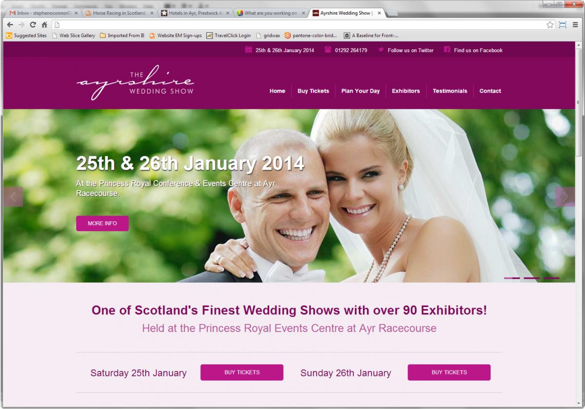
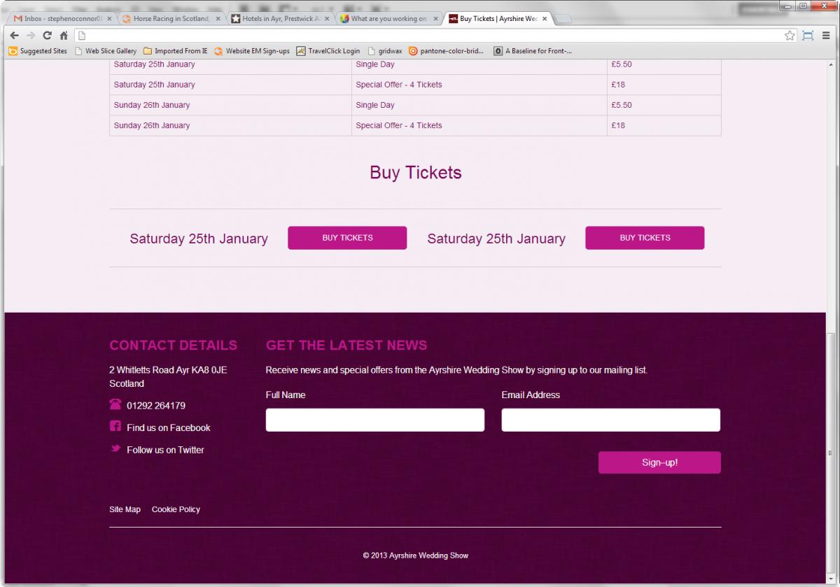
Site design and CMS for a local wedding show, almost finished ....



-
Is there a reason you're using inline styles? Is this design for an email? I'd use divs for this mark up, but you could just add top padding to <h2>.
-
I recently bought this O'Rielly book about JavaScript & jQuery, in fact I bought the HTML5 and CSS3 books as well as a bundle. I find them very easy to get through and they give you real life examples of how can use the technologies. There is a tutorial (or 2) at the end of each chapter which I find very useful.
-
Yeah that's what I thought but that doesn't seem to work, I think it might be something to do with the add-on I am using to set up the site structure. I'll post in their forums to see if I can get a solution. Thanks anyway.
-
Hi, I'm looking to link to a specific part of another page from a button on my homepage, now I know I can normally do this by adding an ID to the part of the page I want to link to and add that to the end of my href, E.g. www.mysite.com/mypage.html#section ... BUT the page is dynamically created via a CMS (Expressionengine) and the .html part of the link doesn't exist. Does anyone have any ideas of how I could go about this? Thanks.
-
Does anyone know why my buttons are showing these weird corners on Safari after they have been hovered over? Here is my code: <div class="buySaturday clear"> <h4>Saturday 25th January</h4> <p><a href="#" class="buttonPink">Buy Tickets</a></p> </div> .buySaturday p { float: left; width: 40%; margin-top: 0; font-size: 1.5em; } .buttonPink { color: #ffffff; text-transform: uppercase; background: #bc1789; display: block; padding: 10px 30px; text-decoration: none; font-size: .6em; border-radius: 5px; font-weight: 300; } .buttonPink:hover { background: #83095d; -webkit-transition-property: all; -moz-transition-property: all; -o-transition-property: all; transition-property: all; -webkit-transition-duration: .75s; -moz-transition-duration: .75s; -o-transition-duration: .75s; transition-duration: .75s; } Thanks.

-
I think it's nice, clean and simple and to the point. Suggestions I have: - I can't read your submit button on your contact page, there isn't enough contrast on the gray button against the light background, nor on the white text on the gray button. - I think the contact page is important enough to give it space on the primary nav. - Is your copyright date out of date? If not I'd list some new projects, later than 2010. - I think there are too many portfolio items, I'd have 10, maybe 12, 15 max, you have at least 40... Other than these, it's good stuff.
-
I'd suggest you learn the basics of design before you start trying to design anything, learn about layout, learn about grids and why they are important, learn about typography and what fonts compliment each other, learn about colour and what it represents. Once you know a bit more about why you need to do things certain ways you will begin to understand it better and then that will affect the way you design something. Everything in a design, whether it be graphic design or digital design has some sort of meaning behind it. I think it's hard to design a site when you have no content, because basically you are just trying to fill space with nothing. Pick a site online that already has content/images/layout/colours etc and then try and redesign it. If I am stuck for ideas I go to these sites for inspiration: www.thebestdesigns.com www.creattica.com www.awwwards.com Keep at it though, you will get there, immerse yourself in design, read blogs, buy books, troll the web for inspiration/ideas/advice from the professionals. We were all amateurs at one stage in our lives ...
-
If I understand what you mean correctly I would tackle it like this, then just repeat the code for all the appropriate sections. <section class="fullWidth"> <div class="pageWidth"> <!--content that needs to be inside the wrapper here --> </div> </section> .fullWidth { background: #000000; } .pageWidth { margin: 0 auto; width: 960px; }
-
I like the simplicity of the top part of the homepage, the orange on the gray works well and the typography in your banner is strong. The site feels a bit 'templatey' to me, is it a template that you have altered? I do have a few observations: - The green in your logo doesn't have enough contrast against the gray background, I'd consider changing either the green or the gray. - Your pricing boxes on the homepage need to be spaced out more, at the moment it looks like there is one missing. - Your t&cs need to be inside the wrapper, the way they are not aligned with the other content at the moment looks strange. - I'd expect the bit about your team to have a description of each team member, at the moment, it's just a cartoon graphic and a name, I'd expect to be able to read more about each team member, if that's not possible I feel like this section is a little bit redundant. - On your Linux, Windows and SSD VPS pages I'd expect the content to stretch across the page more, again in certain areas it feels like there is something missing from the page. - When you click on your status page the nav breaks and comes out of its container (Chrome, Windows 7). - When I click on your contact page it takes me to a site that looks completely different to the one I have been viewing, not a good experience for the user and won't install confidence in them to contact you/buy your product. This page needs to run from the same stylesheet/template as the rest of the site. And once I am in this different section of the site I cannot get back to the other part of the site, even if I click the logo or the home button in the nav, I would (and do) find that very frustrating. - I think your could inject a little bit more colour into the site, possibly into the footer or header. Potential for a nice site here but I feel it still needs some work done to it.
-
William, nice, site, I like the logo and the layout and I think the green works well. I have a couple of points: - I'd expect your logo to link to your home page. - I think the animations on the homepage slider are a little bit slow. - I'd expect the arrows on the "our range of premium brands" to function in some sort of way, they don't do anything just now so I am not sure why they are needed. - You don't have any validation on your forms. - I think your about page is important enough to have its own spot in your main nav, and maybe have a bit about you/the company on the homepage, at the moment it's not clear what your USPs are. - Although not a necessity but 10 stylesheets is a lot of stylesheets to be having, I'd try and get that down to 1 or 2, but that might just be my personal preference.
-
Thanks Throzen. I humphed and hawed (Scottish terms for thought long and hard ) about the font(s) on my site, I chose Museo Sans because I generally love it but I do see - on Windows especially - that the font isn't that crisp/clear. It is something I will probably change to be honest as it is getting to me a little. Thanks again for your opinion.