Eoin
Members
-
Joined
-
Last visited
-
-
-
I like it, if you were doing it as a commercial theme I'd worry that it looks similar to many others out there; but given that you're doing it primarily for experience/portfolio I think it's ideal. Quite often when I get the feeling that I've created a monstrosity, all that's really needed are little touches. For example, the search bar at the top could do with looking a little less square, and as Sash said playing around with the text kerning also goes a long way to making the design look right, in particular on the nav bar and headers. (nav bar text may be a pixel or two too large, or maybe it's just the kerning but there's something not quite right about it.) Many of these things I find easier to deal with once I've done my mock-up and the site is coded, partially because everything appears slightly different in browsers than on Photoshop, but mostly because my supposedly pixel-perfect layouts seem to go to sh*t once I get into coding them...
-
I much prefer Bright Web Zone, there's something about E-planet Web Design I don't like...
-
Windows PC: 28" LCD, Wacom Bamboo Pen & Touch WAMP, Sublime Text 2, Dreamweaver/Photoshop/Illustrator CS6. Skeleton CSS framework (responsive version of 960 grid) but want to pick up SASS once I get some spare time.
-
The seasonal love of pumpkin spice, which until reading your post I was unaware of, doesn't seem to exist here. (I'm open to the idea that I may just move in the wrong circles.) I think I can recall a few places advertising it as some sort of Halloween special, but those places are where you'd ordinarily go for a kangaroo steak or sugared cucumber; not very mainstream!
-
Ok, so first client ever. (I've done lots of my own sites and for friends/family but this is the first time it really matters.) I'm comfortable with HTML/CSS, I know enough PHP to muddle through but let's not talk about Javascript. I have the first client fear anyway. The client wants a Magento web-site. I know enough to advise him against a Magento website in favour of something simpler. (He is worse with computers than my dead grandmother and he intends to sell maybe 20-30 SKU's from shared hosting.) He wants a Magento website anyway, his friend has one. So ok, I'm now skinning Magento. Correction; I'm now skinning THE TEMPLATING SYSTEM OF SATAN. I don't doubt that there are wholly sensible reasons for having one hundred billion XML files spread over the breadth of the visible universe which all seem to have different rules to be comprehended before they can be manipulated. Once I've got the knack of this I won't stop talking about how wonderful Magento is because I'll have put more work into learning the damn thing than it took me to get a degree. For now though, ARGHHH.
-
-
-
-
LOL sorry man it wasn't a reference to you or the political party! In the UK, the word is used to describe somebody who is particularly immovable, illogical and overly emotional about something. So a 'design Nazi' would be somebody who was completely unreasonable on the subject of design. My (now ex) girlfriend was a bit of a timekeeping Nazi, she used to go ape an insisted on leaving 2 hours early for everything in spite of logic and reason. I'm a 'grammar Nazi', in that when I spot somebody put an apostrophe in the wrong place I have to really fight the urge to correct them. Apologies for any offence caused, but it has nothing to do with politics (or indeed you! I started typing before you'd even entered this discussion), it's just a term that's entered everyday language in the UK!
-
As people have said before, it's disheartening when you've spent a great deal of time working on something, to have others come along and critique it so heavily. From experience of this same situation I can tell you there are two ways of reacting to it. 1. (What your brain wants you to think) These guys/girls are design Nazi's and would call the Mona Lisa a piece of sh*t if anyone bothered to ask them. Or; 2. (What your brain is more reluctant to think) I've got a long way to go yet before my design skills are going to cut the mustard. #2 is a difficult one to swallow, because it's not clear when uninitiated how to go about rectifying the alleged deficiency. What did it for me was a good 200+ hours of Lynda.com tutorials and a lot of practice. (A lot of that time was learning HTML/CSS/JS/PHP) but all the course contain elements necessary to create a good web page. Specifically in your case the courses on: Typography for web-designers, User Experience Fundamentals for Web Design Would be necessary. Even taking in everything in those will not prepare you for all you should know, but it would give you a better idea of what it is you need to prepare for. Whichever way you go, all the best of luck! Eoin
-
All of the above!
-
-
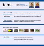
I don't think that there is a correct answer to your questions about the Tenor Sans or whether you should use Georgia/Arial, or whether the midnight blue is too formal. You could go through every colour combination and every font combination possible, and you might well find something that makes your site look 1% more appealing. However, these are primarily subjective issues which are to a great extent matters of taste. What your site needs is a proper overhaul, because there are many objective design issues with it. Take the following example: Again, this is the best I could come up with in 30 minutes so it isn't exactly the pinnacle of human achievement, but it does act as a basic demonstration of what I think your site lacks and why changing the font or colour would be like a drop in the ocean. Differences to note: The absence of any non-relevant information. There's no unnecessary scrolling slideshow taking up prime real estate and no large blurbs of text. The logo is text based, and while it's by no means impressive in an artistic sense, you're never going to be able to represent or enhance a business name like 'Integrated e-Marketing Solutions' with a graphical logo. The logo on your current site acts as a distraction, it adds unnecessary colours onto your page which detract from the feeling of continuity. Note the absence of pictures that don't add anything to the site. Much of your current page looks like it's there 'because you can', not because it lends any functionality. As somebody said earlier, 'form follows function'. Your page has a purpose, and to make it look good you need to cling rigidly to that purpose. If a page element isn't performing a useful function - then get rid of it! Secondly, note the strong lines on the page. The left alignment and right border of the logo is reflected down the page, similarily the right section of the page is also marked. The readers eyes know where to go next, it can all be read extremely quickly. If you want to convey a sense of formality you need to set 'rules' for your page that are obvious and continue throughout. Granted there's very little information on the page I've just done, but even if there was more text, a reader could skim through it without even needing to blink. The bottom half of your current page is all excess baggage. You could be the worlds most accomplished author, but if I'm on your website looking for an answer to a specific query I have, I'll be pissed off if I have to read through 10 lines of waffle on the off-chance it's there. You need to think of internet users as having the attention span of children with ADHD who've been intravenously infused with large doses of caffeine for the previous 3-4 days. They're merciless! Note how the serif font throughout the page makes the page feel more 'formal'. (I used Georgia for everything including the logo, a boring font but does the job.) The same page with a sans-serif font would 'feel' much less formal/traditional. If you want to make your page formal then it's a good way to go, but with your current layout it's not possible as at small font sizes, serif is difficult to read. Furthermore, your current page feels disjointed because you've got non-matching fonts on your logo/rest of the page. Finally, note the application of colour. My artists impression of your better half is no doubt way off the mark, but note just how devestating that bright pink bow in her hair is to the rest of the page. I mean it's tiny, but it distracts your attention no matter what you're looking at. In the same way, the huge range of colours on your own site make it far more difficult to read. If you can, find 2 complementary colours (not including black) and stick to them as best you can. Eoin
-
Sanygeek's given the ideal answer which would apply in 90% of cases, but if you can't compromise on image quality (e.g. photography website) even for users viewing at high resolutions, (or conversely want to really streamline for people viewing on mobiles) you can use media queries to establish the users screen resolution and send different background images for different screen sizes depending on the user. That way you could have several versions of the same image across various resolutions. See: http://www.adobe.com/devnet/dreamweaver/articles/introducing-media-queries.html
-
I have too much faith in humanity to believe that your current website represents you, if it did you wouldn't have had enough of a sense of humour to chuckle at the graphic! The issue isn't with your site looking more formal than informal, as you say, if you're quite a formal guy then naturally your site should be formal. What I suppose I'm trying to get at by calling your site 'corporate', is that it doesn't really convey any sense of you as an individual, it's more like looking at a less polished version of the Halliburton site. (< Not a good thing!) Take this guy's site for example: http://www.alittlebitofsomething.co.uk/ This guys page has been used by others on here as an example in the past, but it's a good example of a personal site because you know exactly what to expect by ordering a site from this guy. i.e. It's likely to be a creatively designed site, you have a good idea of cost, as a client you know your place in relation to the designer, and the guys personality comes across in bucket-loads. I'm not proposing that you copy this guys site, that would be ridiculous, I'm just proposing that you take from it the importance of selling the self-employed persons sole asset - themselves. How you wish to present yourself is the determining factor in how your site should be designed, take your question for instance: Every type of font, whether it be serif, or sans serif or script says something about you. Generally speaking, a serif font says 'traditional' and a sans-serif font says 'modern'. If you want your site to look more soft and appealing, yet at the same time formal, then you're really crying out for a serif font, but because your accompanying text is quite small, with your current design you'd probably need to restrict the serif to headers and use sans-serif for the paragraphs. That restricts your choices quite considerably because in order to 'match' a serif and a sans-serif font they can't (at least with your objectives) be very different from each other. That means you've not got a whole lot of choice but going for something like Georgia for headers & Arial for text if you're restricting yourself to web-safe fonts. (There are dozens of other combinations of course using @fontface, but even then you don't really have the option of using a really 'mellow' serif font on your site because of the layout.) Eoin
-
I think that the different tasks that would need to be accomplished to achieve your goal would require a greater degree of responsibility than any single individual designer/developer could reasonably be expected to bear. The tasks that would need to be done initially would be: 1. Design. To design layout, images, graphics and logo's for the general site, in addition to creating a workable yet efficient user interface for members votes etc. 2. Front-End coding. To actually code the front-end site in HTML/CSS/Javascript (or Flash), and create the user interface which will interact with the back-end. 3. Back-End coding. To code the back end functionality from user accounts + preferences, to the algorithms which calculate members votes, designing a database, setting up methods of payment etc. (Would require an advanced PHP/ASP.net developer with extensive SQL knowledge.) That's a really shallow description of what would need to be done, there are hundreds of sub-tasks which would need to be done for each of the above, and any one of the above would take an experienced individual working full-time some time probably better measured in months than weeks to complete. (At least if you want to have a fully functioning site that looks the part and has any degree of security and sophistication.) Quite how many months would depend entirely on the complexity of your project, and as such, so would the cost. Depending on just how sophisticated your proposal is, how quickly you needed it done and what scale of post-launch modifications you wanted made, in addition to technical support, I think you'd easily break £10k before even considering developing iPhone/Android apps for mobile/tablet users etc. I don't think anybody would be able to be much more transparent than that without knowing the precise details of what required to be done. Given that this would essentially require more than one person working full-time at it for a good while, you'd really need to sit down with a design agency and thrash out the details to get an accurate pricing. Eoin
-
Hi iems, This could be matter of taste on my part, but I think your site design is slightly too 'corporate' for what is arguably (let's not start this debate again people!) a reasonably 'creative' industry. I'm open to the suggestion that I'm not attuned to your target market, but even the name 'Integrated eCommerce Solutions' makes me think of spreadsheets and 2 hour commutes to the office. For instance, if my site looked like this: You could clearly see what was wrong with it. Don't get me wrong, I'm not saying that your site is anywhere near being as abominable as that, but I think the underlying issues are the same. As somebody said earlier, your own business site is as much about building trust with your potential clients as it is about anything else. Your current design seems somewhat impersonal and cold to me, and that's as much about the business name, logo and 'building block' theme you've got going on as anything else. I think you should consider taking a broader view of the image you want to present before deliberating on the design of your site, because while previous posters have made perfectly valid points about typography and general design, no amount of design will be able to put right a house built on loose foundations. Eoin