DustyWeeks
Members
-
Joined
-
Last visited
Everything posted by DustyWeeks
-
OpenOffice has it's quirks, but I use it day in, day out and it's not nearly as bad as Word (which I use day in, day out on my laptop). The new Office I hate with a passion, if only because I couldn't get it to save the change to the standard bloody template after a week of trying. Calibri 11pt and 115% spacing is utterly useless. Grrrrr. Plus that stupid new styling bar thing. You can easily use online converters for .docx files, so if I was paying then I wouldn't pay, and use Open Office at a stroke...
-
Could you use your experience as a benefit to look up the "career ladder". It might well be that you can use it as a advantage rather than what you perceive as a disadvantage. You have great English by the way, miene Deutche ist nicht so gut (spelling errors are very likely!). You might well find that is a big positive. I think the key it narrowing down what you're really great at, and focussin on how you can provide value with those skills. Rather than a catch all approach.
-
noooooo - don't get the 20" A few things. First of all the screen on the 24"is better than the 20", there's various technical reason depending on how geeky you want to get, but one the 20" screen doesn't actually have the same number of true colours as the 24, it has a limited pallete and generates the middle colours by flicking between two colours and tricking the eye. Our designers are moving over to the 20" and most of them have troubles with reproducing colours, photoshopping etc, the 24" is a much better screen for that work. In terms of memory, NEVER buy it from Apple, even if you buy it from Crucial you'll save a stack. But for 4GB (2x2Gb) you'll talking change from £50 if you shop around last time I looked, so don't worry about that. It's easy as pie to do yourself. The only thing I wouldn't get is the bigger HD or faster processor, they don't work out as value for money. If you're a real worrier, then the Penryn iMacs are due any time now because they've moved to that chipset in the laptops. But in a desktop while it wont hurt, it also wont make too much of a difference if you buy now. Anywaaaaaaaaay. I've rambled. But basically do not buy the 20" if you are considering a 24" at all. I have the 24 and use 20s regularly at work, there's no competition. In terms of software, there's a whole bunch that's a lot cheaper/better depending on you POV. Coda is popular, I have CSSEdit too which i like. I haven't tried TextMate yet.
-
Hi, A few more pointers if it helps on features that are more/less important to me 1) custom smilies, for explaining the subject itself 2) SEO (although this is probably #1 in importance) because... 3) "Article" ability. I know I can just use standard posts, but I can see a scope for articles to kick off a discussion, so SEO urls where I can submit them would be great. 4) moderation - I expect it'll get spammed, so what's the most secure forum? 5) Private forums - the ease of implementation of these, although this isn't stunningly important. Cheers
-
Hi guys, I'm in the process of setting up a forum (nothing to compete with this Ben ) and I was looking for forum software. I've used vB from an admin point of view, but nothing from a coding/set up POV. Only on an established forum. This forum runs on Invision and from a user's POV, there are things I like/dislike about it compared to the vB forums I use. But I know nothing about the back end of Invision. However, from those who are more familiar with the backend stuff like setting it up and doing the bits behind the scenes, do you have any preferance for software? Cheers
-
No problem mate. Good luck with it
-
OK, I'll wade into the copy question In terms of the top text, I agree with the third person comment, if only on the basis of consistency. e.g. you have third person at the top, and then elsewhere on the page you are referring in the first "...what I do..." "...I provide..." etc etc. Personally, I think the top needs to be as snappy as possible. Rawkes webdesign Beautiful websites, handcrafted to pixel perfection Could be an option. Then you remove the 1st/3rd problem, and it tells the same thing in fewer words. However, I would argue that text is a deeply personal thing so nothing is ever "right". As people in my business say - "what's the best daily paper in the UK?" You could argue the Times or another broadsheet but the Sun outsells them all with awful copy and horrendous use of language. So "best" is not always successful . To me, the website design itself is quirky, personal, shows a lot of enthusiasm and is interesting. Therefore, I'd make the copy reflect that personality. To take an extreme example: if you had your design and then the text was "Rawkes will deliver key performance measurables in the online sphere, giving you excellent brand recognition in the virtual market place." It makes sense, but it would be completely incongruous to the look and feel of your site. Therefore I would recommend following that (excellent) design and the feel of it into the text. It doesn't have to be much, but the odd reference in a quirky way to ideas like space, robots, taking off, blueprints etc etc will tie it all together, inject some humour and keep the visitor reading. It doesn't have to be much, but it could make a big difference. I agree completely with removing any references to perceived negative words like "small". The one good thing about estate agents is learning their tricks such as "easily maintained outside area". So subsitute words such as small for "bespoke", "personal", "intimate", "dedicated". Don't be too trite with it, but it'll come naturally once you get the idea. I also agree with using the robot theme throughout, make the computer "employee of the month" or something. Personally, I'd replace the about pic with an illustration. You in a spaceman suit, anything, but keep it in the feel of the piece.
-
Bettersearch plugin for FF does something similar, albeit less fancy... I like it a lot.
-
I don't see it as a problem, you're being honest about what you are at the moment. Now, if they saw your site and said "a condition of working for us is you have to give up freelancing" then that's different, but at this stage any chance you have to give them the wow factor is good, so if you are proud of it - display it. Otherwise you wouldn't put down your current employment in Tescos while applying for a job in Sainsburys (or whatever). You're a freelancer, and they will want to see examples of your work, simple as that. At this stage, it's immaterial. Good luck mate
-
Mac fan #4 (or is it 5?) here. Hate to say I've got the Alu24 bloomin gorgeous it is too. Although I'm still thinking about getting a second 22" external screen for dual monitor rig, just not quite sure how I'll explain the sudden appearance of more hardware to the fiance! 4Gb recommended here too especially as it's so ridiculously cheap now, only £30 for a 2Gb SODIMM! Be a crime not to upgrade! Nice mag there Curvball, my background is magazines (I'm and editor), you've got some neat touches in the designs too. Good luck. We should get WDP "Mac fan" sigs or something, start a movement
-
Hi mate, Nice intro, welcome to the forums. Echt eh? Never stopped there, but driven through/near it a couple of time heading towards the Koln area. All I can say in Dutch is "can I have the bill please", so can't even make you feel at home So welcome to WDF
-
No problem, everyone here seem particularly helpful, so no worries there. One thing, learn Dreamweaver via the code, it's sooooo much easier. Also check out the Missing Manual series, I've got two books and they're really good.
-
I agree with the footer comments, the middle gap looks kinda odd to me. I "think" you mean that on the top bar you want a different background on each side of the header image, is that it? At the moment you have the one tiled. Personally I think a better way around it would be to not have different dot angle, just have it "fading" straight up or down, then you can use a much smaller image (only need to be one dot wide) and tile it at the top and bottom. That'd sort your bottom middle problem too.
-
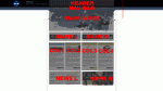
I'm guessing you are currently using html rather than css. If you can use css then it's a matter of taking the layout and spliting it up into the containers and the pieces you need. You've got some pretty clear colums and containers there, so it "should" be easier to split everything up. I'd recomend you google css column layouts, and there's some good tutorials out there on the net. Personally, I've learnt a lot on http://woork.blogspot.com about the basics behind how to work things out. I've done a quick layout of how you could cut your site up. Also if you wanted to start from some kind of starting off point, something like THIS or something similar could be worth a look, you can add more containers to suit the layout and can probably work with it to get something basic up and running. For your bar across the top, you could either do it by 100% width background colours in divs, or if there are gradients involved you can take a 2 pixel slice and then repeat it 100% width. That'll mean it fills the screen, much like a tiled desktop would. BUT, I would say I've only been learning css a short while, so don't take it as gospel, but the forum's more experienced posters can probably point out any flaws in my dastardly plans . There are probably several
-
Hi guys, Thanks for the input, I've (finally) sorted it Had to use divs to get what I needed done though lastcrime - you were kinda right, it was actually a corrupted image that showed up fine in explorer/psd etc locally, but wasn't displayed when online, hence the "empty" box. But when I fixed that I had overlooked something else. RobH - thanks for the offer, but it's a site for my upcoming wedding , so I might run it on a test WP install soon, but at the moment I'd prefer not to post the link. Would be interesting to get comments though, so watch out in the feedback forum I've got a few other ideas up my sleeve too so there'll certainly be more. Thanks again guys D
-
Arrgh, I'm stumped. I'm sure this is stupidly easy, but I can't get it to work. I'm trying to get a wordpress theme to work and I'm having trouble placing one image over a repeating background. I have this in the style sheet #bannerwide{ height:185px; width:100%; background:url(images/topbar.jpg) repeat-x; position:absolute; top:0px; } #wrapper { margin:0 auto; width:960px; background:#c0cfbf; } #logo { padding-top:20px; height:120px; width:960px; background:url(images/banner.jpg); } and this in the header.php <body> <div id="bannerwide"> </div> <div id="wrapper"> <div id="logo"> </div> ...others stuff (containers etc) What I'm trying to achieve is a background (it's 2px x 185 px) that repeats all the way across the page, no matter how wide the page, then over the middle of that (hopefully because I placed it in the centred wrapper) I have a banner.jpg All I get is the background going across the page, I can't see the banner.jpg. I can "inspect" it with firebug and the shaded box is in the right place, but can't see any image. Is there a blindingly obvious thing I'm missing? I'm proably being a tool... Thanks in advance all
-
really? i thought it was about 8hrs long? Anyway, I really meant as in "without distractions" sort of thing. It's rare I get to sit down and just play a game without something else getting in the way.
-
I'm doing a basic one for my sister! Often just charities you see in the local paper and radio are the best, they need the help most because are often smaller places. Or ask at your local council because they deal with a lot of NPOs and charities, the library would be a good start
-
Yes mate, I'm just about to go on for a blast tonight for a couple of hours if you're around? Singleplayer isn't that long so you can do it in a day if you put your mind to it...
-
Good call Ben, COD4, although you're missing a trick with the single player, awesome storyline.
-
Do you use a Mac? I use Snapz Pro and love it for screengrabs.
-
Personally, I'd ask how does the image loading affect the user? i.e. I'd still wait for a "big" site if I got an interesting tidbit to keep me going for those extra couple of seconds e.g. the new BBC homepage often has images delayed, but I can still glance over the text in the meantime and am often off the homepage before the last image has loaded, even if it's a couple of seconds delay it keeps me going. So if you had some "interesting" text elements visible high up the page, a few header images that just make it look better can come along (fractionally) later. But, this is purely a "users" opinion, I don't proclaim to know enough about web dev yet to offer a figure for sizes etc.
-
Overall it's a nice site, clean and (relatively) easy to get around. I agree with the minus comments on the green, too much of it to be that bright. Plus the green in the nav seems too dark for the style. Also I feel the "Web site design & development and graphic design throughout the UK from a Glasgow based internet solutions company in Scotland" on the homepage looks a little clumsy and serves to emphasise how big the header image is. To me the font size of the home/services etc look like it was that big to take up space rather than create impact. Personally I'd like to lose the reflected websites in the header and put the nav up there, get rid of the big picture across the middle and put the (great) "latest work" bit much higher as I think that's really appealing as a visitor. I like the web 2.0 boxes on the right as that's the style you're going for, but I'd make them completely clickable rather than only the title. Otherwise it's just the/my general grammar thing, there are a lot of minor errors. Right, that sounds a lot worse than I think it is, sorry! It's a nice site and doesn't need a lot to enhance it. Good work
-
Nice work there Really, really minor points. I found the link/hover use of pink inconsistent. e.g. on your portfolio page I thought the highlighted words were links and in the footer sitemap is but XHTML validation isn't. I also though the little arrows (which I like) were initially links to example works. It also needs to be edited for grammar - e.g. "Throughout all of my work I have tried to combine art with technology, I still believe in the good old pencil and paper" and style e.g. on 'About me' page "Having 3 years employed and six years of active web..." and others. Also there was the other point about the "home of"; personally I'd keep it all lower case. But, I'm coming from a magazine design background, and I get pedantic about things. Overall though, it's better than I could do, great site
-
This is exceptionally minor, but when I click on the portfolio menu tab it jumps the menu bar across, all the other links work fine. Also making the hosting box three lines of text (it runs to four on mine) as it throws the eye. But that's being hella pedantic Good work