JRP
Members
-
Joined
-
Last visited
Everything posted by JRP
-
Anyone?
-
Hello people of the internet I have recently been accepted into an IT apprenticeship where they do Web development but also all the other stuff you can find on a Level 3 course. While you are being able to pick a Website development company as your work placement, which I've applied for and got a interview next Thursday. But is it all worth it? Considering, I want to become a Freelance website developer? I already have knowledge in HTML, CSS and some JavaScript. Just wondering if you would recommend another route to go down? Thanks in advance, JRP
-
That didn't work but I found a solution, for when I click outside the div it will hide. $(document).mouseup(function (e) { var container = $("#preview1info"); if (!container.is(e.target) // if the target of the click isn't the container... && container.has(e.target).length === 0) // ... nor a descendant of the container { container.hide(); } });
-
Hey! I have created some code, so when I click on an image with the id="preview1" a div with the id="preview1info" will appear, now that would according to plan. But where I am struggling is how would I get the 'preview1info' div to disappear when clicked on? here's the code - <img src="images/preview.png" alt="preview image" id="preview1"> <div id="preview1info"> </div> <script type="text/javascript"> $('#preview1info').hide(); // Initially hide info $('#preview1').click(function() { // Show on click $(this).next('#preview1info').fadeIn(); }); </script> Thanks in advance
-
Thank-you I'll give it a try now
-
Hey people of the Internet. I am creating a website for my mother, and seems this is the first time I'm going to be attempting to create a online shop website, I was wondering if any of you could point me in the direction to head. Should I use CMS? or not? Any tips would be useful thanks.
-
Hi, Have you tried using '@media quires' ? if not search it up on the good old google or feel free to give me a pm
-
There is a few books if you are willing to go with books, I personally think the webs easier like www.codecademy.com. The books are in easy steps - The first three books I brought was Web Design in easy steps an then the html and css books! they do help a lot as you get to know all the basics, then go further into detail about what the languages can do.
-
Personally, I don't see the point of using Adobe products to create any website. I would use Gimp and Sublime text 2 - exactly what I'm using now! then just use the browser to preview . Photoshop gives you messed up code if you slice your design up and adobe, only ever used it in school and never liked it aha.
-
Also post your css and html so we could see if there is a problem there.
-
-
I'm more of a developer as well, learning more design ways every day though, this forum will help you a lot. 50px control panel could work well, yes it would make it a lot easier on mobile viewers - Also one thing I've just noticed is your responsive design (kinda) You have done it so the boxes get smaller when the viewport gets smaller, which makes it a lot harder for users to read. You could use media quires to space out the content when the screen gets smaller, to keep the same amount of content on the page As you said when you are scrolling through the stories you want to see as much as possible, but that also makes it harder to focus on the thing you want. You could have it different sections for your home screen. Where say I want to find out something on sport, I would click on the sport section, which then leads me to all the sport stories? Or the same for The Guardian newspaper. The main thing you need to do it make it a cleaner design, which will allow the user to enjoy it more Also on another note, I notice when I click on a story it takes me the the website the story come from. Try making it so you pull the story from that website and implement it into yours. Hope I've helped!
-
After looking at your website only for around a minute, there should be a bunch of improvements made in my opinion. Here is a few of them: - The header that you can hide and show, seems a bit bare and ugly, could do with a new design - Although I would actually say that about the whole sight, as it just seems difficult, for someone to stop and read or even pay interest in the website you could use a clean design that is nicely spaced out; something that would make the readers have a more enjoyable time. - The header could also do with being a bit smaller, maybe with some buttons that when you hover or click on open up the settings box? Would make more sense. Also if you are going so you can hide it why not make it automatic? instead of having users hide and show it all the time. For example: When the user loads the page have it open, but when they scroll down make it go into hiding, but then when they scroll up make it appear again. Also one thing you could add to the site seems you are going for the multiple news pages in one? If i'm correct. Is to have a search bar so users can find the content they want without having to spend time looking and getting frustrated. Try looking into the google search bars, they could be your answer for now. The main thing you need to do is re-design the website and think of what would be the best experience for the user. But hey they are just my opinions. Goodluck
-
One way that will help any design is responsive design using media quires (already see you're using percentages) so you can change the text size so it does not overlap when the display size changes - I guess it would work the same as well with zooming? Worth a try anyway.
-
-
I was thinking about this design on a train journey back home from and it took me around 20 minutes, But thanks for the advice, I'll carry on with this get it up to my standards and with all the information, then post it to see peoples opinions then. Cheers.
-
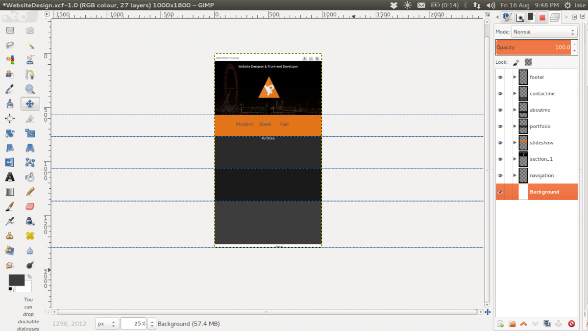
Hey people of the internet, I have been developing a design for my portfolio website and have stumbled upon a problem in which to go for. Dark or light? Should I go for the theme I'm working on at the moment (see image), or turn my attention to a more light minimum design? Also if you think I should stay with the design I've got now any improvements that could help? Note - It's still in early development and quite rough. Thanks in advance, JRP.

-
-
Yes the two images are near enough the same, because the code that I posted is the code I have updated too, should of mentioned it in the actual post. Was just wondering would that be the right way about going to get them to look the same in all browsers? By using more divs? or should i go for -webkit- ?
-
Hey, I am trying to create my website, just messing around with different skills I have picked up and learnt over my college courses. I am stuck at trying to get them to look the same on all browsers, for example - firefox and chromium! When I coded my website, I used percentages to make it flexible, viewing it on firefox it looked fine and was perfect. Then I went onto chromium and noticed that the percentages didn't work the same way and were way off scale. Is there anyway I could fix this? ( I did find a way around but I don't think it is the proper way, just want to ask someone who knows how to do it properly ) This is the way - /* http://meyerweb.com/eric/tools/css/reset/ v2.0 | 20110126 License: none (public domain) */ html, body, div, span, applet, object, iframe, h1, h2, h3, h4, h5, h6, p, blockquote, pre, a, abbr, acronym, address, big, cite, code, del, dfn, em, img, ins, kbd, q, s, samp, small, strike, strong, sub, sup, tt, var, b, u, i, center, dl, dt, dd, ol, ul, li, fieldset, form, label, legend, table, caption, tbody, tfoot, thead, tr, th, td, article, aside, canvas, details, embed, figure, figcaption, footer, header, hgroup, menu, nav, output, ruby, section, summary, time, mark, audio, video { margin: 0; padding: 0; border: 0; font-size: 100%; font: inherit; vertical-align: baseline; } /* HTML5 display-role reset for older browsers */ article, aside, details, figcaption, figure, footer, header, hgroup, menu, nav, section { display: block; } body { line-height: 1; } ol, ul { list-style: none; } blockquote, q { quotes: none; } blockquote:before, blockquote:after, q:before, q:after { content: ''; content: none; } table { border-collapse: collapse; border-spacing: 0; } .header { background-image: url(images/header_background_1920px.png); background-repeat: no-repeat; width: 100%; height: 400px; } #logoholder { width: 100%; height: 150px; position: absolute; margin-top: 65px; } #logo { display: block; margin-left: auto; margin-right: auto; height: 150px; width: auto; } #title { font-size: 18px; font-family: sans-serif; color: white; position: absolute; width: 100%; height: 18px; margin-top: 217px ; text-align: center; } #slogan { font-size: 25px; font-family: sans-serif; color: white; position: absolute; width: 100%; height: 25px; margin-top: 236px; text-align: center; } @media only screen and (max-width : 480px), only screen and (max-device-width : 480px) { #logoholder { height: 150px; margin-top: 25px; } #logo { height: 150px; } #title { font-size: 18px; height: 18px; margin-top: 132px ; text-align: center; } #slogan { font-size: 25px; color: white; position: absolute; width: 100%; height: 25px; margin-top: 236px; text-align: center; } Firefox - Chromium - Any help would be appreciated, thanks.