Mollart
Members
-
Joined
-
Last visited
Everything posted by Mollart
-
-
Hey, There won't be anything free about that will do a mile distance radius check available for free within an ecommerce package. I've coded one up before though, but for yours maybe you could just have set UK counties you would be willing to deliver to?
-
Try... <tr> <td width="100">Name</td> <td width="200"> <input type="text" name="field_1" value="<?php echo $_POST['field_1']; ?>" /></td> </tr> <tr> * note, this is just to get your php working.
-
You don't need to do a while statement if you're just looking for a single entry output. This would do the job, you might want to stick it in a function as you have above though... $sql = "SELECT * FROM AdminUsers WHERE AdminPassword = '".$password."'"; $query = mysql_query($sql) or die("Cannot query the database.<br>" . mysql_error()); $row = mysql_fetch_array($query);
-
Are you using PHP? You can do a %like% statement within the SQL to try and match words rather than exact answers. http://www.techonthenet.com/sql/like.php
-
Remove px from your height and width.
-
Your right about the footer being for people. The thing is the SEO text to this extent is only on the home page and we're going to have the phone number showing near the top of the website on the home page and that's the only thing we really need people to be looking at down there. They can click about for info on the company, the blog is purely for SEO also, but we will be feeding some bits of content in there. Also, the header will be sliding down on top of the content so the option for contact and about will always be visible.
-
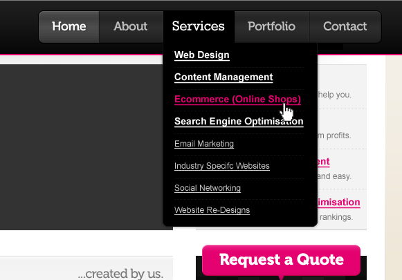
Here is the drop down menu. Main services are big and bold, additional services are listed smaller and slightly darker.

-
Thanks for that, your right about the visible content. There is another issue though, extra javascript, extra file size, extra page load time. I realise that will be minimal but it all counts. We've been speaking about it in the office and we decided to stick with the content just showing rather than adding further javascript and adding any further file size to the page - I know it's a bit mad since it's only small but we're very keen not to risk losing out on any rankings as we rely on search engine traffic so heavily these days. Also if you saw a big bulky bit of text near the bottom of the page would you bother reading or just skip to the page you wanted to view? To be honest, I know it's there but I hope people ignore it to a certain extent. Honestly, thank you for your input, it's much appreciated.
-
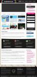
Slight re-work of footer and side content following above feedback.
-
haha, I'm not the seo expert, I just get told what needs to be on the page and why! I've been told not to hide the content in an accordian or anything like that as Google doesn't like hidden content on the site and we don't want to upset the almighty Google!
-
Well spotted, will change!
-
I know exactlty what you're saying here, I appreciate the comments, my problem is that I can have the best site in the world, but if people can't find it... what's the point? We're currently ranked 5th on google.co.uk for "website designers" and page 1 for "ecommerce website designers". We can't jeopardise that as we get more enquiries through this than anything else. We used to spend 3 grand a month on leads, we spend nothing now and get the same amount of business through our SEO work - that's got to be good math. I'm using the 3 column bar as a splitter, so the user doesn't need to really go down much further. I understand people will browse down and it will appear spammy but it's really the only way to find yourself near the top of Google these days. Thanks for the mock-up! PS: I'm going to re-work the footer a little so it's less spammy looking!
-
You've come to the right place! You can get an ecommerce site without a maintenance contract, be wary of anyone who tries to charge you for one unless you actually require changes to your website on a daily basis. With your ecommerce website you can have it so that pretty much everything is editable yourself via a control panel. Products, categories, offers, banners, information page content. It all should be pretty simple for you to manage. Make sure you get a one page checkout and have site elements such as your categories and some of your top navigation stripped out when a buyer is checking out as you want to push them through the checkout process with as little distraction as possible. The whole aim of the website is to get someone on and buy as quickly as possible. When it comes to SEO you can start off slow and just have the site optimised (made well - seo wise) with things such as header tags, url's that include your product and category names. Especially if you have traffic from ebay already. Going on from that you can really start to drive traffic to your website once you focus on keywords (well key phrases really) that you can compete on Google for. Think like this when optimising, do I want to be on page 5 for a short key phrase (very few people will find you) or do I want to be page 1 for a few niche or longer phrases which could direct more buyer specific traffic. Even if the number of searches for this phrase aren't as many you'll be much more likely to sell that way. Hope this helped.
-
Drake - Fancy ... sorry, I like Hip Hop!
-
Hi Guys, Thanks for all the feedback, this is where we're up to now... Point taken about the Google type ads on the right, we're not really focused on anything beneath the dark grey area it's mostly for the search engines. We hope the top half is enough to direct people around the website. PS: I realise the phone number is missing at the moment.

-
Yep he could, but the sale would go through on the retailers website. There is no possible way he could gain analytic access to their websites transactions with Google Analytics unless he had access to analytics on every site he sold from. It would have to be done with cookies.
-
Couldn't agree more, have a domain that's easy to spell if you plan on spreading the site via word of mouth. Also I honestly think the Z looks cheap, it's on half the kebab shops around Stoke!
-
The google analytics would be on the site their buying from, so he wouldn't have access to do that.
-
I think you need to prove your worth and get 25 posts or above for some things on the forum. Ps: Welcome!
-
I've started switching it all around, not stuck the slider in yet. The black on the right is a mouse over effect.

-
I think there has been a huge improvement, well done mate!
-
Thanks, that's actually really useful. I think I got caught up in the whole thing of covering the white space with content. Your right about your eye being dragged around the page, I was trying to hit the user with content, but I feel I went a bit too far. My business partner actually wants a slideshow like what you've done already so we'll be switching it around to something quite similar to that. Thank you!
-
The third one is definitely the cleanest one. Try not having your corners quite so rounded, might work better?
-
Couple more things that could maybe improve it further... Try splitting your "Services Offered" section with light blue lines and try making the first paragraph in your text bold, that can be a summary right at the start about who you are and what you do.