Eskymo
Privileged
-
Joined
-
Last visited
Everything posted by Eskymo
-
I've been using Clean CSS to clean up and optimise my CSS and I'm a bit bemused by: what I had originally referred to top / right / bottom / left. so what does the new cleaned up notation refer to as it only has three rather than 4 parts?
-
Hi all I've been searching around this afternoon for a form that I could put on my site that wouldn't generate loads of spam like the last form I had [total nightmare] and came across this example: Secure & Accessible PHP Contact Form It sounds pretty good from the description, so I'm going to give it a go and thought I would post it up here to see what everyone else thought of it. Not sure this is the right section of the forum for this, but I couldn't figure out where else to post this... E
-
it's OK, I think I've figured it out now...
-
Hi there I'm having a bit of a mental block regarding lists today and so thought I'd post a thread in the hope someonw can help me out... I've got lots of tiny sqaure thumbnails I want to list in the footer of my site and want it to look like this: I want it to be a list and can't figure out how to do it. Any ideas? E p.s. I know I'm going to kick myself when someone tells me.

-
I want one in Eskymo Blue so I can freak out the dog! - That is so funny! How does he bounce in it - surely it's uncomfortable. There are some realy gems/nutters in this world - it certainly would be boring without them!
-
no mine didn't look impressive either, but I found the combination of the flowing movement and the music very relaxing.
-
are you using a mac or pc? it might not work on a mac...alternatively it might be an Internet Explorer bug if you're using that borwser as I often can't view interactive content with IE.
-
click on 'create' and then on the start button and then you click and drag your mouse about and change colours using the keyboard.
-
Have a play here: http://www.rhythmoflines.co.uk/ it's very relaxing!
-
That got me a lot of work when I first started out!
-
I think it's lovely. Can't see anything wrong with it...
-
hello and welcome to the website - I'm also in Scotland and I also stay up very late most night - is that a scottish thing or is that a freelance thing, not sure.
-
Designing for yourself is the hardest thing ever! It took me years to get my own site online and even then I wasn't happy with it as I'd done it in a rush as I was about to got full time self employed. I've since redesigned it a couple of times and am at the moment doing another re-design...luckily they're all on the same theme and I've just been developing the idea I had in the first place. I would definitely start off with your identity. If you're set oon the name of your company, then try and do a brainstorm and get a load of words that describe what you're about - what you do, how you do it, how you want to come across and then go from there. You could awlays post up your logo ideas here and get some opinions from the folk ont eh forum. It's always useful to get a point of view from someone not directly involved as they can be objective. Once you have a logo established - don't ever change that - it's what clients and web users will recognise as your company. If you keep changing your identity/branding you won't be taken seriously. The logo, once you've designed it, will also influence your colour scheme for your website and company stationary, if you get stuff printed. Consistency is very important - so if your website is bright pink - make sure this is reflected in any printed mateiral like invoices, headed notepaper and business cards. Hope that helps.
-
who cares? - are you making money? are you happy? that's what counts. Why does everything need defining?
-
I'd not thought of that...I always put 'site by Eskymo' - thanks for the tip.
-
not sure I need to do anything now...how did Daemon Byte's post get before mine when it wasn't there earlier when I posted my reply - I'm very confused.
-
I'll certainly have a look for you...but it will be later tonight. What I can do is either go through the text and put all the amendments into a word document for you or alternativley I could just post the amendments into one long thread as that way other people could comment on it and offer suggestions. Let me know your preference.
-
I agree - I never give a cost for a site until I know how simple or complex it's going to be. I always cost per project as each site is different and each client has different needs/requests. If you cost each website at $250 then what happens when a client comes a long with a huge site that takes you 2 weeks to design and build. I know I wouldn't want $250 for that amount of work. I charge double that just for one days work.
-
welcome to the forum...it's great to have you!
-
expat - should I change my signature then to keywords? so instead ofhaving my URL, I could type Fife Web Design?
-
I think you've got the link right there...the menu works fine in Firefox, although it's a bit odd as the menu's expand upward which is not the norm, but maybe that's what you're after. I don't have IE6 but in IE7 all the menu's appear at the same time as you've mentioned. I notice you've got this in your code: <!-- InstanceEndEditable --> <!--[if lte IE 6]> <style type="text/css"> div.menu:hover div.popup li a {display:inline-block;} div.menu:hover div.popup li a {display:block;} div.menu:hover div.popup {margin-left:-3px; bottom:11px;} div.mainmenu {font-size:10px; top: 5px;} </style> <![endif]--> <!--[if IE 6]> <style type="text/css"> div.mainmenu {font-size:10px; top: -2px;} </style> <![endif]--> Surely you can add some code to give instrcutions specific to IE7 in the same way.
-
hey - nice logo...
-
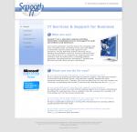
Hey I've joined this discussion a bit late as I've been away...still feel it's worth offering my opinions though from a designers point of view. I think the new site is a great development on the old one and certainly a lot more refreshing and easier on the eye. I don't particularly like the logo - I think it lets you down and hinders the sexy look you're going for. I think it would be useful for you to decide on a colour palet and stick to it. You have a lovely blue used in the horizontal header bar at the top of the page - it's a shame this isn't reflected elsewher in the site - like your text headers or your navigation and your body copy - all the different blues conflict to be honest and it would be good to settle on one and use a grey or a darker blue in the same tonal range as a secondary colour. I took a screengrab and had a little play about and came up with this: I've used 2 main colours - The blue in your header and a grey to compliment it. I removed your beige/pale orange background colour as to me it screams 'naff' and 'cheap' [personal opinion, I hope no offence is taken] and replaced it with a grey one - you could have it with stripes or without, but it compliments the rest of the layout better than the previous colour which didn't match anything. I've also removed the word 'navigation' as it's not necessary. If you define your navigation area, I think people aren't going to need it pointing out. What you have is OK, but I wouldn't have such a contract between the off and on states - plain text/white background to the coloured background and vertical bar. Why not have the coloured background present at all times and use the vertical bar to define the on state? I've also introduced a couple of icons as I thought they would help to differentiate your main headers from the rest of the copy and your sub header. Feel free to use the jpg attached andtake ideas from it or use it outright - I can send you the png if you think it would be useful. Hope these comments help.
-
your link doesn't work - so can't see what you've done...
-
I never really liked it or found it funny, then my OH came on the scene and Irish humour all of a sudden started to make sense!