Zach Townsend
Members
-
Joined
-
Last visited
Everything posted by Zach Townsend
-
Hi again, This is the finished version of the site - again the logo will be improved as will the copy as suggested above. What do you think?

-
Hi all, I'm a real newbie when it comes to web design, and I'm just now working on my first complete website. I'm going to provide the client with CMS so he can edit it in the future. Certain sections of my site are designed to work in a certain size, and my concern is the layout of the website will "break" if there user puts in more text than it is designed for. My question is, how do designers/developers handle this? Do you code a fall-back design, or do you let the user worry about fitting their text into the designated space? Thanks, Zach
-
Just happened to have another look at this site, and it looks miles better now. It's nice to see a design evolve like that.
-
Well what can I say, can't really fault it. Looks great, loads quickly, all the pages are clear and easy to navigate. Is it all jQuery and HTML5?
-
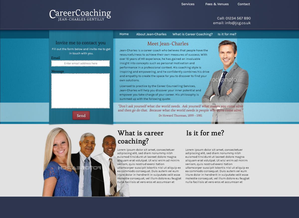
Hi folks, See attached the implementation of the suggestions you had. I've rethought the content strategy, so I'm going to include the "What is Career Coaching" on the front page, which I actually wanted to do originally. As such, ignore the navigation bar with these in, I'm going to put more "practical" stuff here like services, fees and so on. Also, the pictures are tacky put they're really placeholders at the moment until I can get something more suitable. Let me know if you think I'm going into the right direction. Zach

-
I agree with all the others say, very cool and inspiring site. I thought I was hallucinating I was looking at the subtly spinning logo - and that's not necessarily a criticism!
- 12 replies
-
- web design
- portfolio
- css3
- html5
-
Tagged with:
-
I chose the bottom one as the angle of the picture adds more depth to the page. I agree that the white background needs to go, but I don't think that image would work with the blue background. Maybe somehow blend the white background into the blue background?
-
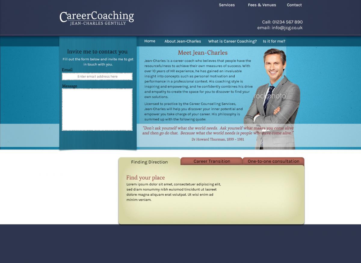
Thanks for the feedback Andy, Do you think I should scrap the 3 tab thing entirely?
-
Hi all, I'm currently working on a project for a Career coach website. It's a work in progress, but I've done most of the home page. Let me know what you think of it. Cheers, Zach
-
I would say the 'callout' text doesn't quite fit in with the hand-drawn style of the header. I find both elements really cool on their own, but stylistically they are too different. Also, what is the background image of? It looks like a bridge in the US or something? With a tagline "A creative web designer based in beautiful Cornwall" it makes sense to me to have an image of the beautiful Cornish countryside. If the bridge is in Cornwall, I apologise for my ignorance and withdraw that comment.
-
Yes, a big improvement! It's a good site, simple but looks nice. I think perhaps there should be more going on above the fold? There should also be a link to bring you back to the top of the page for each 'section'. Zach
-
I guess the layout and colour scheme are nice enough. Maybe you can expand on this design by using Lorem Ipsum as a text filler, figure out your font combination (you can use this tool to help you choose a pleasing combo http://font-combinator.com/). Maybe start adding some texture and subtle gradients to add some depth and interest? Maybe even experiment with drop shadows? Is that the actual size of the website? That would be quite narrow and the text would be tiny. If not, you should probably make the image actual size as it will give you a better idea of what it will look like in the browser, plus it will make it easier to convert to a web page. Generally, I think most fixed-width websites these days are around 960px, design gurus out there correct me if I'm wrong. What do you use to design with? Maybe you could use a program like Photoshop or Fireworks to pep it up a bit? If you can't afford any of these, there are free alternatives like GIMP you can try. Zach
-
Definitely has great potential, I'm actually working on a similar project at the moment and you have some nice ideas which have inspired me... I like the background image, although maybe you could fade the edges and not repeat it so you don't get the tile effect on larger monitors or when you zoom out.I'm not so sure about the mainly black backgrounds, next to the bright and sunny header it makes it look a bit surreal. Perhaps you could experiment with the colours of these? I really like the navigation buttons, they look very slick and realistic. There are a couple of problems though. Firstly it took about 5 minutes to load and secondly, the navigation should be above the fold.
-
Noted, cheers
-
That's alright Rallport, I appreciate your honest critique. As you can probably tell, I'm somewhat of a beginner and I'm looking for advice and guidance from experienced web designers so I can learn and grow. I agree with your points about it being uninspiring. I'll take your points on board and get back to the old drawing board!
-
I'd be interested in hearing what people say to this. Generally I have been using 14px or 16px for copy text, but I guess it depends on the font, the colour of the text and the contrast of the background?
-
Oops!! This was supposed to go in the Feedback and Reviews forum - sorry admin! Could you move it please? Thanks, Zach
-
Hi all, I am currently working on an eCommerce site for my aunt's Equestrian and pet supply shop. The initial prototype of the page is here: http://www.zachtownsend.co.uk/equicentrics. Let me know what you think. My own personal critisms which come to my mind are the "Can't visit in person" box looks like its missing something - I've experimented with grey backgrounds but I can't quite make it work. Any suggestions? Also, those of you using Safari or Chrome might have noticed the bg image on the callout is bleeding out under the shadow. I've looked for a fix for this online but nothing is coming up. I assumed this would be a common fix, maybe I'm not searching for the right thing? Anyone know the fix for it? Thanks, I look forward to your replies. Zach
-
Very cool site. I love the textures, you've really nailed avoiding the "CSS-look". Just a couple of very small things I noticed - I agree with what RyanKnights said about the copy being a bit too small. Also, I like the colour scheme but the "Printed Artwork" h2 in the #printarea div is hard to read on that background. Thanks, Zach
-
Very nice, very stylish. It's fun and innovative, and I like the idea of the single page navigation thing you have there. However, I think there should be clear separation between the sections, because I when I scrolled down I wasn't expecting a new section and I was momentarily confused. Maybe it would be a good opportunity to put in some fancy graphic in there or something? Or maybe even a clearer header?
-
Great, that's good news. Thanks Porkchop!
-
Thanks for the replies guys. Hmmm... interesting. Unless I'm missing something on the link you sent me Mike, the license is pretty relaxed on that font. Porkchops, so what you are saying is as long as I don't make the entire font range available for download or copy I should be okay?
-
Hi all, I'm currently creating a logo for a friend's small business. I don't have any skill with designing typography so I've used the Giddyup Regular font for the design (arranged and modifies slightly). I believe this font comes with the Adobe CS software, and I can't find any clear details about the license restrictions. Does anyone know the legal implications of using a well-known font like this for a commercial logo? I know there are plenty of logos by major companies who use Helvetica, but do they have to pay the copyright holders for it? Thanks, Zach
-
Thanks for all the great replies guys. You made some great points and taught me a few things. I look forward to implementing them. My apologies if I was being an ass with the baby picture, I was really just joking and I was eager to get some replies before I went on holiday because the deadline for me assignment was quite soon. No ego stroking was sought (this time). Cheers, Zach
-
Waaah! Why does no one want to review my site?