andylyon87
Members
-
Joined
-
Last visited
Everything posted by andylyon87
-
again load speed fine for me. I like the way the whole page loaded while the background loaded seperate. I am on avg of 15mb connection. I am really not a fan of the drop shadow on the header box. I don't know what you would do instead though. I am afraid I don't have many suggestions just get a bad vibe about the thing! Sorry! Im not much of a fan of the 1px diagonal black line on the moving bg either. It makes the text harder to read Sorry if thats not too negative
-
I would avoid capital letters! apparently our brain processes words better as normal text better than all capitals! On the whole very simple design and to the point, I would maybe try and redo the text though. Also I noticed the main body text is an unusual font, I would steer away from that for the main body and implement cufon to reproduce the headers this way it becomes more accessible!
-
Im not sure if its meant to be like that but the margins on all your right column are off. They sort of form a slight diagonal across the page
-
lol you changed it as I typed, much easier to read now
-
Im sorry have to agree, the background is very busy and make the text very hard to read! It may be better with a gradient or as suggested a single block colour, this way you will be able to read the text
-
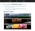
After my catastrophic failure to produce a good interesting and very colourful portfolio haha I thought I would flip it on its head and produce a super minimalist portfolio with minimal design simply focussing on the work. I was told my portfolios are very date oriented so have taken that into account and hopefully applied it better here. The other big criticism I received was that I was pretty nineties in my designing so I have tried again to steer away from this and go for a very conservative but more focused design that hopefully showcases my work a little better. I had checked out the trends before the last attempt but I think I missed the mark by a couple of miles lol. It is, as with the last, a work in progress. Please feel free to slate it but give some reason why so I can take the criticism on board. Inside my head: the idea is that this will be the home page, but you will only visit once (no link back) the about page is pretty self explanatory, the folio page will be similar in style to the latest work, however on clicking the box a div will expand and show details of the work and other images (these will open in lightbox) Thanks in advance for you critique
-
@hogIT I am very pleased with the feedback I am getting and am very greatful for it. It does help in wake me up to the fact that it needs redesigning. I will be keeping the design for something more like a nursery ha ha I am actually good at taking constructive criticism -- you have to be in any design and development job, what I dont enjoy is little snide remarks! I just think its petty and a waste of both my time and the other persons :s
-
@aaroniza yes I have been developing since 1999, not designing in photoshop! However I was 13 so its not like I was hardcore into it its more of a progression in the last 4 years. @makemeawebsite I am not a designer, I am a developer. I also said the design was scrapped :s I have been looking at design trends and coming up with things, then posting them on here to see if I can get useful feedback not snide remarks!!!
-
I can see this going the same way as the last, but its still in development! If anyone has any ideas I would love to hear them.
-
right I might have to go away and rethink the look. I know it might not be up to scratch, but is there absolutely nothing that anyone thinks can be salvaged from this to another?? I am pretty gutted that there is absolutely nothing that is any good about it!
-
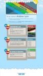
ha ha fair enough. Design is by far my weakest point unfortunately! I did spend a while doing it, but that's just because I'm not amazing at design! The dates are simply there to show it is updated regularly with work. I have edited it to have a hello blurb at the top but thats not finished atm and I might wait till I have more feedback to see if that works ha ha. The main thing I don't like about my old site is the big date bits! I want them in their to show regular updates and a more blog style home page. However I just think the old design is really bland! I am looking for a job in the near future so am hoping to build an attractive and fun page that exhibits my talents with code as much as the design. Thanks for your feedback. I would love to hear other feedback. Thanks for you honesty though HogIT
-
-------------------------------------------------------------------------- -------------------------------------------------------------------------- -------------------------------------------------------------------------- -------------------------------------------------------------------------- Ignore this thread idea scrapped (dunno how to delete a post) -------------------------------------------------------------------------- -------------------------------------------------------------------------- -------------------------------------------------------------------------- --------------------------------------------------------------------------
-
Main problem for me is that I use a small height window, so when I opened your site I never got the emblem on the top left because it was cut off till I resized the window :s
-
Right I have been thinking about this for a while. How viable is it to use semi-transparent png files? I personally use them quite a bit, but they aren't supported by IE6 (but then again neither does standard code). Should I stop trying to cater for outdated browsers and focus on the future or should I be trying to cater for everyone? I thought about opacity, but until it is supported in all up to date browsers I don't see the point.
-
I wish IE would behave like all other browsers its an absolute joke!!! I have an autocomplete box that uses Jscript mysql and php etc. The list that appears as you start typing is great in all but IE, in all others cufon appears under the list. In IE cufon appears above the list :s. Cufon (in case you havent heard of it) just replaces large text to give a smoother appearance but I am unsure if I can edit this to be of a lower z-index.
-
SOLVED I had to scripts with window.onload IE didnt like it! Wanted to remove this thread but its a nightmare trying to remove it!
-
OK I can narrow this down. It isnt just cufon its all javascript. Does anyone know why it would do this??
-
I have looked in a lot of places before posting and it is annoying the hell out of me. I am just testing my bros website in IE and it keeps coming up with and error message saying a syntactical error is occuring. I can only assume its the class attribute in the html tag! http://www.muzzyunited.com/opponents.php The page above is the page I would like to point out although it happens on all. I point this out because I wondered if people have a problem with producing jquery autocompleters in IE also. The code is 100% validated XHTML strict, at least it should be. The autocomplete works in all other browsers I have tried just annoyed about cufon not working. Cufon version installed is: the latest 1.09 Thanks in advance
-
it would look better with fixed height columns. However, if the content doesn't fill much space it might look a little bit weird! You may end up with a load of white space, on the flip side it probably will still look awesome
-
In the real-world they probably will be, unless you do something horrible and make each scroll. The left is twitter, the center is latest work and the right is news so theyll never be identical lengths!
-
The retouches are fine its just that they are simple retouches of levels and contrasts and hues etc not like removing elements I suppose is what they are getting at. The way people look at it may be that you have messed up your lighting and need to retouch your photos! Although if we start down that road there would be a huge debate on photo retouching ha ha Overall, really nice, fast to load for me (10mb avg speed). Good use of progress bar and not just a loading screen!
-
really like this design The main box with the ready to get started is brilliant, really nice and clear. Latest projects will look really nice when its completed. Only bit I am unsure if I like is the services area, I think it should be there but maybe the buttons shouldn't be that big. <-- edit: jus noticed you said you gotta work on this still Footer is great, nice easy to read design and simple to nav Just my thoughts PS. just seen something else, is there a 1px stroke round the font at the top "hello, we are...", it looks like there is, not so keen on that. Might just be the image though
-
Yeh that looks better. Just need to sharpen up the peel away shadow and it should look good. Cheers bud

-
I have changed the shadows, however after trying it without I felt it really didn't benefit from not having them. I have created more interesting shadowing and not just the standard photoshop shadow! I might also do similar to the top line, I feel this still needs a shadow to bring depth to the design. I got rid of the image behind the text on the right, still trying to figure out what to do with it.

-
will try that when I get chance and post back