andylyon87
Members
-
Joined
-
Last visited
-
I would tend to agree with learning php first. Once you know that in depth and are an efficient programmer of php you can look at other languages. If I had time again I would learn php, javascript, xml. However as you progress your learning of php you will probably come up with projects that cannot be completed by using php alone, once you get to this stage you are starting to think beyone the boundaries of php and it may be a good time to bring Javascript in. XML is as previously mentioned a storage facility more than anything, it doesn't take longer than a couple of days to grasp the basics. However as also previously stated it is much more powerful when you can use php.
-
ah right, cheers bud. Its been ages since I used an A with anchor name and wasnt sure if it was self cosing or like other anchors. Thanks for looking at it
-
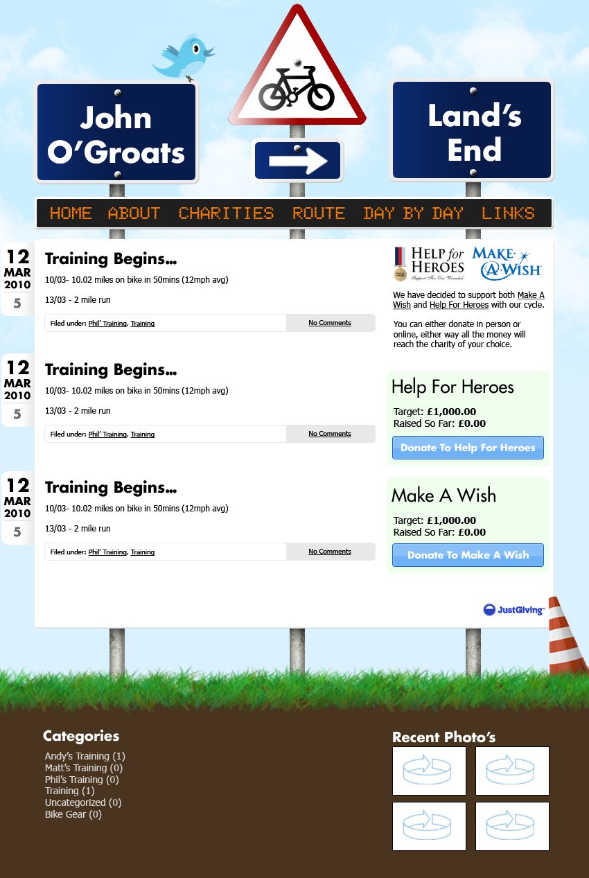
I am still getting it after emptying the cache. It is weird because I don't normally have to worry about IE8 even more weird is that it works in IE7. The error occurs in the navigation as per image attached

-
If you have been reading the web review area of the site you might remember this site. I am making my first wordpress site and I am just mocking up the html template. As per usual it works in chrome ff but not in IE8 (IE7 great just not IE8). It seems to throw up a double padding error on the navigation :s can anyone see why, I have been playing with it for over an hour and I cannot find a problem with it! I dont really want to do a special -ve padding for IE8 only but if thats the only way. Also when I did think I fixed it in IE8 (by removing #nav height) it starts to replicate the bg inside the ul :s The website in question As I say it is fine in chrome just IE8 Im having a prob with! Anyone else had this problem? Hope this makes sense, thanks in advance for your help
-
nice design overall. Would look better if the bg gradient at the top went all the way to black instead of ending abruptly. Also after using it, it would be good if your buttons went concave or had some recognition of mouse over (not mouseover js but you know what I mean). Also a selected tab would look good so you can see what page you are on.
-
thanks bud, I have been looking at the footer, I was thinking of drawing in some worms or a mole or something. I thought about a powder look or something, I just need to make sure the soil doesn't overload the content!
-
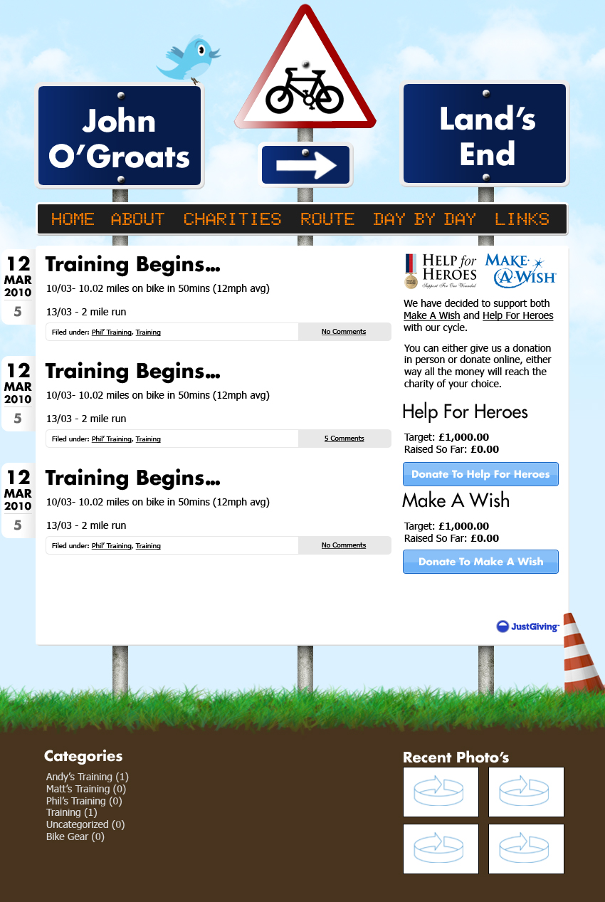
I have updated the design a little, trying to add in the spacing, smaller headings, more white space between posts and sidebar and below posts, flipped the bike, put a background colour round some of the sidebar, reduced text sizes in the sidebar and main content! Would like to keep the size of help for heroes and make a wish the same as that's main point of website.
-
Cheers for all the input. I realise it doesn't have a a logo but its for a charity cycle, so basically we are cycling from john O'groats to lands end. I didn't really think we would need a logo as it is a one off event. I will try and increase the spacing, was actually thinking of increasing the width by 100px in the main body, but then I think the top signs would look a bit strange. I think like most people have said it needs a little more white space to give more breathing space, I have also taken onboard the point about the font size in the sidebar I think i will reduce it. I was looking at the bike after I uploaded it and I think you have all confirmed what I think and will flip it so doesn't look like Im cycling backwards. Thanks for the positive feedback though and it has all been really constructive.
-
I like your graphic looks cool, I was told about futura LT on here which is a really nice font smooth round and crisp. Also try putting your graphic on the right and have the logo draw your eye across. Something a little less spaced between the lines may look better also.
-
Hey everyone, would really appreciate your feedback on my first wordpress theme. It is a custom theme meant for a new website I am developing for a charity cycle from John O'Groats to Lands End next year with my brothers. Any tips or ideas to make this better would be much appreciated. Also if you havent guessed when opening the design is meant to look like a roadsign stuck in the ground. I am pretty chuffed with the layout at present but thought I would run it by you to get your thoughts. Forgot to mention, I am having issues thinking of ways to style the sidebar was told by a friend it looks a little ad-wordsy if you know what I mean. Thanks in advance PS. the footer will be filled properly when it is launched

-
There are a few problems, some of which are: when do you start the timer? when the page finishes loading or when the server finishes sending the page? or is it when the first area of the site is visible? what connection speed should be used? it needs to be the same for each participant that sort of thing
-
I don't have enough time unfortunately I suggested it and was told to complete all of it would be too tall an order including the current project. My project actually looks at phishing websites and I am testing user perceptions of design elements on a page. I am going to be showing participants popular websites (time limited which is where the research comes in), they then have to decide if they thought think the site was real or fake. I would like to say 3 seconds, but unfortunately its academic so I cant just pull a number out of thin air ha ha. It is a good idea to do my own but I am pretty sure it has been done many times before so there should be data out there somewhere I just cannot find it!
-
cheers bud this is the exact sort of thing I need lots of! If anyone else knows anymore let me know, I need as much information to back up these reason for the timings in my dissertation as possible.
-
Hi everyone I am doing my honours dissertation project and need to find reliably sourced data as to how long a user spends making an evaluation of a website. I am looking for the time a user spends looking before deciding a website is fake/real/rubbish/not what they want. I have heard everything from 0.5 secs to 5 secs but need data to show where along this sliding scale is most reliable. So if anyone knows of any relevant research or has read somewhere about this I would be chuffed if you could point me the right way. I have tried google but its a nightmare. Also I hope this is in the right section was having probs placing it!
-
Nothing ever is!!!