rhfmedia
Members
-
Joined
-
Last visited
-
-
-
Thanks! It's a fantastic machine. For the specs, It was surprisingly one of the cheaper options out there at around $1,100. So not bad at all! Ever since I've switched from macs, it's been quite a challenge to find a pc brand that I like, and I can honestly say that lenovo is my favorite so far. You've got a decent setup yourself there! That imac with those kind of specs must have cost quite a bit back in 2010. Very cool! I assume you've added some options like the SSD and what not as upgrades recently? Nice! Got any pics of your setup?
-
No problem, glad I could help! Feel free to let me know if you have any other questions. Good luck!
-
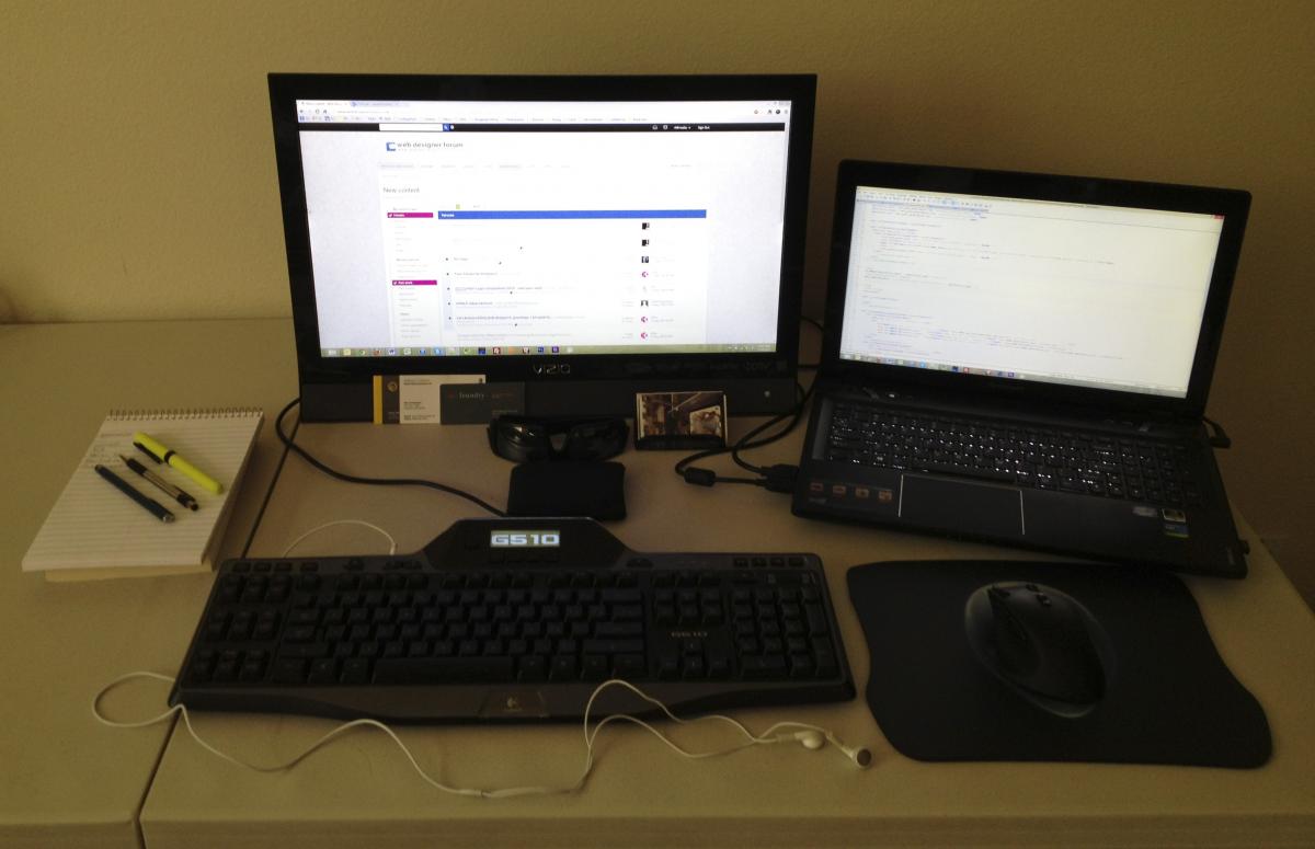
Alright, so I thought it would be interesting to see what other people's work space setups look like along with what specs your running on, what kind of editors you use etc. Always neat to see what kind of creative setups are out there! To start, I'll post my current setup: Laptop: Lenovo Ideapad Y580 Specs: i7-3630QM, GTX660M, 15.6" 1080p HD, 8GB RAM, 120GB SSD, 1TB HDD Keyboard: Logitech G510 Backlit Mouse: Logitech G700 Wiresless/Wired Primary Programs/Editors: Photoshop CS6, Adobe Premier Elements 10, Notepad++, FileZilla Nothing spectacular, but gets the job done! So, what does your current setup look like? Please feel free to post and share it below. Would love to check it out!
-
Awesome, totally makes sense to me! I really like how simple and clean it is! Has a very professional feel to it as well. And yes, maybe try either a lighter red or maybe a darker greenish blue for the nav hover.
-
It should already be centered if you use Pam's code. As long as you set your wrapper to margin: 0px auto; you should be good to go.
-
 rhfmedia reacted to a post in a topic:
What CSS code do I need to create this layout using div tags?
rhfmedia reacted to a post in a topic:
What CSS code do I need to create this layout using div tags?
-
-
All great points Pam! Really like the idea to include that mobile responsive mockup. That clear both is definitely important as well. Be sure to put her code to good use!
-
Honestly, when I first started using Photoshop I found that the best way to learn it was to just jump right in and start playing around with it. Open up a photo, edit it, clip it, add some text, etc. No better teacher than hands on experience! That said, I've also found PSD Tuts to be a helpful resource for Photoshop tutorials/articles. You can find it here: http://psd.tutsplus.com/ Oh, and here's a list of 50 beginner tutorials to get you started: http://psd.tutsplus.com/articles/web/50-great-photoshop-tutorials-for-clever-beginners/ Enjoy and have fun!
-
Great thread! That's awesome you're already able to use it as a part time gig! I am currently working part time on my own as a freelancer, and have been for a few years now. I hope to be able to go full time with it someday if I get the chance to, but if that doesn't happen, I definitely plan on staying involved with it by helping other people in one way or another.
-
All you should need to do in order to have everything stack up nicely is place all of your divs into one main div (in this case I'll call it "wrapper"). As for positioning the images and text divs, you simply float each accordingly to where you want them to be. See the code below: <style> #wrapper { margin 0px; padding: 0px; } #header { width: 1000px; height: auto; } #menu { width: 1000px; height: auto; } #you-are-here { width: 1000px; height: auto; } #text { float: left; width: 800px; height: auto; } #images { float: right; width: 200px; height: auto; } #footer { width: 1000px; height: auto; } </style> <div id="wrapper"> <div id="header"></div> <div id="menu"></div> <div id="you-are-here"></div> <div id="text"></div> <div id="images"></div> <div id="footer"></div> </div> <!-- End Wrapper --> Hope that answers your question. Feel free to let me know if it doesn't make sense.
-
Looks good! Has the makings of a very nice design. All that's really left as far as main page elements go would be a decent nav and footer. Keep it up!
-
rhfmedia replied to Precise Estimating Ltd's topic in SEO (Search Engine Optimisation) & Search EnginesDepends on the website or service, but for the most part I'd say it couldn't hurt to have it in a spot that's accessible from any page on the site such as the footer or a side bar. Sort of like http://www.inc.com/ and http://www.engadget.com/
-
Can never go wrong with WordPress in my opinion, but here are a couple of lighter weight options that I've found useful in the past that you may like: http://www.surrealcms.com/ http://www.cushycms.com/en Also, I've found this list by line25 to be quite helpful as well: http://line25.com/articles/which-hosted-cms-website-builder-is-right-for-you Hope that helps some!
-
Really all depends on what you are planning on using it for.. If it's for design/developing than I like the pjwdev. Also, pjwebdev has a nice ring to it and seems a little more descriptive.
-
It's all good! To be honest, I am not a jquery expert by any means, but from the looks of it, it seems like it's as easy as typing out each of the coordinates of the spots on the image that you want to be clickable and allowing the script to do the rest. Like I said though, I don't have too much experience with jquery so if anyone has a better explanation, feel free to correct me if I'm wrong, Anyway, from looking at the source, here's what a couple of highlight-able sections on the map look like: <img class="map" src="demo_usa.png" width="960" height="593" usemap="#usa"> <map name="usa"> <area href="#" title="HI" shape="poly" coords="225,521, 227,518, 229,517, 229,518, 227,521, 225,521"> <snip> <area href="#" title="AK" shape="poly" coords="41,486, 43,491, 43,492, 40,491, 39,488, 37,486, 35,486, 34,484, 36,481, 37,484, 39,485, 41,486"> <snip> <area href="#" title="FL" shape="poly" coords="742,578, 744,577, 746,577, 747,575, 749,573, 750,574, 752,574, 752,575, 749,576, 745,577, 743,579, 742,578"> </map> Also, be sure to take a look at the documentation for it found here: http://davidlynch.org/projects/maphilight/docs/ That should give you a good idea of how to implement and how to use it with different options. It also provides you with several other demos as well. Again, I'm sure this is just one of many solutions that are out there for your particular scenario, but I hope this this is able to help accomplish what you need it for.