jame5payne
Members
-
Joined
-
Last visited
-
Thanks sittinperty!
-
Okay, thanks for the advice Jane and Sash
-
Thanks sash! Can I use their content which is on the site at present or is that a no go too!?
-
Hi all! I'm looking for content to go into my portfolio so was thinking of re-designing a few local and bigger company sites. I've seen a few other people do this and was wondering if I needed to get permission from the company/person? I've tried to google the question but don't seem to have much luck there. Thanks
-
-
Good morning all, I was hoping for a bit of advice regarding my first responsive image gallery I'm coding at the moment. The problem I'm having is when I slowly resize the browser window I get some strange movement from my <li>'s. I've uploaded the site for you to take a closer look, http://sleepylabs.co.uk/vehicles.html From 1024 pixels up there are 3 vehicles on the first line, 2 on the second and 3 on the last. Then if I reduce the browser window to 1023 pixels I then get 3 vehicles on the first line, 3 on the next and 2 on the last (which is what I want), any ideas??? Here's my HTML . . . <ul id="gallery" class="clear"> <li> <a href="millenium.html"> <img src="images/millenium1.jpg" alt="Millenium stretch limousine"> <p>Millenium</p> </a> </li> <li> <a href="facelift.html"> <img src="images/facelift1.jpg" alt="Facelift stretch limousine"> <p>Facelift</p> </a> </li> <li> <a href="tuxedo.html"> <img src="images/tuxedo1.jpg" alt="Tuxedo stretch limousine"> <p>Tuxedo</p> </a> </li> <li> <a href="phantom.html"> <img src="images/phantom1.jpg" alt="Rolls Royce Phantom"> <p>Phantom</p> </a> </li> <li> <a href="flyingspur.html"> <img src="images/flying-spur1.jpg" alt="Bentley Flyng Spur"> <p>Phantom</p> </a> </li> <li> <a href="8seater.html"> <img src="images/mb_8seat1.jpg" alt="8 seater transit"> <p>8 seater</p> </a> </li> <li> <a href="8seatervip.html"> <img src="images/mb_8seatvip1.jpg" alt="8 seater V.I.P mini bus"> <p>8 seater V.I.P</p> </a> </li> <li> <a href="16seater.html"> <img src="images/mb_16seat1.jpg" alt="16 seater mini bus"> <p>16 seater</p> </a> </li> </ul> and here's my CSS . . . #gallery ul, #vehicle ul { list-style: none; padding: 0; margin: 0; } #gallery li { float: left; width: 45%; margin: 2.5%; } ul#gallery a { text-decoration: none; } ul#gallery li a p { margin: 0; } ul#gallery a img { max-width: 100%; display: block; } Look forward to your comments as this has been a bit of a head scratcher Thanks
-
I had set the footer to absolute and body and html are already set to 100% but the footer was still not quite touching the bottom of the page (you could see the body colour below the footer). I've just done what you said for now, I gave my main element a min-height and also made my footer a little higher which seems to have done the trick (looking on my 23" screen). This just seems to me more like a 'bodge' rather than a fix. I mean, if we should be looking at responsive design these days we never know what device/size screen our sites are being viewed on therefore the min-height I set will obviously not work on any screens bigger than a 23"? Thanks for your help though Rob, definitely helped with my headache. James
-
Note taken, thanks rob
-
But I don't want the footer fixed to the bottom of the browser window, I want it fixed to the bottom of the page?
-
Okay so I've changed my CSS to the following . . . (kinda following from this example http://www.cssstickyfooter.com/) @media screen and (min-width: 1024px) { #bar-wrap, #header-wrap, #footer-wrap, #main-wrap, #section-wrap { max-width: 960px; } main { padding-bottom: 150px; } footer { position: absolute; bottom: 0; width: 100%; height: 100px; margin-top: -150px; } footer ul { margin: 0 auto; text-align: center; } footer ul li { display: inline-block; margin-right: 2.0833333%; /* target(20)/context(960)=total(2.0833333) */ padding: 4px; } #services li { width: 21%; /*total width-padding=100-16=84/4=21*/ } #services li:nth-child(3n) { clear: none; } } but, it still doesn't seem to be sitting at the very bottom? Just to clarify, my structure is . . . <body> <header> <div id="bar"> <div id="bar-wrap" class="clear"> </div> </div> <div id="header-wrap" class="clear"> <div id="logo"> </div> <nav> <ul> <li></li> <li></li> <li></li> </ul> </nav> </div> </header> <section> <div id="section-wrap"> </div> </section> <main class> <div id="main-wrap"> </div> </main> <footer> <div id="footer-wrap"> <ul> <li></li> <li></li> <li></li> <li></li> <li></li> <li></li> <li></li> <li></li> </ul> <div id="copy"> </div> </div> </footer> </body> and I've uploaded what I'm working on at http://www.sleepylabs.co.uk just to make it easier for you to see what's happening (Note - I'm currently looking at this on a 23" monitor) I'm obviously balls-ing something up so any pointers would be brilliant guys and girls. Thanks James
-
Hey all, hope someone can help, having a little trouble keeping my footer at the bottom of the page. Have read numerous fixes for this but none seem to be helping. I need the footer to stay at the bottom of the page, regardless of how much content there is on the page. Can anyone point me towards a decent fix? Here's my code if interested . . . <!DOCTYPE HTML> <html> <head> <meta http-equiv="Content-Type" content="text/html; charset=UTF-8"> <title></title> <link href='http://fonts.googleapis.com/css?family=Open+Sans:400italic,700,300,400' rel='stylesheet' type='text/css'> <link rel="stylesheet" href="css/reset.css" type="text/css"> <link rel="stylesheet" href="css/main.css" type="text/css"> </head> <body> <header> <div id="bar"> <div id="bar-wrap" class="clear"><p id="quote-info">Get a quote now<a href="tel:012345678910">01234 567 8910</a></p></div> </div> <div id="header-wrap" class="clear"> <a href="index.html" id="brand">JJs <span id="limos">Limo Hire</span></a> <nav id="header-nav"> <ul> <li><a href="about.html">About Us</a></li> <li><a href="cars.html">Our Cars</a></li> <li><a href="contact.html">Contact</a></li> </ul> </nav> </div> </header> <section> <div id="section-wrap"> <div id="tagline"> <h1>We get you there in style</h1> <p>We've been providing Essex with fine looking, chauffeur driven vehicles since 2006</p> <a href="#" class="button">More about us »</a> </div> </div> </section> <main> <div id="main-wrap"> <div class="services clear"> <h1>Stand out from the crowd</h1> <ul> <li> <img src="images/balloons.png" width="80" height="80" title="" alt=""/> <h2>Availability</h2> <p>Operational 24 hours a day, 7 days a week, 364 days of the year.</p> </li> <li> <img src="images/balloons.png" width="80" height="80" title="" alt=""/> <h2>Areas</h2> <p>Every square inch of Essex covered and parts of London too.</p> </li> <li> <img src="images/balloons.png" width="80" height="80" title="" alt=""/> <h2>Events</h2> <p>Any occasion catered for. Prom? Wedding? You name it, we do it.</p> </li> <li> <img src="images/balloons.png" width="80" height="80" title="" alt=""/> <h2>Prices</h2> <p>All quotes we provide are tailor made to suit your needs.</p> </li> </ul> </div> <a href="#" class="button">See our cars »</a> </div> </main> <footer> <div id="footer-wrap"> <nav> <ul id="footer-nav"> <li><a href="index.html">Home</a></li> <li><a href="about.html">About Us</a></li> <li><a href="vehicles.html">Our Vehicles</a></li> <li><a href="faq.html">FAQ</a></li> <li><a href="terms.html">Terms</a></li> <li><a href="feedback.html">Feedback</a></li> <li><a href="sitemap.html">Sitemap</a></li> <li><a href="contact.html">Contact</a></li> <li><a href="#" class="social">Facebook</a></li> <li><a href="#" class="social">Twitter</a></li> </ul> </nav> <p id="copy">JJs Limo Hire © | 2006 – 2014</p> </div> </footer> </body> </html> body { font-family: 'Open Sans', sans-serif; background-color: #3CF; min-height: 100%; } p { font-weight: 300; font-size: 18px; } h1 { font-size: 34px; } h2 { font-size: 28px; } h3 { font-size: 24px; } #bar-wrap, #header-wrap, #section-wrap, #main-wrap, #footer-wrap { max-width: 1200px; margin: 0 auto; } #bar-wrap { color: #fbfbfb; } #about-wrap { max-width: 600px; margin: 0 auto; } .highlight { font-weight: bold; } #bar { width: 100%; background-color: #333; } a[href^="tel"] { color: #45aab8; margin-left: 8px; } header { width: 100%; /*height: 140px;*/ background-color: #fbfbfb; } #quote-info { float: right; padding: 10px 3px; } #brand { font-size: 38px; font-weight: 700; float: left; color: #bca95b; /*margin-top: 22px;*/ padding: 20px 0; } #limos { color: #333; font-weight: 300; letter-spacing: -1px; } #header-nav { float: right; padding: 20px; } #header-nav li { display:inline; font-size: 18px; letter-spacing: -0.50px; margin-right: 40px; } #header-nav li:last-child { margin-right: 0; } #header-nav a { color: #333; } section { width: 100%; background: #666 url(../images/bg.jpg) no-repeat center; background-size: cover; height: 100%; } #tagline { height: 100%; } #tagline h1 { font-size: 60px; text-align: center; color: #fbfbfb; margin: 0; padding: 80px 0 40px; } #tagline p { font-size: 18px; text-align: center; color: #fbfbfb; letter-spacing: 0.5px; padding-bottom: 60px; } main { width: 100%; background-color: #fbfbfb; padding-bottom:30px; } #main-wrap h1 { margin: 0; padding: 30px 0; text-align: center; } .button { background-color: #bca95b; background-image: -webkit-linear-gradient(top, #bca95b, #9c8d50); background-image: -moz-linear-gradient(top, #bca95b, #9c8d50); background-image: -ms-linear-gradient(top, #bca95b, #9c8d50); background-image: -o-linear-gradient(top, #bca95b, #9c8d50); background-image: linear-gradient(to bottom, #bca95b, #9c8d50); border-radius: 6px; -webkit-border-radius: 6; -moz-border-radius: 6; display: block; width: 120px; color: #fbfbfb; font-size: 15px; font-weight: 200; padding: 14px 11px; text-decoration: none; margin: 90px auto 50px; } #main-wrap a.button { margin: 40px auto 20px; } a.button { text-align: center; } .services ul { list-style-type: none; padding: 0; margin: 0 auto; max-width: 1200px; } .services li { float: left; width: 270px; margin: 20px 40px 40px 0; text-align: center; /*background-color: #96C;*/ } .services li:last-child { margin-right: 0; } .services h2 { margin-bottom: 3px; } .services p { max-width: 200px; margin: 0 auto; } /* ============================== footer ============================== */ footer { background-color: #333; width: 100%; } #footer-nav { font-weight: 300; font-size: 14px; text-align: center; margin-top: 0; padding: 20px 0; } #footer-nav li { display: inline; margin-right: 30px; } #footer-nav li:last-child { margin-right: 0; } #footer-nav li a.social { color: #45aab8; } #footer-nav a { color: #fbfbfb; } #copy { font-size: 10px; text-align: center; color: #fbfbfb; padding-bottom: 3px; } /* ============================== clear floats ============================== */ .clear:before, .clear:after { content: " "; display: table; } .clear:after { clear: both; } .clear { zoom: 1; } Thanks in advance, James
-
-
-
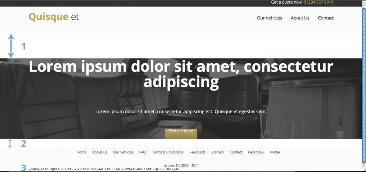
Hi all, hoping someone can help me out and point me in the right direction please, it seems I have hit a wall. Apologies in advance for the fairly long post and if i haven't made sense or you need more info please let me know. My issues . . . 1 & 2. If you look at the upload (img1) you will see a gap between the header and main elements & main and section elements? 3. My section element is being shown underneath the footer? Could this be anything to do with floats? If so then I was under the impression that when you float an element you need to clear that float which is done by applying a 'clear fix' rule to it's parent element? (Please correct me if I'm wrong). Or could this be anything to do with the selector and value overflow: hidden; in the body element? Or could this be something to do with the background image in the main element . . . or . . . something else? I've uploaded a very rough image to show you what I'm actually trying to achieve. (img 2) Thanks in advance for any comments/help. HTML code . . . <!DOCTYPE HTML> <html> <head> <meta http-equiv="Content-Type" content="text/html; charset=UTF-8"> <title></title> <link href='http://fonts.googleapis.com/css?family=Open+Sans:400italic,700,300,400' rel='stylesheet' type='text/css'> <link rel="stylesheet" href="css/reset.css" type="text/css"> <link rel="stylesheet" href="css/main.css" type="text/css"> </head> <body> <header> <div id="bar"> <div id="bar-wrap" class="clear"><p id="quote-info">Get a quote now<a href="tel:012345678910">01234 567 8910</a></p></div> </div> <div id="header-wrap" class="clear"> <a href="#" id="brand">Quisque <span id="limos">et</span></a> <nav id="header-nav"> <ul> <li><a href="#">Our Vehicles</a></li> <li><a href="#">About Us</a></li> <li><a href="#">Contact</a></li> </ul> </nav> </div> </header> <main> <div id="main-wrap"> <p id="intro">Lorem ipsum dolor sit amet, consectetur adipiscing</p> <p id="desc">Lorem ipsum dolor sit amet, consectetur adipiscing elit. Quisque et egestas sem.</p> <a href="#" class="btn">Find out more</a> </div> </main> <section> <div id="section-wrap"> <h1>Lorem ipsum dolor sit amet</h1> <div id="service-1" class="service"> <h2>Lorem Ipsum</h2> <p>Lorem ipsum dolor sit amet, consectetur adipiscing elit.<br>Quisque et egestas sem. Vivamus et quam tincidunt, vestibulum sem quis, tristique.</p> </div> </div> </section> <footer> <div id="footer-wrap"> <nav> <ul id="footer-nav"> <li><a href="#">Home</a></li> <li><a href="#">About Us</a></li> <li><a href="#">Our Vehicles</a></li> <li><a href="#">FAQ</a></li> <li><a href="#">Terms & Conditions</a></li> <li><a href="#">Feedback</a></li> <li><a href="#">Sitemap</a></li> <li><a href="#">Contact</a></li> <li><a href="#">Facebook</a></li> <li><a href="#">Twitter</a></li> </ul> </nav> <p id="copy">sit amet © | 2006 – 2014</p> </div> </footer> </body> </html> CSS code . . . html, body { font-family: 'Open Sans', sans-serif; height: 100%; overflow: auto; position: relative; } p { font-family: 'Open Sans', sans-serif; font-weight: 300; } #bar-wrap, #header-wrap, #main-wrap, #section-wrap, #footer-wrap { max-width: 1200px; margin: 0 auto; max-height: 100%; } #bar { width: 100%; background-color: #333; } #bar-wrap { height: 100%; color: #fbfbfb; } a[href^="tel"] { color: #bca95b; margin-left: 8px; } header { width: 100%; height: 140px; background-color: #fbfbfb; } #quote-info { float: right; margin: 10px 0; } #brand { font-size: 38px; font-weight: 700; float: left; margin-top: 20px; color: #bca95b; } #limos { color: #333; font-weight: 300; letter-spacing: -1px; } #header-nav { margin-top: 26px; float: right; } #header-nav ul { margin-top: 9px; } #header-nav li { display:inline; font-size: 18px; padding: 0 30px 0 0; letter-spacing: -0.50px; } #header-nav li:last-child { padding: 0; } #header-nav a { color: #333; } main { width: 100%; background: #666 url(../images/bg.jpg) no-repeat center; background-size: cover; } #intro { font-size: 60px; font-weight:700; letter-spacing: -0.5px; color: #fbfbfb; margin: 100px 0 80px; text-align: center; } #desc { font-size: 18px; font-weight: 400; color: #fbfbfb; text-align: center; } section { width: 100%; background-color: #fbfbfb; } #cta { margin: 0 auto; } .btn { width: 125px; height: 40px; background: #bca95b; background-image: -webkit-linear-gradient(top, #bca95b, #91834c); background-image: -moz-linear-gradient(top, #bca95b, #91834c); background-image: -ms-linear-gradient(top, #bca95b, #91834c); background-image: -o-linear-gradient(top, #bca95b, #91834c); background-image: linear-gradient(to bottom, #bca95b, #91834c); -webkit-border-radius: 6; -moz-border-radius: 6; border-radius: 6px; font-family: 'Open Sans', sans-serif; color: #fbfbfb; font-size: 15px; font-weight: 300; text-align: center; text-decoration: none; display: block; margin: 60px auto; } footer { background-color: #fbfbfb; position: absolute; bottom: 0; width: 100%; height: 80px; } #footer-nav { font-weight: 300; font-size: 14px; margin-top: 10px; text-align: center; } #footer-nav li { display: inline; margin-right: 20px; } #footer-nav a { color: #333; } #copy { font-size: 12px; text-align: center; margin-top: 40px; } .clear:before, .clear:after { content: " "; display: table; } .clear:after { clear: both; } .clear { zoom: 1; }


-
Afternoon all, a fairly straight forward question. I have a site that I am currently building, pretty straight forward, 9 pages, contact form, image gallery blah blah. It has to be repsonsive so first question . . . In this scenario would you code the site and use media queries OR would you use a framework, such as Foundation, Bootstrap etc? Second question . . . I know everyone is different but what do you personally find the best approach when coding for a responsive site? Do you code a section of a page then find it's break points and get it looking right responsively or do you code a page then find it's break points and get it looking right responsively? Or something else perhaps?
-