jame5payne
Members
-
Joined
-
Last visited
Everything posted by jame5payne
-
Thanks sittinperty!
-
Okay, thanks for the advice Jane and Sash
-
Thanks sash! Can I use their content which is on the site at present or is that a no go too!?
-
Hi all! I'm looking for content to go into my portfolio so was thinking of re-designing a few local and bigger company sites. I've seen a few other people do this and was wondering if I needed to get permission from the company/person? I've tried to google the question but don't seem to have much luck there. Thanks
-
-
Good morning all, I was hoping for a bit of advice regarding my first responsive image gallery I'm coding at the moment. The problem I'm having is when I slowly resize the browser window I get some strange movement from my <li>'s. I've uploaded the site for you to take a closer look, http://sleepylabs.co.uk/vehicles.html From 1024 pixels up there are 3 vehicles on the first line, 2 on the second and 3 on the last. Then if I reduce the browser window to 1023 pixels I then get 3 vehicles on the first line, 3 on the next and 2 on the last (which is what I want), any ideas??? Here's my HTML . . . <ul id="gallery" class="clear"> <li> <a href="millenium.html"> <img src="images/millenium1.jpg" alt="Millenium stretch limousine"> <p>Millenium</p> </a> </li> <li> <a href="facelift.html"> <img src="images/facelift1.jpg" alt="Facelift stretch limousine"> <p>Facelift</p> </a> </li> <li> <a href="tuxedo.html"> <img src="images/tuxedo1.jpg" alt="Tuxedo stretch limousine"> <p>Tuxedo</p> </a> </li> <li> <a href="phantom.html"> <img src="images/phantom1.jpg" alt="Rolls Royce Phantom"> <p>Phantom</p> </a> </li> <li> <a href="flyingspur.html"> <img src="images/flying-spur1.jpg" alt="Bentley Flyng Spur"> <p>Phantom</p> </a> </li> <li> <a href="8seater.html"> <img src="images/mb_8seat1.jpg" alt="8 seater transit"> <p>8 seater</p> </a> </li> <li> <a href="8seatervip.html"> <img src="images/mb_8seatvip1.jpg" alt="8 seater V.I.P mini bus"> <p>8 seater V.I.P</p> </a> </li> <li> <a href="16seater.html"> <img src="images/mb_16seat1.jpg" alt="16 seater mini bus"> <p>16 seater</p> </a> </li> </ul> and here's my CSS . . . #gallery ul, #vehicle ul { list-style: none; padding: 0; margin: 0; } #gallery li { float: left; width: 45%; margin: 2.5%; } ul#gallery a { text-decoration: none; } ul#gallery li a p { margin: 0; } ul#gallery a img { max-width: 100%; display: block; } Look forward to your comments as this has been a bit of a head scratcher Thanks
-
I had set the footer to absolute and body and html are already set to 100% but the footer was still not quite touching the bottom of the page (you could see the body colour below the footer). I've just done what you said for now, I gave my main element a min-height and also made my footer a little higher which seems to have done the trick (looking on my 23" screen). This just seems to me more like a 'bodge' rather than a fix. I mean, if we should be looking at responsive design these days we never know what device/size screen our sites are being viewed on therefore the min-height I set will obviously not work on any screens bigger than a 23"? Thanks for your help though Rob, definitely helped with my headache. James
-
Note taken, thanks rob
-
But I don't want the footer fixed to the bottom of the browser window, I want it fixed to the bottom of the page?
-
Okay so I've changed my CSS to the following . . . (kinda following from this example http://www.cssstickyfooter.com/) @media screen and (min-width: 1024px) { #bar-wrap, #header-wrap, #footer-wrap, #main-wrap, #section-wrap { max-width: 960px; } main { padding-bottom: 150px; } footer { position: absolute; bottom: 0; width: 100%; height: 100px; margin-top: -150px; } footer ul { margin: 0 auto; text-align: center; } footer ul li { display: inline-block; margin-right: 2.0833333%; /* target(20)/context(960)=total(2.0833333) */ padding: 4px; } #services li { width: 21%; /*total width-padding=100-16=84/4=21*/ } #services li:nth-child(3n) { clear: none; } } but, it still doesn't seem to be sitting at the very bottom? Just to clarify, my structure is . . . <body> <header> <div id="bar"> <div id="bar-wrap" class="clear"> </div> </div> <div id="header-wrap" class="clear"> <div id="logo"> </div> <nav> <ul> <li></li> <li></li> <li></li> </ul> </nav> </div> </header> <section> <div id="section-wrap"> </div> </section> <main class> <div id="main-wrap"> </div> </main> <footer> <div id="footer-wrap"> <ul> <li></li> <li></li> <li></li> <li></li> <li></li> <li></li> <li></li> <li></li> </ul> <div id="copy"> </div> </div> </footer> </body> and I've uploaded what I'm working on at http://www.sleepylabs.co.uk just to make it easier for you to see what's happening (Note - I'm currently looking at this on a 23" monitor) I'm obviously balls-ing something up so any pointers would be brilliant guys and girls. Thanks James
-
Hey all, hope someone can help, having a little trouble keeping my footer at the bottom of the page. Have read numerous fixes for this but none seem to be helping. I need the footer to stay at the bottom of the page, regardless of how much content there is on the page. Can anyone point me towards a decent fix? Here's my code if interested . . . <!DOCTYPE HTML> <html> <head> <meta http-equiv="Content-Type" content="text/html; charset=UTF-8"> <title></title> <link href='http://fonts.googleapis.com/css?family=Open+Sans:400italic,700,300,400' rel='stylesheet' type='text/css'> <link rel="stylesheet" href="css/reset.css" type="text/css"> <link rel="stylesheet" href="css/main.css" type="text/css"> </head> <body> <header> <div id="bar"> <div id="bar-wrap" class="clear"><p id="quote-info">Get a quote now<a href="tel:012345678910">01234 567 8910</a></p></div> </div> <div id="header-wrap" class="clear"> <a href="index.html" id="brand">JJs <span id="limos">Limo Hire</span></a> <nav id="header-nav"> <ul> <li><a href="about.html">About Us</a></li> <li><a href="cars.html">Our Cars</a></li> <li><a href="contact.html">Contact</a></li> </ul> </nav> </div> </header> <section> <div id="section-wrap"> <div id="tagline"> <h1>We get you there in style</h1> <p>We've been providing Essex with fine looking, chauffeur driven vehicles since 2006</p> <a href="#" class="button">More about us »</a> </div> </div> </section> <main> <div id="main-wrap"> <div class="services clear"> <h1>Stand out from the crowd</h1> <ul> <li> <img src="images/balloons.png" width="80" height="80" title="" alt=""/> <h2>Availability</h2> <p>Operational 24 hours a day, 7 days a week, 364 days of the year.</p> </li> <li> <img src="images/balloons.png" width="80" height="80" title="" alt=""/> <h2>Areas</h2> <p>Every square inch of Essex covered and parts of London too.</p> </li> <li> <img src="images/balloons.png" width="80" height="80" title="" alt=""/> <h2>Events</h2> <p>Any occasion catered for. Prom? Wedding? You name it, we do it.</p> </li> <li> <img src="images/balloons.png" width="80" height="80" title="" alt=""/> <h2>Prices</h2> <p>All quotes we provide are tailor made to suit your needs.</p> </li> </ul> </div> <a href="#" class="button">See our cars »</a> </div> </main> <footer> <div id="footer-wrap"> <nav> <ul id="footer-nav"> <li><a href="index.html">Home</a></li> <li><a href="about.html">About Us</a></li> <li><a href="vehicles.html">Our Vehicles</a></li> <li><a href="faq.html">FAQ</a></li> <li><a href="terms.html">Terms</a></li> <li><a href="feedback.html">Feedback</a></li> <li><a href="sitemap.html">Sitemap</a></li> <li><a href="contact.html">Contact</a></li> <li><a href="#" class="social">Facebook</a></li> <li><a href="#" class="social">Twitter</a></li> </ul> </nav> <p id="copy">JJs Limo Hire © | 2006 – 2014</p> </div> </footer> </body> </html> body { font-family: 'Open Sans', sans-serif; background-color: #3CF; min-height: 100%; } p { font-weight: 300; font-size: 18px; } h1 { font-size: 34px; } h2 { font-size: 28px; } h3 { font-size: 24px; } #bar-wrap, #header-wrap, #section-wrap, #main-wrap, #footer-wrap { max-width: 1200px; margin: 0 auto; } #bar-wrap { color: #fbfbfb; } #about-wrap { max-width: 600px; margin: 0 auto; } .highlight { font-weight: bold; } #bar { width: 100%; background-color: #333; } a[href^="tel"] { color: #45aab8; margin-left: 8px; } header { width: 100%; /*height: 140px;*/ background-color: #fbfbfb; } #quote-info { float: right; padding: 10px 3px; } #brand { font-size: 38px; font-weight: 700; float: left; color: #bca95b; /*margin-top: 22px;*/ padding: 20px 0; } #limos { color: #333; font-weight: 300; letter-spacing: -1px; } #header-nav { float: right; padding: 20px; } #header-nav li { display:inline; font-size: 18px; letter-spacing: -0.50px; margin-right: 40px; } #header-nav li:last-child { margin-right: 0; } #header-nav a { color: #333; } section { width: 100%; background: #666 url(../images/bg.jpg) no-repeat center; background-size: cover; height: 100%; } #tagline { height: 100%; } #tagline h1 { font-size: 60px; text-align: center; color: #fbfbfb; margin: 0; padding: 80px 0 40px; } #tagline p { font-size: 18px; text-align: center; color: #fbfbfb; letter-spacing: 0.5px; padding-bottom: 60px; } main { width: 100%; background-color: #fbfbfb; padding-bottom:30px; } #main-wrap h1 { margin: 0; padding: 30px 0; text-align: center; } .button { background-color: #bca95b; background-image: -webkit-linear-gradient(top, #bca95b, #9c8d50); background-image: -moz-linear-gradient(top, #bca95b, #9c8d50); background-image: -ms-linear-gradient(top, #bca95b, #9c8d50); background-image: -o-linear-gradient(top, #bca95b, #9c8d50); background-image: linear-gradient(to bottom, #bca95b, #9c8d50); border-radius: 6px; -webkit-border-radius: 6; -moz-border-radius: 6; display: block; width: 120px; color: #fbfbfb; font-size: 15px; font-weight: 200; padding: 14px 11px; text-decoration: none; margin: 90px auto 50px; } #main-wrap a.button { margin: 40px auto 20px; } a.button { text-align: center; } .services ul { list-style-type: none; padding: 0; margin: 0 auto; max-width: 1200px; } .services li { float: left; width: 270px; margin: 20px 40px 40px 0; text-align: center; /*background-color: #96C;*/ } .services li:last-child { margin-right: 0; } .services h2 { margin-bottom: 3px; } .services p { max-width: 200px; margin: 0 auto; } /* ============================== footer ============================== */ footer { background-color: #333; width: 100%; } #footer-nav { font-weight: 300; font-size: 14px; text-align: center; margin-top: 0; padding: 20px 0; } #footer-nav li { display: inline; margin-right: 30px; } #footer-nav li:last-child { margin-right: 0; } #footer-nav li a.social { color: #45aab8; } #footer-nav a { color: #fbfbfb; } #copy { font-size: 10px; text-align: center; color: #fbfbfb; padding-bottom: 3px; } /* ============================== clear floats ============================== */ .clear:before, .clear:after { content: " "; display: table; } .clear:after { clear: both; } .clear { zoom: 1; } Thanks in advance, James
-
-
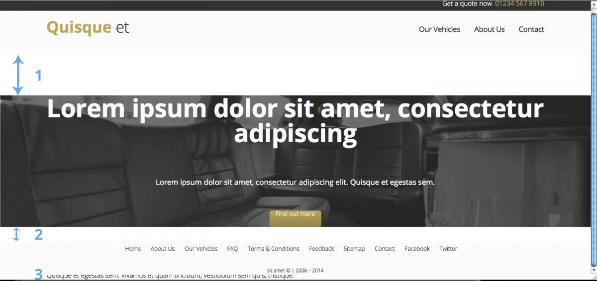
Hi all, hoping someone can help me out and point me in the right direction please, it seems I have hit a wall. Apologies in advance for the fairly long post and if i haven't made sense or you need more info please let me know. My issues . . . 1 & 2. If you look at the upload (img1) you will see a gap between the header and main elements & main and section elements? 3. My section element is being shown underneath the footer? Could this be anything to do with floats? If so then I was under the impression that when you float an element you need to clear that float which is done by applying a 'clear fix' rule to it's parent element? (Please correct me if I'm wrong). Or could this be anything to do with the selector and value overflow: hidden; in the body element? Or could this be something to do with the background image in the main element . . . or . . . something else? I've uploaded a very rough image to show you what I'm actually trying to achieve. (img 2) Thanks in advance for any comments/help. HTML code . . . <!DOCTYPE HTML> <html> <head> <meta http-equiv="Content-Type" content="text/html; charset=UTF-8"> <title></title> <link href='http://fonts.googleapis.com/css?family=Open+Sans:400italic,700,300,400' rel='stylesheet' type='text/css'> <link rel="stylesheet" href="css/reset.css" type="text/css"> <link rel="stylesheet" href="css/main.css" type="text/css"> </head> <body> <header> <div id="bar"> <div id="bar-wrap" class="clear"><p id="quote-info">Get a quote now<a href="tel:012345678910">01234 567 8910</a></p></div> </div> <div id="header-wrap" class="clear"> <a href="#" id="brand">Quisque <span id="limos">et</span></a> <nav id="header-nav"> <ul> <li><a href="#">Our Vehicles</a></li> <li><a href="#">About Us</a></li> <li><a href="#">Contact</a></li> </ul> </nav> </div> </header> <main> <div id="main-wrap"> <p id="intro">Lorem ipsum dolor sit amet, consectetur adipiscing</p> <p id="desc">Lorem ipsum dolor sit amet, consectetur adipiscing elit. Quisque et egestas sem.</p> <a href="#" class="btn">Find out more</a> </div> </main> <section> <div id="section-wrap"> <h1>Lorem ipsum dolor sit amet</h1> <div id="service-1" class="service"> <h2>Lorem Ipsum</h2> <p>Lorem ipsum dolor sit amet, consectetur adipiscing elit.<br>Quisque et egestas sem. Vivamus et quam tincidunt, vestibulum sem quis, tristique.</p> </div> </div> </section> <footer> <div id="footer-wrap"> <nav> <ul id="footer-nav"> <li><a href="#">Home</a></li> <li><a href="#">About Us</a></li> <li><a href="#">Our Vehicles</a></li> <li><a href="#">FAQ</a></li> <li><a href="#">Terms & Conditions</a></li> <li><a href="#">Feedback</a></li> <li><a href="#">Sitemap</a></li> <li><a href="#">Contact</a></li> <li><a href="#">Facebook</a></li> <li><a href="#">Twitter</a></li> </ul> </nav> <p id="copy">sit amet © | 2006 – 2014</p> </div> </footer> </body> </html> CSS code . . . html, body { font-family: 'Open Sans', sans-serif; height: 100%; overflow: auto; position: relative; } p { font-family: 'Open Sans', sans-serif; font-weight: 300; } #bar-wrap, #header-wrap, #main-wrap, #section-wrap, #footer-wrap { max-width: 1200px; margin: 0 auto; max-height: 100%; } #bar { width: 100%; background-color: #333; } #bar-wrap { height: 100%; color: #fbfbfb; } a[href^="tel"] { color: #bca95b; margin-left: 8px; } header { width: 100%; height: 140px; background-color: #fbfbfb; } #quote-info { float: right; margin: 10px 0; } #brand { font-size: 38px; font-weight: 700; float: left; margin-top: 20px; color: #bca95b; } #limos { color: #333; font-weight: 300; letter-spacing: -1px; } #header-nav { margin-top: 26px; float: right; } #header-nav ul { margin-top: 9px; } #header-nav li { display:inline; font-size: 18px; padding: 0 30px 0 0; letter-spacing: -0.50px; } #header-nav li:last-child { padding: 0; } #header-nav a { color: #333; } main { width: 100%; background: #666 url(../images/bg.jpg) no-repeat center; background-size: cover; } #intro { font-size: 60px; font-weight:700; letter-spacing: -0.5px; color: #fbfbfb; margin: 100px 0 80px; text-align: center; } #desc { font-size: 18px; font-weight: 400; color: #fbfbfb; text-align: center; } section { width: 100%; background-color: #fbfbfb; } #cta { margin: 0 auto; } .btn { width: 125px; height: 40px; background: #bca95b; background-image: -webkit-linear-gradient(top, #bca95b, #91834c); background-image: -moz-linear-gradient(top, #bca95b, #91834c); background-image: -ms-linear-gradient(top, #bca95b, #91834c); background-image: -o-linear-gradient(top, #bca95b, #91834c); background-image: linear-gradient(to bottom, #bca95b, #91834c); -webkit-border-radius: 6; -moz-border-radius: 6; border-radius: 6px; font-family: 'Open Sans', sans-serif; color: #fbfbfb; font-size: 15px; font-weight: 300; text-align: center; text-decoration: none; display: block; margin: 60px auto; } footer { background-color: #fbfbfb; position: absolute; bottom: 0; width: 100%; height: 80px; } #footer-nav { font-weight: 300; font-size: 14px; margin-top: 10px; text-align: center; } #footer-nav li { display: inline; margin-right: 20px; } #footer-nav a { color: #333; } #copy { font-size: 12px; text-align: center; margin-top: 40px; } .clear:before, .clear:after { content: " "; display: table; } .clear:after { clear: both; } .clear { zoom: 1; }


-
Afternoon all, a fairly straight forward question. I have a site that I am currently building, pretty straight forward, 9 pages, contact form, image gallery blah blah. It has to be repsonsive so first question . . . In this scenario would you code the site and use media queries OR would you use a framework, such as Foundation, Bootstrap etc? Second question . . . I know everyone is different but what do you personally find the best approach when coding for a responsive site? Do you code a section of a page then find it's break points and get it looking right responsively or do you code a page then find it's break points and get it looking right responsively? Or something else perhaps?
-
-
-
-
Good evening all, I'm looking for a bit of advice/suggestions on what to include in my CV. This may sound like a dumb question so allow me to elaborate a little further. For so long now I have wanted to work in the web industry but my current job isn't remotely similar to this, it's insurance work. Yep, I hear you, it IS duller than dish water! The role came at a time when I was desperate for work, so it was only sensible to take it. The job was initially for a 3 month period, which turned into 6, 9, 12 months and is now a permanent position, it was guaranteed money so I wasn't just going to walk. Well, it's the start of a brand new year, we all make resolutions and my one and only resolution for 2014 IS to break into the web industry. I have a plan and know what I need to do 1. Get involved with as much design and coding as possible so I can . . . 2. Build a portfolio to show potential employers which will help in . . . 3. Getting me my first shot. "So what's any of this got to do with CV advise?" Well, I want to start applying for some jobs that I've seen and yeah, it maybe a waste of time as I don't have anything to show at the moment but I will have in a month or 2. The area I'm confused about and the reason for this post is the 'Employment History' section. I'm not exactly young, I've been working for the last 14 years now and could list quite a bit of info but none of it is going to be relevant to the roles that I'll be applying for, surely employers won't be interested in 'Audio/Visual Installer' or 'Senior Team Leader' or 'Delivery Driver'? To me this would be a waste of time. So, going back to the beginning of this post . . . if you were me what would you put in the 'Employment History' section? Thoughts/advice/suggestions are all welcome and appreciated. Thanks for taking the time to read this, James
-
-
Oh god, I feel your pain, "just a bit of a perfectionist" - this has to be my BIGGEST downfall - hence why I haven't completed a single web project!!!Been quite a while since I've done any type of coding, to be honest, it's been a while since I've done ANY web stuff so forgive my dumbness! Been scratching my head for a while now, I'm having a little trouble with margin and padding in my navigation bar. I've added green vertical border lines to the links so it's easier to see (image1) but what I'm trying to achieve is something like (image2). Any advice would be great, thanks kindly. Here is my HTML . . . <header> <div id="header-container"> <img src="images/logo.png" id="logo" alt="Logo image" title="Home" /> <nav id="main-nav"> <ul> <li><a href="#">ABOUT</a></li> <li><a href="#">CARS</a></li> <li><a href="#">CONTACT</a></li> </ul> </nav> </div><!--end #header-container--> </header> And here is my CSS . . . #logo { width:264px; height:70; margin-top:10px; float:left; } #main-nav { float:right; width:310px; height:90px; } #main-nav ul { width:310px; height:90px; } #main-nav li { display:inline-block; margin:0px; } #main-nav a { color:#fff; text-decoration:none; padding:37px 20px; margin:0; display:block; border-right:#0F6 solid 1px; border-left:#0F6 solid 1px; }

 Lol, just read all the responses, definitely brightens up a dull day coming on here. Like I have mentioned before in some of my other posts I am new to web design and that's the whole reason I joined a forum...to learn from professionals out there. Once again I really do appreciate all the advice and tips that I'm given and do take it all on board. I have stripped it right back and started from scratch so I'll let you know if I'm still having problems. Thanks for the www.miltonbayer.com/font-face link, that's been lots of help in itself. Thanks again JamesIt is yeah, have it in a 'css' folderSorry Renaissance, should have read . . . @font-face { font-family: 'NobileRegular'; src: url('../fonts/nobile-webfont.eot'); src: url('../fonts/nobile-webfont.eot?#iefix') format('embedded-opentype'), url('../fonts/nobile-webfont.woff') format('woff'), url('../fonts/nobile-webfont.ttf') format('truetype'), url('../fonts/nobile-webfont.svg#NobileRegular') format('svg'); font-weight: normal; font-style: normal; } @font-face { font-family: 'NobileBold'; src: url('../fonts/nobile_bold-webfont.eot'); src: url('../fonts/nobile_bold-webfont.eot?#iefix') format('embedded-opentype'), url('../fonts/nobile_bold-webfont.woff') format('woff'), url('../fonts/nobile_bold-webfont.ttf') format('truetype'), url('../fonts/nobile_bold-webfont.svg#NobileBold') format('svg'); font-weight: normal; font-style: normal; }