emwi
Members
-
Joined
-
Last visited
Everything posted by emwi
-
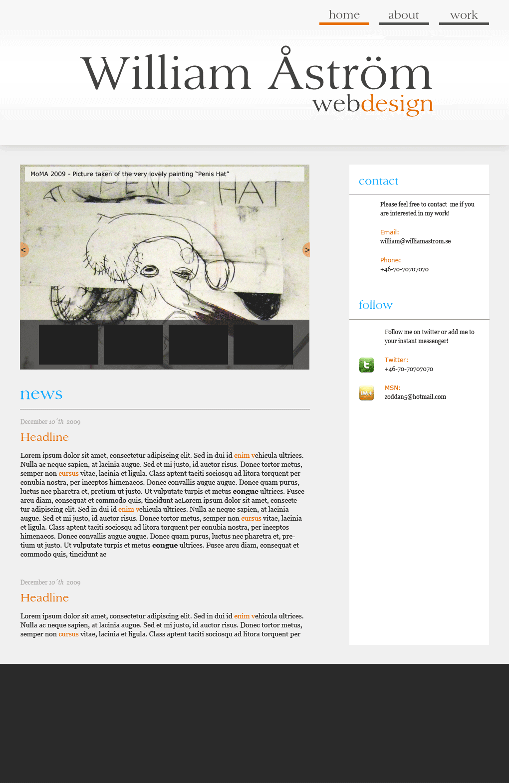
Completed a new web design for my website. Haven't had time to fill it with all content yet. And i will also have to fix the section for the portfolio. It need to look better and separated from the rest. But roughly, any suggestions? www.williamastrom.se /will
-
Tested the site on the pc with most firefox versions and it seems to work with the background... i wonder what the problem is!
-
Goodd points! What version of ff do you have? Pc or mac?
-
Thanks for great input! I am the webdesigner, so i don´t really decide regarding the team thing. But i know they will add new team members soon. Regarding that missing link back, i had missed a function in Modx regarding friendly paths. Thank you for finding that issue. Really sloppy by me to miss it. Best Regards, William Åström http://www.williamastrom.se
-
The page is www.midweststartups.com. Any ideas? Suggestions? /william

-
Thanks for a better comment:) Yeah, i dont really like the whitespace myself at the beginning. Will probably do something about it. Just don´t really know yet how to. Ill get back when ive worked something out!
-
I like the simplicity, although it feels alot like themeforest.net. I wouldnt mind if it was created for a client. But as your own website. i would like to get some other impression as soon as i land on it. Maybe work on your typo a little more?
-
Thanks for your time to evaluate my design, could you give me some pointers on how to improve it?
-
Final result at: www.williamastrom.se
-
Thank you!
-
Im kind of finished with my website: www.williamastrom.se Any thought? ideas? Hope to hear from you! /william
-
maybe i should sell it and start over
-
mmm i know.... havent decided if it sucks or not yet:)
-
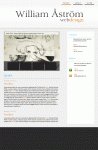
This is where i am at right now
-
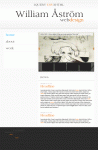
More changes!
-
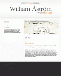
This is the latest revision:
-
Hi , thanks for the comment. Actually justifing texts in webdesign layout is a big No No. So that won´t happen.. But ive made some changes!

-
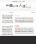
You are SO right! Seriously i don´t know what i was thinking. Must be the flue and the late hour. Or its because i have mixed emotions regarding how to place the section texts. Left or right?
-
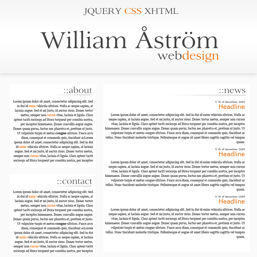
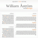
I kind of like this one. What do you think? I will later have a navbar to the top right instead of the jqeury css text. But until my portfolio is a little bigger i cant have it there yet!
-
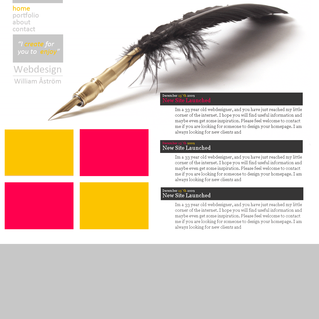
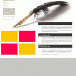
Yes i think you are right about that. I also like #2 now when ive had time to get away a little from the newest design. Too bad i also fancy the pen:) Gotta spice up # 2 somehow though and find something to the left side.
-
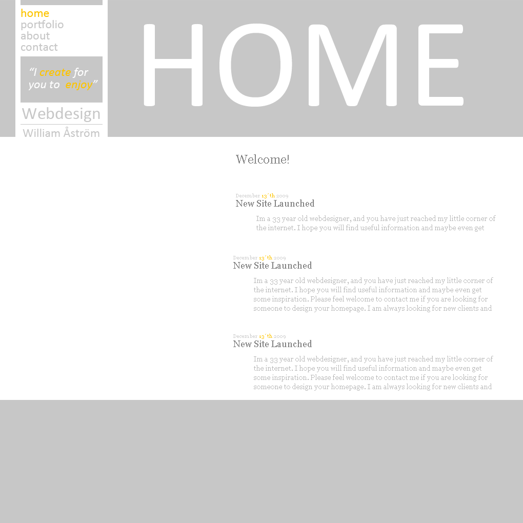
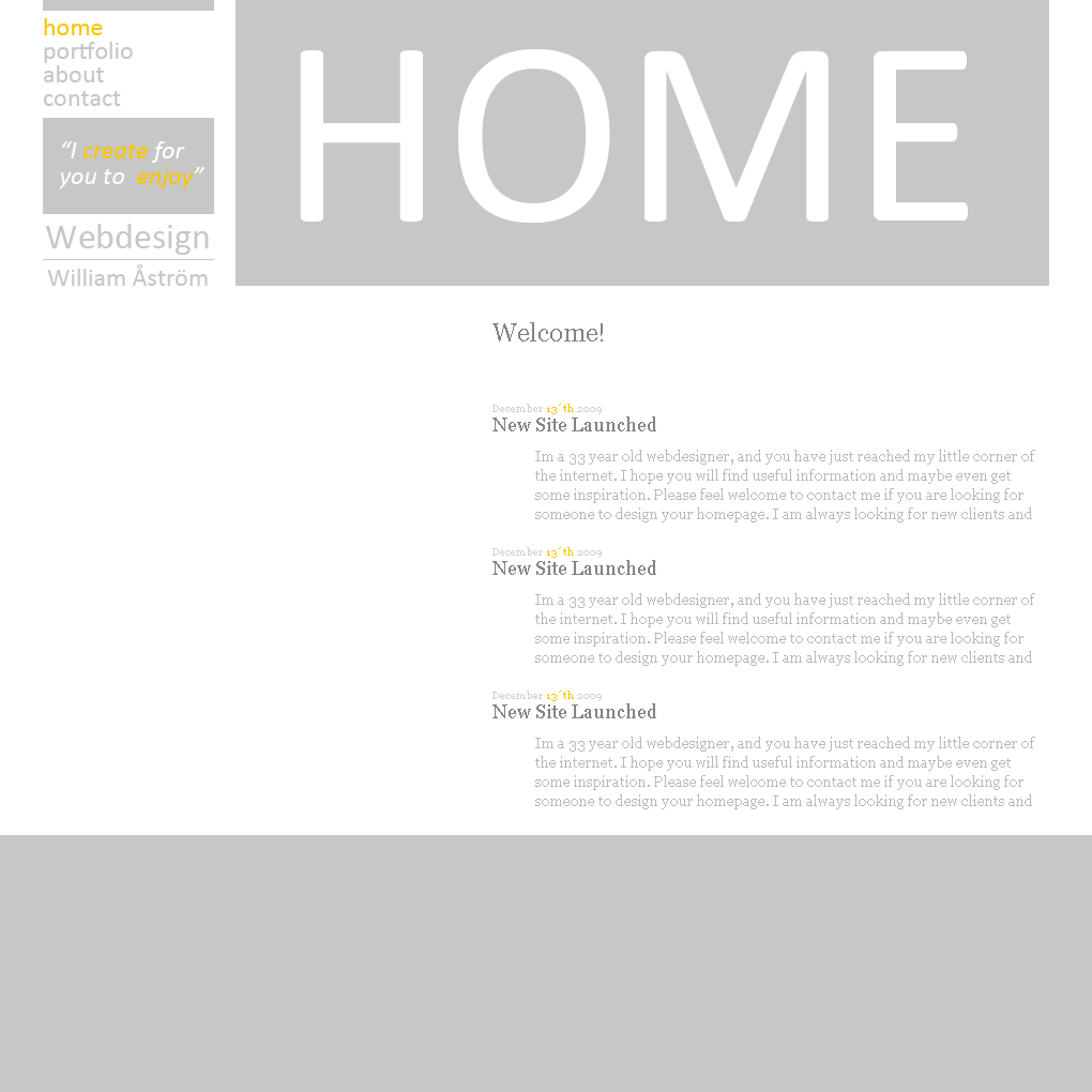
Thanks alot for all your comments. Been doing some changes. Not only to the typo. How about this? is this a worse version than those above or better? How about the typo in the "blog" section? Which of those three do you prefer? Dont mind the dark gray bar since its not designed yet. But i was thinking something dark grey there in the header of the blog dates
-
My 5 cents: #navbar: The hover7active effect is too little. Id work on that. #sidebar: Dont like that " " thing , nor the text area background. I like the red scheme alot better than the blue. And it looks better now when u added stuff. But i am not 100% with you on the typo in navbar or the logo. For the sidebar try find some kind of paper and do some grungy thing. I think that would look better. Good job! keep on!
-
Need to rethink the typo 100%
-
The background is too heavy, gotta go or make it lighter. Takes 4ever to dl. U need to work alot on the the typo.
-
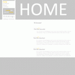
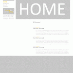
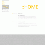
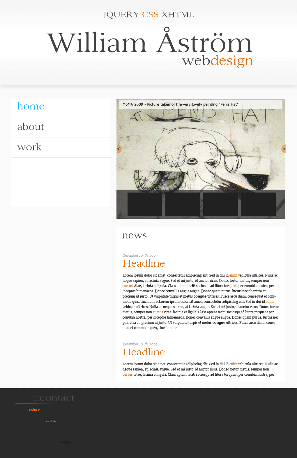
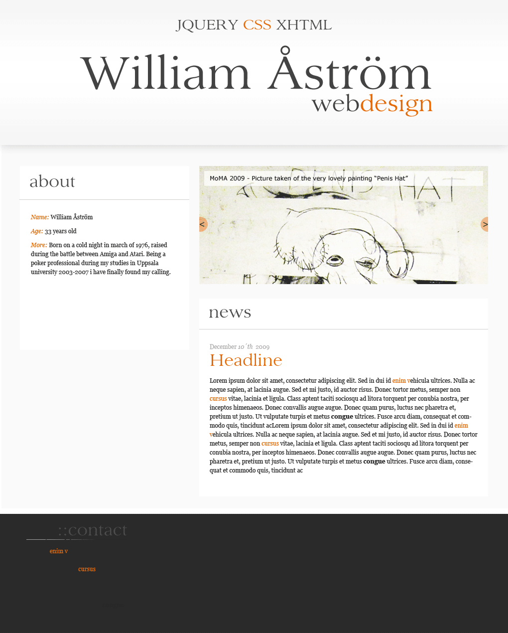
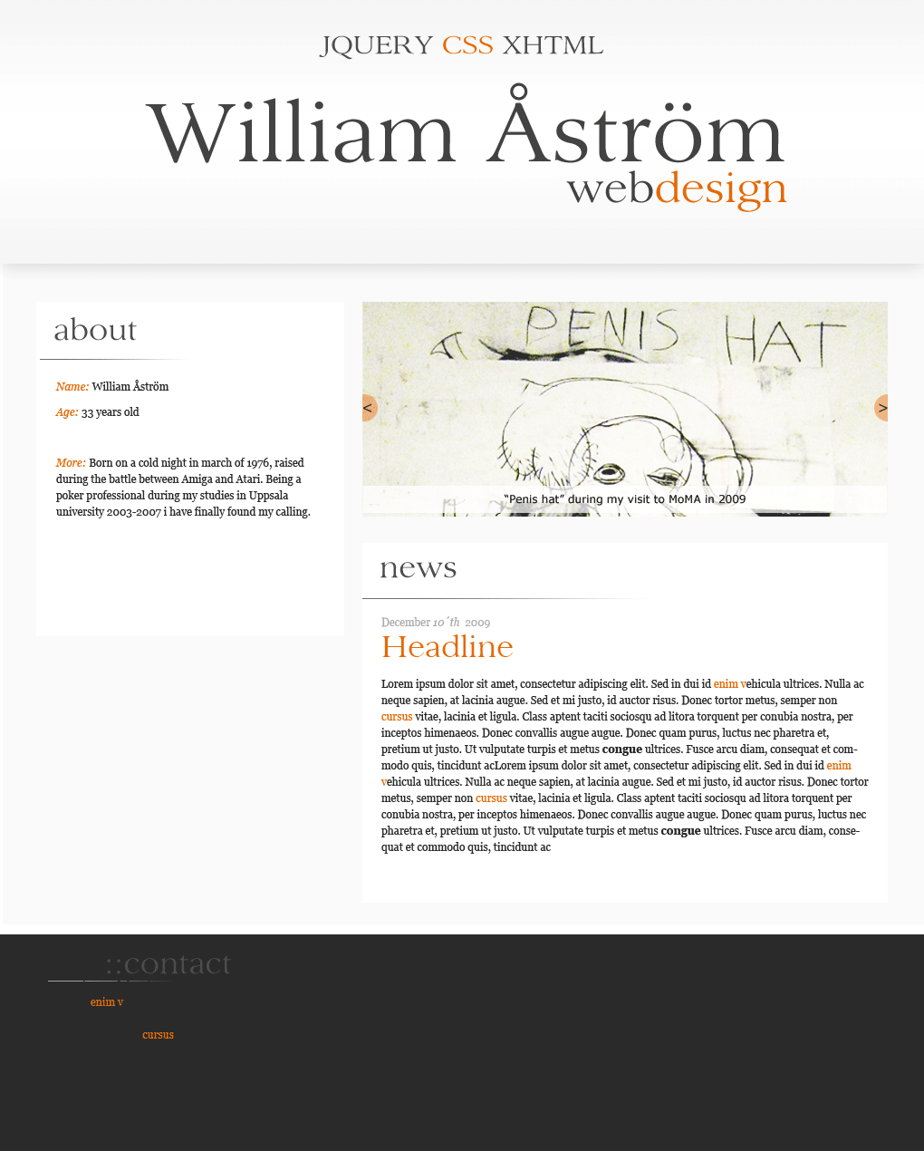
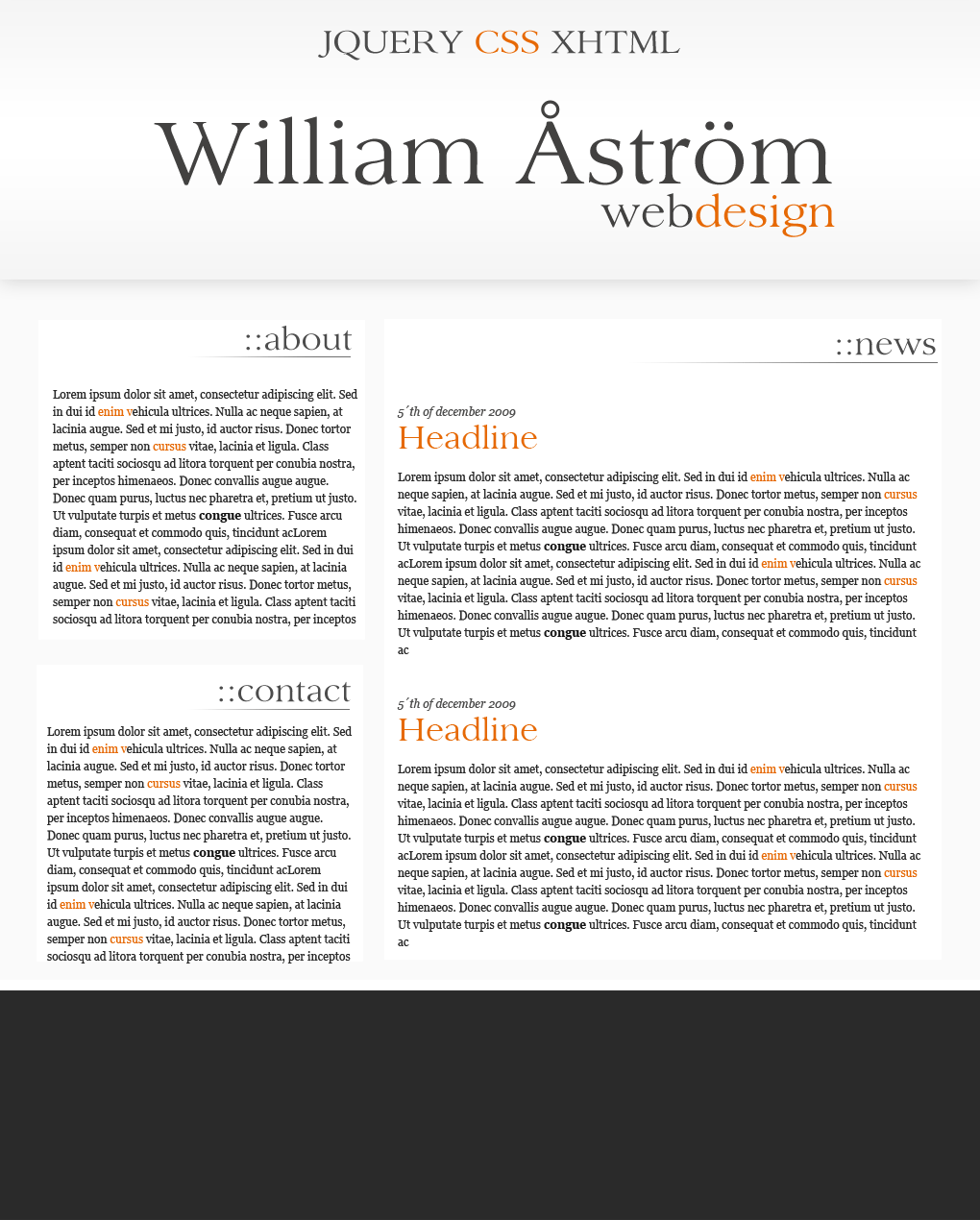
So im making a new design of my homepage. But my flow has stoped. And i need some feedback to more easily be able to step forward. If you look at these three revisions, wich one would you choose to build on. Best Regards, Will