MsCrow
Members
-
Joined
-
Last visited
Everything posted by MsCrow
-
Hello again Thanks for the response. I decided in the end to use the space for some branding. So I have mostly left it as it is. I am just working on the layout and have widened it all by 50px. It seems ok aside from the fact that I cannot trace a tiny graphic or border which is sitting between the content and right sidebar. I thought it was a graphic and now I'm not sure. If anyone can see it, please let me know. This website is mostly a blog so I have worked with this template to mod it for easy readability and usability. Hence the fixed width. Does this seem ok? I am a little rusty. Thank you
-
Hello Thanks for your reply. I played with the css and really wasn't sure how to change the nesting. If it's possible to get the ehadline 'The truth about local government pensions' in line with the word Unison?
-
Hello I'm working on http://www.unisonmanchester.org/wordpress/ As you can see the content on the left hand side is too low, I don't like the whitespace above. How can I move the div up t be aligned with the logo? I've been searching through the css and can't find the right bit. Thank you Ellie
-
Thank you for replying Edited: because I am half asleep Thanks for your patience!
-
Hello Sorry to drag this back up. The website looks ok on most screens now. The only issue I have is on some, the website title, sitting over the soundwave, wanders up a little. Is there any way of fixing the h1 so it's always dead over the middle? Thank you
-
Hello Thank you SO MUCH for the replies Yes, I needed that to drop the text over the blackest part of the sound wave. Thanks, I used this and reduced the h1 margin to 15px and it looks so much better now. No white redundant space. I'd be really grateful if someone could explain the advice below as I'm not sure what it means and whether it would be a more elegant solution (not that the current one doesn't work).
-
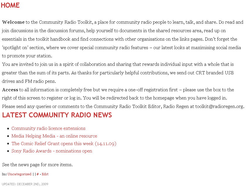
Hello I have just finished http://www.communityradiotoolkit.net/, well enough to release it anyway. It uses wordpress with a few plugins. I heavily modded the theme to suit our needs. Under the menu and above the top bit of the sound wave in the header is probably 30px of redundant white space. You can see that although the header is 150px to match the graphic, there is more white space above than below. I've used the web develop toolbar for FF to see if I could find it and no success. I use a plugin called menubar but that doesn't seem to be the culprit. I'd like to be able to solve it before I tidy up the CSS and html. Any help appreciated.
-
Thank you, I might get rid of the global reset (I wasn't sure that was it) first. If it sends the design a bit wonky then I'll try Wickham's solution. If you've got any feedback on the design I'd be grateful. I'm trying to get the most comfortable fonts with a modern design. If you look at http://www.communityradiotoolkit.net you'll see what I'm replacing.
-
Hello I've been modding a theme for a test site (http://www.test1.communityradiotoolkit.net/) and it's going ok except for a couple of basic things. The headings and paragraphs are all close together. This applies especially to paragraphs where there's little differentiation between them. I'd be grateful if someone could look at this. I've attached a screen shot of what I'm seeing. I can attach the css if you have trouble accessing it. Ellie

-
Thank you so much for looking at this, I'll try your fix as the links at the top will remain the same on all pages. I had a much more in depth menu but for a mobile version, it seemed very space hungry to use. I'll definitely look at the article, thank you for posting the link. This is all new to me and I'm grateful for CS3's inbuilt device central for testing. I'll take on board the thing about fixed widths. I usually work to a liquid layout anyway but for this I've also been streamlining the css right back, so no nice curved corners and stripping out all javascript. Phew.
-
Hello, try this: http://www.mscrow.com/analysethis/mobile/ Please remember though it's a mobile version so it'll look a bit odd I guess. Though if you have any feedback on size/layout catering for mobile devices I'd be really grateful. Thank you
-
Thanks for your reply. When I remove float: left and substitute it for display: inline, I get the buttons displaying vertically and taking up the whole width
-
Hello I'm minifying a website for use on mobile platforms. If that wasn't a bummer in itself, I'm having a bit of an elementary problem. I know there are resolutions for this, but thanks to my tired head and silly code, I can't make it work. I'd like to be able to centre this unordered list which sits within a div. Here's the css And here's the html If anyone is a happy mini mobile coder, if you can let me know if there's any issues with the above html/css for mobile platforms too, that would be so helpful. Thank you
-
Great website. Just a couple of points to add; it took over 10 seconds to load with the bottom images taking longest, you should reduce the file size if you can. Secondly, the hand at the top takes up a lot of space so the content is halfway down the page, could you move the hand to the right and have it appearing more horizontally?
-
Hello I'm designing a tutorial that has to work inside WebCT; therefore I cannot use server side scripting as I don't have access and WebCT can't cope with it. I want to be able to have the results of a form posted to a new page so that the student can save or print the results. Is there a way to do this? I looked at Javascript but the only solution I found posted just one form field. Many thanks
-
Hello I'd be massively grateful if someone could advise. I've been working on http://www.mscrow.com/mmu - and trying a better layout on the index page (the rest is messy). It browsercam's fine on some systems but I have two primary problems: - On 800x600 and some less common browsers, the menu and extra div drops down the page - On some browsers, particularly Mac, the footer creeps over into the dividing gap between the columns. For some reason, using a width setting of 80% like the content div makes the footer too short. Ellie