Acoustic
Members
-
Joined
-
Last visited
Everything posted by Acoustic
-
Content boxes are really the only thing holding me back at this point. Would appreciate all suggestions on color schemes, effects, layout, ect.
-
Here is what I have so far, need to reevaulate design and layout along with styling suggestions for content boxes. Here is the content I am going to need to put in, so keep that in mind when giving suggestions: Teamspeak 3 View (vertical banner) Welcome/Introduction News/events Recent posts Recent members ect Also have nice graphic banner that can fit anysize for the website. This is just the Home page content, rest will sorta use a template for what is on the home page.
-
Ok, here is a quick little center content I drew up. Might need some improvements but I need to know how/what is the best way to incorporate it into a DIV tag or if thats even what I am suppose to do.

-
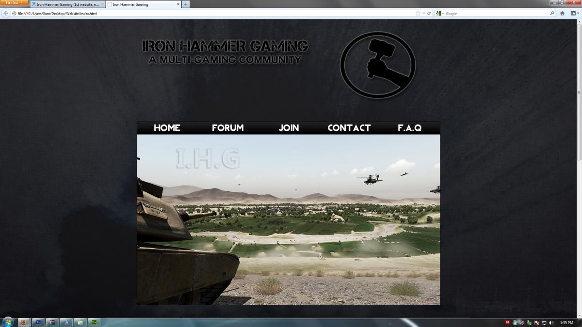
Heres the new layout. For whatever reason the navbar will not go down to close the gap in between it and the content wrap DIV box. I have no idea why because I have checked the codes and nothing appears that way plus it doesn't look like that in the DW design view, just firefox preview. Any suggestions on everything would be appreciate , still need lots of criticism. Again, I am not sure how to make my content boxes look good either.

-
I got a big idea actually after the response, will try it tomorow and post the results.
-
Which header? I am really not down for getting a Facebook/Twitter. I intend to have a recent news post/calendar or something added to one of the content boxes later. As well as a forum. I am thinking about getting a youtube for the clan though, so maybe I could post a youtube button somewhere. My main problem now is what to do with the content boxes. As of right now they look very unprofessional with the rest of the layout. Also, what do you think about the navigation bar? Any tips or quirks?
-
Might add some small changes but overall I am happy with it.
-
New top pic (bottom looks the same), lmk what you think. I still need lots of help with everything else, like what to do with the content boxes and how they look. What else could I add to fill up content? ect. Thanks!

-
Got something made guys, thanks for the help!
-
Thanks for the input but I kinda what to incorporate the logo I made above with text. None the less, thanks for the ideas!
-
Of course there will be text to the left of the symbol but I can manage that myself but will probably give it the same "style" as the symbol.
-
This is what I have so far, need some suggestions on what to do to it next or if I should just leave it be.

-
Posted in the graphic design forum to get ideas to make a better logo for top. I am kinda gainst the plain text and bad looking hammer so I figured that would be the best place to post something for that.
-
Making a logo to put as the title of my website (at the top) and need some suggestions. What ways could I go about making it that incorporate: Name (Iron Hammer Gaming, could also add A Multi Gaming Community in there) A Hammer symbol Not so plain text and that goes along with this background(remember it will have to be at the top of that background as well): Thanks!

-
I've tried most of the metal textures and it gives too much of a dark feeling. Any more suggestions? I really want to completely redo the text on the top for a better feel but not sure what route to take.
-
Added a new bg that I made. Tell me what you think. I understand that you said that the text at the top was plain but can you give me some suggestions as to what to do it? Also, what should I add to make the website look fuller and more professional? How should I do my content boxes? Thanks!


-
First of all, no domain yet so I will just post pics. I don't have much of anything yet but the basic design and that is primarily what I need help on. Anything you can think of to critique the website is fine by me, considering it's my first. It is a gaming community/clan website, so keep that in mind. Here are the pics: (top) (bottom)