.dark .negativ .antisocial
Members
-
Joined
-
Last visited
-
Done with a website builder :-/ Even tough it do not look good.
-
why don´t make the leftsite sticky? Would look better cause when you scroll down it looks bit empty. Its not hard to do it http://www.vertstudios.com/blog/jquery-sticky-scroller-position-fixed-plugin/
-
Thanks for your thoughts. The problem was with the paragraph <p> and you´re right. Set-up of lineheight in <p> and the floating div didn´t match. Seriously I went crazy and then it was just that silly <p> :-D
-
Hello together, I have no idea what the heck goes wrong. I put a "read more" button inside a text. Wishing to float right so thats at the end of the text but also inside it. After I puting the floating element inside it, i see a problem with the last line. The height seems to be 2-4px heigher than the rest. Maybe someone here can solve it. CSS: .mehr { float:right; font-family: 'Homenaje', sans-serif; /* google @fontface */ font-size: 16px; padding:5px; font-weight:400; background:#000000; color:#FFFFFF; display:inline; /* text an bg anpassung */ } html: <p>Lorem ipsum dolor sit amet, consetetur sadipscing elitr, sed diam nonumy eirmod tempor invidunt ut labore et dolore magna aliquyam erat, sed diam voluptua. At vero eos et accusam et justo duo dolores et ea rebum. Stet clita kasd gubergren, no sea takimata sanctus est dolor sit amet. Lorem ipsum dolor sit amet, consetetur sadipscing elitr, sed diamdolore magna aliquyam et dolore magna aliquyame sed diam nonumy eirmod tempor<div class="mehr">mehr lesen</div> labore et dolore magna aliquyam</p>

-
By the way: great that you give some backlinks to the sources you´re using. Likeable.
-
hihi, serious?

-
Design looks bit like the start of internet with a touch of web 2.0 in the logo. Don´t like it at all. However the use is great. Just tested it with one of my sites and the result you produce is pretty cool. From me i do not know a other place where to get all of this information's on the same time. Put it my favorite folder :-D
-
I really liked it. The response is great. Mobil looking fine. I may find the red a little bit to dark. But mhhh you already told it´s not debatable
-
looks pretty cool. Maybe something with the navigation. The font looks a bit to small.
-
thank you very much
-
-
Thanks for your fast reply. I´ve tested it and played a little bit but still the background does not change. No idea why ...
-
-
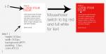
Hello everyone, I´ve got a little problem to set a a:link / hover properties. I want to make a container to switch by hover to background white to red. The textcolor has to switch from #333 to #FFF. But I do not get the container to do that. Attached you will find a picture which shows what I mean. Big thanks in advance for some help :-)
-
Looks like the internet explorer pushes your pictures around 5px to much right. So in the end the last pictures do not fits into the container. Try something with a stylesheet only for IE <!--[if IE]> <style type="text/css">@import url(ie.css);</style> <![endif]--> There your have to play with the margin (set to 0?) or with the position-properties. I´m sorry this is not a big help :-D But most of the times if you just play little bit around you will get a solution.
-
I read a article somewhere about the dangerous of using to much css3. Here is a example of using @fontface in a bad way. Its just to much. What I like is the rollout for your work but again to much use off css3 shadow way to much. animated gif pictures - serious? the b/w background also looks not good. I think its wanted but the quality sucks You´re using the new technology. Thats good. But I think you do not know how really to use it. Lots of good idea. Try to make new graphics and take new fonts. Take readable fonts.
-
"Only 2 billion less users than Facebook…" - love it :-)