AndyRoid
Members
-
Joined
-
Last visited
-
Love the redesign just stands out better now. Having the uncomplecated background image makes the content jump out at you. Definately a great redesign fella keep it up love the work. Although do you not think that the gallery would warrant its own page just to show off the Cottage that bit more? 2 big oversized thumbs up from me
-
Thanks guys thats a massive help!
-
sorry assumed everyone knew it link to image here!
-
Does anyone know what the font used on the "This Is It" poster is? I'm designing a site who's an MJ tribute act and he wants it to be as close as it can be. I'm useless with being able to figure out what fonts what but I think its a serif font. Would greatly appriecate a quick response on this from you smart designer people
-
Hi all, I have recently taken on a project to design a logo, it's not something I've ever done before. I'm having a hard time trying to simplify the technical drawing they've sent me to use for the logo. Can you let me know where I'm going wrong (which I most certainly am) The main area they really need is pipe at the bottom in the center as thats what they do Here is where I am so far I respect everyone's opinon on this forum and can take any feedback bad or good so don't be afraid to be blunt!
-
cool cheers
-
the main part of the site is built for 1024 resolution the extra was/is to see how it'd look on the wider screens. Do you think that the top 3 pictures have too much prominance? Just worried people won't really read the content, possibly shrink them down to a third of the size? Then time to create the character illustration, anyone got any good tutorials for that? I don't want to buy a vector graphic and change it, I fancy having a go myself
-
I've made some updates to the way the site looks let me know if you think I'm heading the right direction again. I've ditched the post it notes and gone a bit minimal graphics now hopefully less of distraction. Note that the contact form will stay as part of every page like the trend that seems to have taken off quite rapidly thought I'd see how it fitted. See what you guys think

-
thanks guys, fair point about post it notes just tacky and horribly out of place. Will have a fiddle later to sort out something more inline with the site style. I'll have a play with the blue's too as I wasn't too sure with that. Yer the logo artwork isn't mine, didn't get in there quick enough for that
-
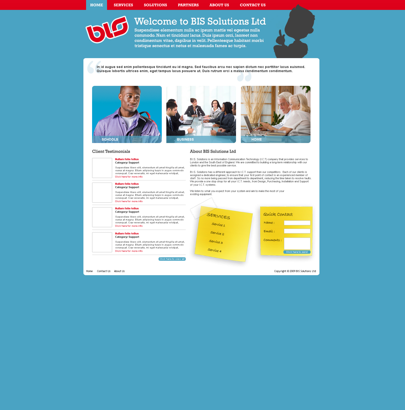
Could you guys let me know what you think of my design for a IT company. I've tried to keep it professional yet slightly trendy, not sure if I've pulled it off to be honest. The blacked out character at the top is done so, because I'm yet to complete mine and still want to show where I'm going with it. Looking at it now I don't think the blue works. Please give me any comments I'm a big boy I can roll with the punches.

-
I like it I agree with the comments above about the headings etc. I like the idea of the ducklings as twitter/rss feeds. All I'd like to add is that you could maybe play with the idea of a fish/fish tail or other pond life to accompany the ducks you have because you don't want to be over heavy on the ducks. Thats my two cents. Really nice site and yes its already bookmarked. Love it.
-
Hey anyone seen the gadget shows Jason Banbury's Blog site? Must say pretty nifty, the nicest use of a twitter feed at the top. Anyone know how to create something like that? Is it Ajax or Jscript? I fancy having a go at something like that! Jason Bradbury's site Any ideas for source code etc?
-
I used col-right to split it into three columns using content-left and right. crowds a test div to push the content around!
-
Nah its the height to strech to the bottom when the content in the middle gets longer
-
You sir are a genius thank you so much! Now all I need to do is sort out the blue boxes