Frazmand
Members
-
Joined
-
Last visited
Everything posted by Frazmand
-
I'm coding this page for a friend and I have no idea why the images in the navbars are so spaced out in IE - looks fine in FF. http://fraserdeans.com/sites/djpolska/ Any help appreciated.
-
No, it's actually a personal project so nice to get on with something without a clients "can you just change that" . I take your point there Sam about it blocking the banner. It's easy enough to find somewhere else for it.
-
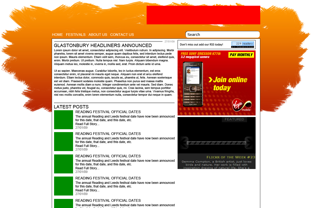
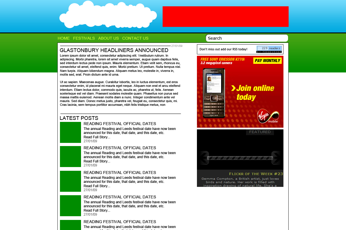
Heres a new mockup. I like this design a lot better and I've taken on you guys suggestions. The banner still needs a little work, the logo will feature on there when it's completed. Tell me what you think please.
-
Thanks for the advice Ben. When the site is up there will be an image in the main article at the top. I agree with the statement about the read more buttons, i'm rectifying that as I type this.
-
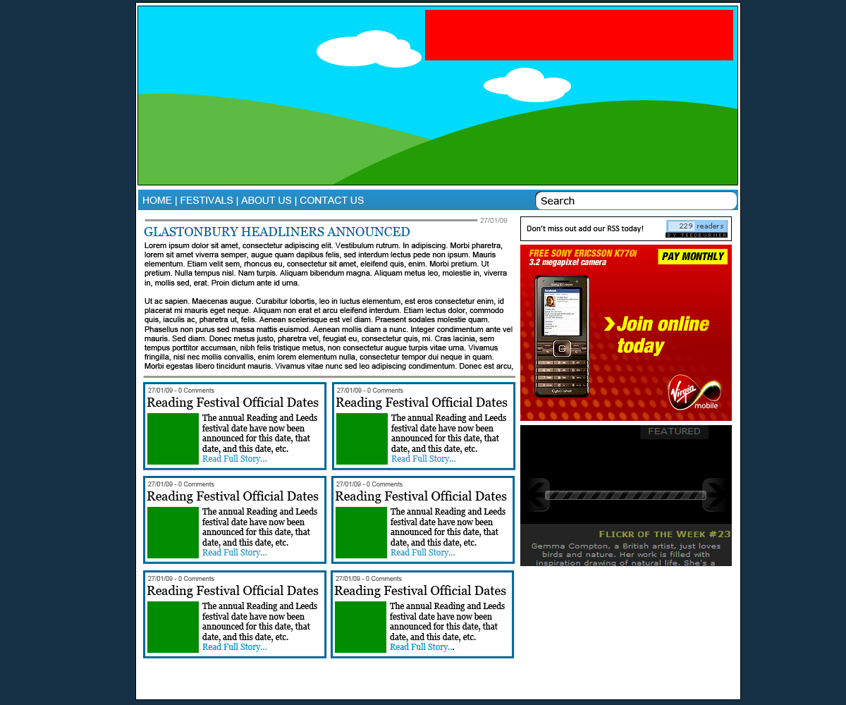
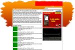
Ok, here is a revision i've made to the inital design. It's pretty different, constructive crit please including the colourscheme. Take not that the red box at the top is for advertising and the green boxes at the bottom will be filled with pictures relevant to the articles.
-
I'm pretty sure we will be rid of the cloud and we're currently getting a logo together now. As for the advert I agree, we're undecided which advertising program to go with. I noticed your from Reading scaz. I'm not too far, in Ascot.
-
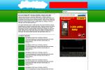
I probably didn't explain it well enough. The red bit at the top is an area for advertising. The green boxes are placeholders for images within the posts I make - so they wont be green when the site goes live. The reason for the green and the blue as it's about outside music events and hence green fields, blue sky. I'll take that on board though. Anyone else?
-
I've attached a mock up of a site I'm currently looking to launch. We still need a design to be finalised but if you could give me critism on this inital design please. The cloud will probably be removed from the final design - it's just to show the location of the logo. The site is going to be a wordpress blog about music festivals. Cheers.
-
Alright. I've got a solution now. Seems there is a problem with the actual images like you said. I've just popped them in PS and if i save them again it seems to correct the error. Cheers for your help mate.
-
I uploaded them via FTP. Reckon I should try and upload them again? And the comment about lightbox script image, I know waht you mean, i don't know where it's gone!!
-
I'm building a site for a client atm and for some reason the pictures I've put on a webpage won't show up in Internet Explorer. There isn't a problem in Firefox just IE. I know it's a crappy browser but I need to get it sorted. I'm using the lightbox script but that hasn't affected any of the other pictures. Any help appreciated. Webpage: http://wrsracing.fraserdeans.com/portfolio.php
-
I think i know what you mean. I'm going to work on a logo for the site. Hopefully that will sort it out and make it more eye catching. Thanks for taking the time to review it.
-
I'm a big fan of it. It's really good. I love the navbar. Nice work!
-
Constructive crit on this site please. Screen6.net All comments appreciated.
-
I'll give those points a go. Thanks John.
-
Here's a theme design I put together. Crits on it please. I haven't turned it into code yet. Just want to get the design right to begin with. I watermarked it, just to be on the safe side.

-
That graphic on the homepage is sweet. T-shirt industry is a tough one - i wish you luck!
-
Yeh, really cool design.
-
Thanks for all the comments guys. I agree with you all. I did have a few more urban designs but the client liked that one best.
-
Thanks for the reply guys. I appreciate the time you put into that empek. It's definately an improvement no doubt. I'll get in touch with the client and see if he'd like any of those changes.
-
I agree with you there mate. I think I concentrated on functionality more than design. I'll look into the error tomorrow. Cheers.
-
I would love your thoughts and crit on this site please. www.Urbanismzine.co.uk Coded with XHTML and CSS. The client was very happy with the design but i'd like to know where to improve in the future.
-
Awesome design buddy. Very very cool.
-
If I were designing the site I'm sure I would have tried to put in a flashy Web 2.0 style padlock in the banner.
-
I think the fact that you've put the 'Quote form' on the front page is a great idea. Stops people from having to trawl through pages and pages to find the form. Great design.