JumpJump
Members
-
Joined
-
Last visited
-
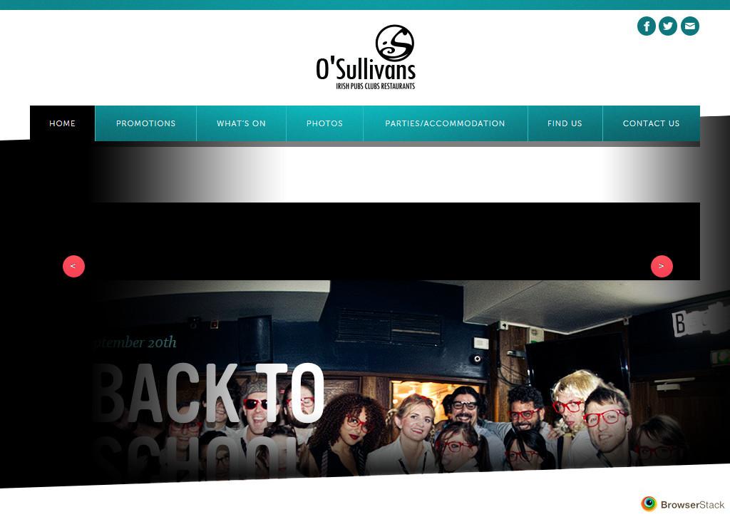
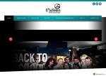
I'm really struggling with a layout issue in (all versions of) IE. The site I'm working on works fine in Chrome and Firefox, but the layout of the banner is completely wrong in IE, where it appears a few hundred pixels lower than it should. I'm not sure if this is an issue with negative margins or what, and there's not much testing I can do since I'm using a Mac and only have static screenshots to go by. I'd really appreciate any feedback on this. The link to the site is: http://www.osullivans-pubs.com/draft The screenshot I'm getting for IE (10):
-
Thanks for the feedback. I'm glad you like it. The link for the visiting page simply links to the address and map on the contact page, I don't think they need to be on seperate pages, but if somebody wants to locate the place they might not know to check the contact page, hence the link. Re: the logo - it's gone through a few stages now and this version was approved. Thanks again.
-
Site's up now.
-
How about we hold a contest for you to work for us for free - you give us free stuff from your catalogue and we'll have a competition to see which thing we like the best? Then we'll keep them all for nothing.
-
Hi guys, thanks for all the feedback on this. I've coded it and it's in testing stages at the moment, I'd appreciate if anyone could give me some feedback (permalinks are temporary for the moment until I switch my clients hosting to Linux. It's also using placeholder text for now): www.theirishvillage.ht EDIT - Changing over to Linux hosting now, site is down temporarily.
-
Thanks for the feedback. The position of the searchbox is a UI decision, I'm putting it where it is most visible because it will be one of the more used aspects of the site, though I agree it may compromise the header, aesthetically. I might try and see how it looks up top, in the black bar with the navigation. Thanks again.
-
Thanks man. Maybe no responses is a good sign then.
-
Anyone? This forum seems fairly quiet.
-
Hi, this is the mockup for a new development in Haiti, essentially a mall and currently under construction, which is seeking to attract international business and investment in the area. The design is intended to be modern, clean, fashionable and coherent. Logo is temporary. I'd appreciate any feedback.


-
Very nice. Get it to take IE screenshots and you have a successful website.
-
Oh, and to fix the scrolling problem, add 'width: 100%;' to your .facebook class.
-
Not at all! That's the best way to engage in constructive criticism. To have meaningful conversations about what works and what doesn't. I always advise to start with typography relatively early in the process. Along with layout, it is the most important part of web design imo. Pick two typefaces that work well together (preferably a serif and a sans serif), one for headlines and one for body text. Choose the size of your heading 1, then heading 2 etc down to the smallest text element. This will establish a visual hierarchy in your design. Use this with a solid grid layout (Google 960 grid for the most common web design grid) and you have a good starting point.
-
-
What I mean is that the background colour is a dull colour (not dull as in 'boring', Google dull colours). Me and another person are telling you the background colour doesn't work - just because it's different from a competitor doesn't mean it's good. That site you linked to isn't up to much so I wouldn't worry too much about that. Perhaps take a look at higher end sites for examples of effective design in a similar area (for example - http://www.darasgarden.com/). I'd work with colour in the photography and the typography rather than the backgrounds (especially the background for the content). And again - lose the Lucida Handwriting. But of course, the decision is yours, use the advice as you wish.
-
P.S. Forgot to add - your site is way too wide (unnecessarily), it has a horizontal scrollbar that scrolls to nothing.
-
Simplicity and clarity are always a good starting point in design. However, I'd change your colour scheme, at the moment it's a bit sickly and dull (especially that green/brown/yellow/whatever background colour. I also think changing the background colour on the content (the one that's currently blue) to either an off-white or a pure #ffffff white would be a good decision. It's all a bit dull at the moment. Also - get rid of Lucida Handwriting for the subheading, it's an awful typeface. And the graphic on your logo needs work, it looks very low quality at the moment.