


MAT
Members
-
Joined
-
Last visited
-
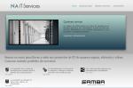
OK, I think the blue box IDEA was correct, but the execution was really poor, it looked awfull, I'll try some different colors and see how it works. Thanks to everyone who commented so far, you've been very helpful.
-
Luke, the translation was just to give you an idea of what it was all about. Most sentences have poor grammar as it is an automatic translation "word for word". I've uploaded a new version without the bluebox in naits.com.ar/index2.html. Let me know how it is working our for you, I think the design becomes too monochromatic and need some highlights to bring life to it. Thanks for your input!
-
I've just noticed google translate breaks the layout a little (spacing, position), so please check both the translated and original page. Thanks
-
I'm not so sure about the blueish box too, I'll do somthing about it. Ideas?
-
This is the translated page so you can have an idea of the content: http://translate.google.com/translate?u=http%3A%2F%2Fnaits.com.ar%2F&hl=es&langpair=auto|en&tbb=1&ie=UTF-8 Thnx
-
Thanks for the link pandadoodle!
-
Marc, I don't understand your comment, could you please post a screenshot? I've attached a picture of the way it looks on my machine.
-
Bump, please people, I want and need your feedback Thanks
-
Pandadoodle, could please provide some advice wrt typography? I've fixed the CSS a little but I'm not experienced enough to know what needs to be done. Thanks
-
And please comment on the font choices too, I'm an engineer, not a designer so I went with something I thought looked nice, but I'd really appreciate a designer's POV. This is my first webpage btw, so I read a little about CSS and HTML before starting. Thanks!
-
Think of the content as Lorem ipsum, I'm really looking for some advice about layout, graphics, colors, etc. Thanks!
-
I see what you mean pandadoodle, inner pages looks untidy, specially http://www.naits.com.ar/ideas.html I'm not too good formatting text, these long paragraphs look better when justified? Thnaks
-
Please take a moment to review http://www.naits.com.ar It's the website for my consulting business. I'd really like feedback from experienced designers about what you think is wrong . Thanks a lot in advance Regards EDIT: Typo
