dan958
Members
-
Joined
-
Last visited
-
sorry for not being near your level of expertise on my first design. I am used to a simple webpage, with a small header and the rest PHP driven. I am a PHP coder, not a designer. Which is why im trying to learn.
-
Because the fonts will be coded in, so then i will play around with fonts when the website is online and then i can see what looks best.
-
As i said in my last post, im going to have a play around with colours and textures and post it later to see what you all think. Il try and cut down on tabs, i now can see some of the pointless ones i have like 'contact us and price quote' that is the same thing! The fonts are something that im not doing right now, since this is just the design. The font for the 'logo' (its not really a logo, but you know what i mean) will definitly be changed. The rest of the fonts will be changed when i code my website, so not an issue right now. May i ask whats wrong with the layout?
-
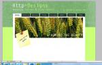
Il have a play around with different fonts and textures, with different colours to see how this changes the overall look, thanks. I think it looks much better with one simple line. Im definitely going to get more fonts. Thanks! Il change colours to see how it looks. I put the email address there because on viewing a few portfolio designs, it seemed a high percentage of people did that. No it's not. The colours are green because i grew tired of seeing blue webdesigns. The picture was because, as i said above, i viewed other portfolio designs and they and they had pictures of tree's and such. This picture will be on a changing loop with other pictures. Thanks all.
-
I accidently posted in the wrong section, i apologise.
-
I don't know if its just me, but i feel like there is too many 'blocks of text' on the home page, things are so much easier for the customer or the onlooker if text is short and sweet, bullet point important information.
-
When i zoom out a bit i get weird lines across the banner.
-
Not sure if others have said this, but when i click send without filling out the form on the contact page, i get directed to a new undesigned page with just '3' in the corner.
-
Hello, Here is the work in progress design for my portfolio. It's not finished so im not sure what is going to stay or be changed. Id just like you good people to let me know what you think that should be changed/improved/added to make the design more affective. Im going for an 'arty yet elegant' theme.