


idny99
Members
-
Joined
-
Last visited
-
Okay, When you say "unfinished" do you mean in terms of the structure? Or do you mean that the site is too flat with not enough going? How can I improve this in your opinion?
-
Thanks. I agree it is a rather similar layout to many other websites. However I want to go for the familiarity to increase UX. Maybe slightly too much?
-
Hello All, I have recently finished improving/redesigning my website with the aim of brining a little more to life and character into it. There are a few things being put on the "to do" list such as SEO, some minor padding etc, however it's nice to have another pair of eyes to point out areas that could be improved. Let me know what you think. www.dev-works.co.uk Thanks Idny
-
-
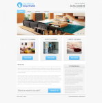
Hello, Been a while since I have posted on here so I thought i would pop back and request some feedback. I have just finished designing the home page for a small business website, for a cleaning company (the name is not yet confirmed as the company is new) so please excuse the logo. The website is still in the design phase so I only have a PNG for you guys. All feedback is welcome. Thanks
-
The CSS one looks nice. However, Will this work if the images are coming from a database?
-
Thanks. I will give it some testing shortly and hopefully get it working as per your advice. I also noticed you said it is not optimal. Is there a reason for this? Or a possible better method used for product images previews? Thanks
-
Hi All, I have been looking around for this answer and I'm either completely blind or just searching the wrong words. Anyhow... I have a product which I would like to have multiple image thumbnails that when clicked displayed larger in a fixed content area, but do not reload the page. How can I go out this as I am a bit lost on this one? Example (Amazon) http://www.amazon.co.uk/Kindle-Wireless-Reader-3G-Wifi-Graphite/dp/B002LVUWFE/ref=amb_link_159955307_2?pf_rd_m=A3P5ROKL5A1OLE&pf_rd_s=center-1&pf_rd_r=1698CTF1GZD462A63Y40&pf_rd_t=101&pf_rd_p=248625307&pf_rd_i=468294 Thanks in advance Idny,
-
This should be confirmed by someone more experienced, but perhaps try adding...? HTML <html> <head> <link href="style.css" rel="Stylesheet" type="text/css" /> </head> <body> <div id="wrapper"> <div id="header"><img src="images/logo.gif" alt="Victoria Osborne logo" width="475" height="108"/> </div> <!-- end header --> <div id="nav"> <ul id="menu"> <li>test1</li> <li>test2</li> <li>test3</li> </ul> </div> <!-- end nav --> <div id="footer"> </div> <!-- end footer --> </div> <!-- end wrapper --> </body> </html> CSS body { margin: 0; padding: 0; } #wrapper { width: 100%; } #header { height: 120px; float: left; } #nav { height: 120px; float:right; } ul#menu li { display: inline; }
-
Looks fine to me. One thing though... ...make the logo letter pressed as at present its the only text that is not. Edit - use the default theme css that comes with the nivo slider. It will help pop it out more
-
-
Thanks, I didn't design the logo. That was done by the previous website developers so i'm just using it as a place holder for now. Thanks, some really useful tips here. I'm looking into the trends with carts and will in future provide one with the best functionality I can without information overload to the user. The info text has been lightened and also the line height for the "specification" area has been adjusted. Also I understand it may look like a template and as you pointed out its pretty hard not to make a website without someone, somewhere having uploaded a template that looks similar. I have the original, selfmade PSD to those who have doubts. Sometimes being blunt gets the point across. Good, bad or blunt critique can only help you improve, right?
-
Ahh really. I created it from scratch so that hits home. Feel kind of silly for spending the time on it now. Any idea on how it can be improved? I don't want it to be too vibrant though.
-
Impressive. The pressed elements work really well. I need to step up my game
-
Afternoon, I'm currently in the process of designing an e-commerce website in photoshop and thought it would be best to get some critique before I start putting it in html/css. Its my first e-commerce design so I understand there may be a some dislikes, but please let me know so I can improve on them. Sharing is Caring Idny,

-
Site looks nice and definitely a large improvement over the original website. Which slider have you used there? It seems to have some transitions that Nivo doesn't.
-
Okay, I'll get a grid set up to make sure the layout is more balanced so will spend some time getting it as best I can here before making it look pretty. As for the colours im not entirely sure what part needs tweaking, but my guess is that less grey would be better?


