CHurst
Members
-
Joined
-
Last visited
Everything posted by CHurst
-
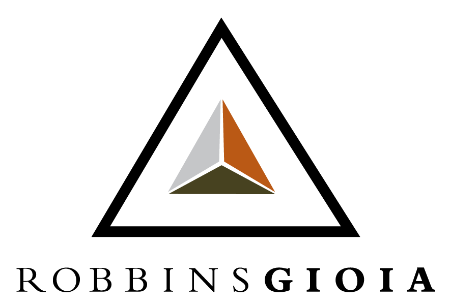
I am an art director for a mid-sized consulting firm in Washington DC. I have been working for about 6 months on a redesign of my company's corporate identity to match their new positioning in a contemporary marketplace. However, there are no other well trained designers at my company and I am looking for some more professional critique for the new logo and color palette. I have uploaded the old logo for you to see. The old color palette was taken straight from the logo (black, silver, rust & hunter) and the logo has several major problems; size ratio between the symbol & the type, lack of precision in the geometry, etc. My firm has an emotional attachment to the "triad" (some of the founders are still with the company after 30 years and helped come up with the original logo concept), so I am working to make an updated, contemporary version of the same concept, while also working in some newer concepts of precision, sophistication, efficiency, and globally appropriate expression. I have also updated the new expanded color palette I am working on. Please let me know your thoughts and reactions, any insight you can provide would be amazing! I have been staring at this project too long to provide myself with any more valuable insight. Thanks!