Steve25
Members
-
Joined
-
Last visited
-
Yeah perhaps you're right I guess it is a little difficult to see that shade of red. I think I need to make it a little bit lighter but still fit the rest of the website. Depressing? Hmmm, I didn't think it would give off that impression and that certainly isn't the mood I want to give. The website is really intended for me to host some information about myself and some of the projects that I'm doing. Kind of like a portfolio site but not for web design more software stuff really among other things
-
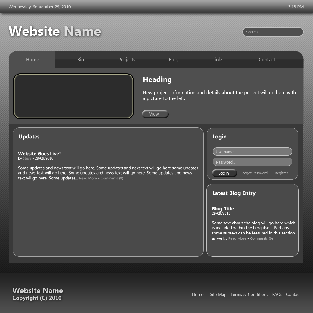
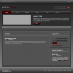
Ok I've made some changes to this design which I think is slightly better, hopefully you will agree. It's still not perfect but hopefully it's a step in the right direction. I've added a little bit more colour to it and changed the layout slightly.
-
Thanks for your reply. Yes, I to was thinking perhaps it's a bit too dark and not enough colour. Not sure where to put the colour yet
-
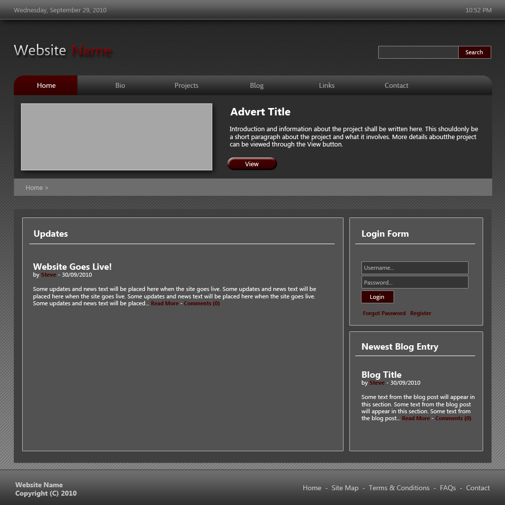
I'm mostly just a developer and do a bit of design for myself but I'm nowhere near a commercial standard when it comes to design I've never really been brilliantly artistic and I always struggle with designing. So lately I've been trying to improve on web design a little bit and a perfect opportunity came to create a website for myself. Usually when creating a website I will just jump into the website and start building it piece by piece with bits of HTML, CSS and PhotoShop graphics. However, I got an idea off of a friend to first create an entire template in Photoshop first something which I've never done before. I've attached the image of what I have so far and would appreciate some feedback and some advice on it. Thanks
-
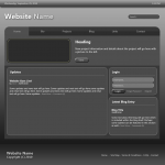
Hi sorry for the late reply. I decided to scrap that design and create another one. This is what i have so far. I think it's ok at the moment but i'm not yet happy with the navigation on the left but i'm not entirely sure how to make it better. What are your opinions?
-
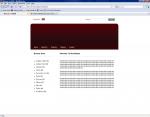
Thanks for all the feedback. Now that i think about it i think cabbage is right, the header is probably the worst bit which is funny because when i started out i liked that part but now it just doesn't fit with the rest of the website. I'll work on making the middle wider as well. Yeah i use photoshop but to be honest i'm not that great with it.
-
Thanks for the replies everyone . By typography you mean different fonts and sizes? I've tried moving things around but nothing else really looked that great to be honest. By the way i don't really understand how that 960 grid system can help? I'm thinking of scrapping the design and starting again but i've done that twice already and i can't keep doing that
-
Thanks for the reply, i'm glad i'm not the only one who has problems . Those links were good thanks. I added some content into the box area in the middle and stuck a bar down the bottom and it looks okish but there's still something that just doesn't feel right about the overall page.
-
I could most likely fix them for you for nothing post here and lets see what we can do
-
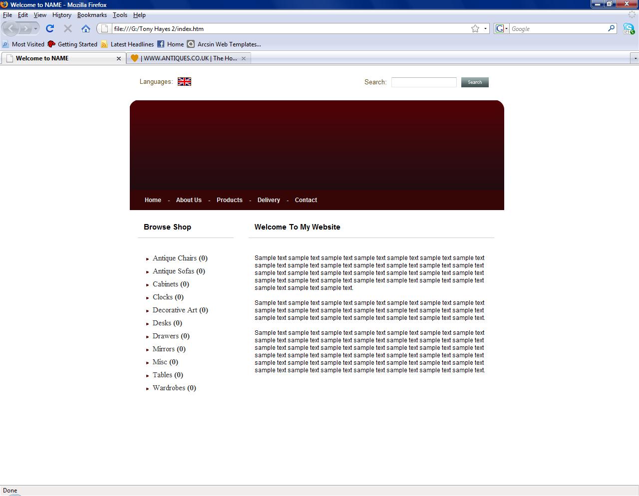
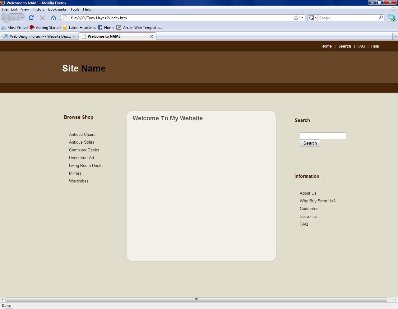
Hi, this is my first post and i'm hoping to learn a lot about web design from here . Well i'm definetly more of a coder when it comes to web stuff and in fact i'm terrible at design. I just don't have the "talent" or whatever it is to make something look right etc and i'm working on a website now which i can't get to look right at all. I've been through about 3 different designs already and i just don't like what i do. I've looked at god knows how many templates/websites/tutorials and it just doesn't help. I'm making an antiques website which will be used to sell antiques on. If i can fix the design side of this website then i will be away and happy days because i'm comfortable with everything else. Here it is so far, any tips would be greatly appreciated as i've been trying to do the design for months!