kasraaa.de
Members
-
Joined
-
Last visited
-
Well,since it's not in english i can't understand what's the website about and how related it is to the content of the website but from designing point ,in my opinion, it looks neat and clean.Personally i like this sort of minimal designs.
-
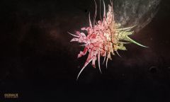
 The objects in this wallpaper are separately rendered in 3d Max and Zbrush then finalized in photoshop software. The motivation behind this wallpaper was to portray an odd ,colorful and seductive world that you might never want to live in.
 -
-
 The objects in this wallpaper are separately rendered in 3d Max and Zbrush then finalized in photoshop software. The motivation behind this wallpaper was to portray an odd ,colorful and seductive world that you might never want to live in.
 -
I think it's too simple ,I suggest you to change the header to something more eye catching with green theme.My advise is to use the same color as the first arrow (shape) from left in your header.cheers
-
-
-
-