Demonolith
Privileged
-
Joined
-
Last visited
-
-
Thanks for the reply rbrtsmith, very helpful and informative. I do use arbitrary numbers as opposed to device-specific devices, but was tempted to go the other way. No need to now. I use @media(max-width: 900px) for a mobile-responsive setup, it looks quite a bit different to how it looks on desktop (I'm forever working on it as it's more of a side-project than for a demanding client). Because of this when it comes to iPads portrait orientation is altogether different in looks to landscape orientation. Bad practice? Unfortunately I use !important more than a few times and a number of smells like display: none; and padding: 0; but I'll look into it. Thanks again!

-
-
-
-
I should've used the following instead of what I originally used I think: @media all and (device-width: 768px) and (device-height: 1024px) and (orientation:portrait) { .ipad-portrait { color: red; } /* your css rules for ipad portrait */ } @media all and (device-width: 768px) and (device-height: 1024px) and (orientation:landscape) { .ipad-landscape { color: blue; } /* your css rules for ipad landscape */ } My main issue was that I wanted to override certain CSS rules, but the only way I saw how was to use !important in each rule. I ended up getting my site to look how I wanted it to look simply by removing the following code. A silly oversight by me. @media only screen and (max-width: 1024px) and (min-width: 800px) { html { zoom: 0.8; // Old IE only // -moz-transform: scale(0.8); -webkit-transform: scale(0.8); transform: scale(0.8); margin: -126px -70px 0; } } Sorry for being so confusing in my intentions, all's well that ends well though - thank you!
-
Sorry if I'm not following correctly, with the following code it now appears on a desktop browser of 1024px width or less - and I still need to use !important: @media screen and (max-device-width: 1024px) and (max-device-height: 768px) and (orientation: landscape) { .topbanner { top: 158px; width: 100%; height: 100px; } #searchicon-m { width: 77px; top: 160px; right: 20px; } .searchpop { top: 258px; height: 70px; } input#s { width: 97%; height: 50px; } .page-id-754 .banner-slides { top: 208px; } } /* iPad [portrait + landscape] */ @media(max-width: 900px), screen and (max-device-width: 1024px) and (max-device-height: 768px) and (orientation: landscape) { body { margin: 0; } a { -webkit-tap-highlight-color: rgba(255, 255, 255, 0); -webkit-tap-highlight-color: transparent; } img { width: -webkit-fill-available; width: -moz-available; width: 100%; height: auto; } #main-div { width: 100%; overflow: hidden; } }
-
Thanks, but using that means affects desktop screens to when I want it to only affect iPads in lansdcape orientation.. /* iPad [portrait + landscape] */ @media only screen and (min-device-width: 1000px) and (max-device-width: 1024px) { .topbanner { top: 158px !important; width: 100% !important; height: 100px !important; } #searchicon-m { width: 77px !important; top: 160px !important; right: 20px !important; } .searchpop { top: 258px !important; height: 70px !important; } input#s { width: 97% !important; height: 50px !important; } .page-id-754 .banner-slides { top: 208px !important; } } /* iPad [portrait + landscape] */ @media(max-width: 900px), only screen and (min-device-width: 1000px) and (max-device-width: 1024px) { body { margin: 0; } a { -webkit-tap-highlight-color: rgba(255, 255, 255, 0); -webkit-tap-highlight-color: transparent; } img { width: -webkit-fill-available; width: -moz-available; width: 100%; height: auto; } #main-div { width: 100%; overflow: hidden; } }
-
Hi all, I'm using media queries to sort out my site on an iPad (landscape orientation), it looks OK to me in portrait orientation. I'm using the following code to make changes from what I already have for a max-width of 900px: @media(max-width: 900px), only screen and (min-device-width: 1000px) and (max-device-width: 1024px) { } The only way I can override CSS from the 900px media query is to add !important to every rule, this seems like a bad move. Basically, my site looks different on mobile as to desktop. Hope this makes sense, not so sure it does but I'm not very good with words...
-
-
Yeah, I see now that the default Woocommerce CSS is terrible. I was looking at the Hestia theme, do you know how I can retain my current theme while changing only the Woocommerce elements so that effectively only the store and checkout pages change? Sorry if I veered too far off-track...
-
-
-
Hi all, I am getting annoying horizontal scroll on a Woocommerce page when I view portait (landscape orientation is fine) and wanted to know if anyone can help me. It seems to be as a result of the form Woocommerce has included as when I add display: none; to the .form class it fixes it (though I'd rather the info within the form stayed...). form { margin: 50px auto; position: relative; top: -51px; } Here's a page where the problem is happening I can't figure this out and could really use your help!
-
-
-
-
Is my approach unsecure? If I'm putting myself or visitors at risk then I will try a plugin.
-
I removed the value and required lines, but does that just leave me back at square one?
-
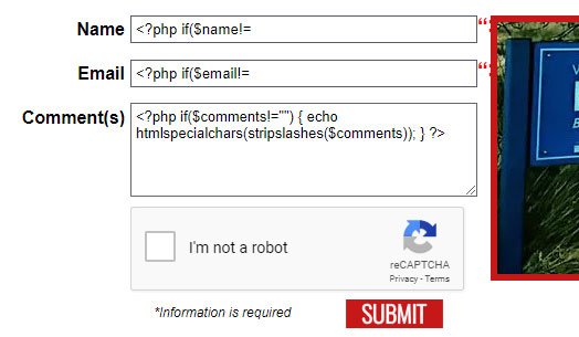
Sorry I haven't replied in a while but I was taking advantage of this rare bout of good weather we're having in the North of Ireland! I've given fisicx's Quick Contact Form (thanks!) and WPForms Lite a go and I can't seem to customise them fully to match my original contact form (ie pop-up validation such as 'This field is required' and to be taken to a separate thank you page). Neither seems to email to the Hotmail address whereas my own does. I replaced my original PHP with what BrowserBugs provided and it seems to work (though with Javascript turned off it just takes you to a blank page without submitting the actual form so I'm not sure...). When I add the extra lines of code to the HTML it gives me what appears in the attached image. Am I getting closer with my own form? <div class="form"> <form id="myform" class="cssform contact_form" action="http://www.greencastleparish.com/wordpress/wp-content/themes/ourladyofwayside/contact-us.php" method="post"> <?php if($err_msg!="") { ?><div><?php echo imp($err_msg); ?></div><?php } ?> <ul class="field"> <li><label id="Name">Name</label> <input class="cssform-field" name="Name" type="text" data-bvalidator="required" placeholder="Enter your full name here" value="<?php if($name!="") { echo htmlspecialchars(stripslashes($name)); } ?>"> </li> </ul> <ul class="field"> <li><label id="Email">Email</label> <input class="cssform-field" name="Email" type="text" data-bvalidator="required,email" placeholder="Enter your email address here" required="required" value="<?php if($email!="") { echo htmlspecialchars(stripslashes($email)); } ?>"> <span class="form_hint"><strong>Example</strong> name@something.com</span> </li> </ul> <ul class="field" style="text-align: left;"> <li><label id="Comments">Comment(s)</label> <textarea class="cssform-field" name="Comments" rows="5" data-bvalidator="required" placeholder="Enter your comment(s) here" required="required"><?php if($comments!="") { echo htmlspecialchars(stripslashes($comments)); } ?></textarea> </li> </ul> <div class="g-recaptcha" data-sitekey="6LdrHSkTAAAAABGTS7K2RsSedXKYWiWf0mAGhcjF"></div> <ul class="submitwrapper"> <li> <div class="inforequired"><em>*Information is required</em></div> <div class="submitbutton"><input alt="Submit" src="http://greencastleparish.com/wordpress/wp-content/uploads/2017/11/olw-submit.svg" style="width: 88px;" type="image" value="Submit" /></div></li> </ul> </form> </div><!-- form --> <?php function imp($var) { return htmlspecialchars(stripslashes($var)); } if($_SERVER['REQUEST_METHOD']=="POST") // Check it was posted else simply going to the processor would send the email $ok_to_send = true; // Default we want to send $name = trim($_POST['Name']); // Trim removes whitespace at the ends of a string if($name=="" && $ok_to_send) { $ok_to_send = false; $err_msg = "Error! Please provide your name."; } $email = trim($_POST['Email']); // Trim removes whitespace at the ends of a string if($email=="" && $ok_to_send) { $ok_to_send = false; $err_msg = "Error! Please provide your email address."; } elseif($ok_to_send && !filter_var($email, FILTER_VALIDATE_EMAIL)) { $err_msg = "Error! Your email address appears to be invalid."; $ok_to_send = false; } $comments = trim($_POST['Comments']); // Trim removes whitespace at the ends of a string if($comments=="" && $ok_to_send) { $ok_to_send = false; $err_msg = "Error! Please provide your comment(s)."; } $captcha = $_POST['g-recaptcha-response']; $response = file_get_contents("https://www.google.com/recaptcha/api/siteverify?secret=-----&response=".$captcha."&remoteip=".$_SERVER['REMOTE_ADDR']); if($response.success==false) { $err_msg = "You are spammer!"; } if($ok_to_send) { // Here is where you form and send the mail. $referrer = "Unknown"; if($_SERVER['HTTP_REFERER']!="") { $referrer = $_SERVER['HTTP_REFERER']; } $sTo = "nialldevlin@hotmail.com"; $replyTo = "Reply-To: " . $name . " <" . $email . ">".PHP_EOL; $subject = "New message from " . $name; $email_message = "This message was sent from: $referrer <br><br>" . PHP_EOL; $email_message .= "---------------------------------------------------------------- <br><br>" . PHP_EOL; $email_message .= "Name: $name<br>" . PHP_EOL; $email_message .= "Email: $email<br><br>" . PHP_EOL; $email_message .= "---------------------- COMMENT(S) ----------------------<br>" . PHP_EOL; $email_message .= nl2br("$comments<br>") . PHP_EOL; $email_message .= "----------------------------------------------------------------<br>" . PHP_EOL; ini_set("sendmail_from", " info@greencastleparish.com "); if(mail($sTo, $subject, $email_message, "From: Greencastle Parish Website <info@greencastleparish.com>\n" . "MIME-Version: 1.0\nContent-type:text/html;charset=UTF-8\n-f" . $replyTo)) { header("Location: http://greencastleparish.com/wordpress/our-lady-of-wayside/contact-us/thank-you"); exit(); } else { $err_msg = "Whoops! Sorry but the email didn't send."; } } ?>
-
Thanks fisicx
-
This is how I currently have it functioning. I wanted to see it as a challenge to learn from. I also don't know how much freedom for customisation there is if I use a plugin. In saying that, I'm looking at the WPForms Lite plugin as Plan B!
-
Would this mean putting the PHP in header.php? I don't know how to add it to a single page using wordpress.
-
I have all the PHP code on it's on page (/wordpress/our-lady-of-wayside/contact-us.php) while the Wordpress page containing the form is /wordpress/our-lady-of-wayside/contact-us/.
-
Sorry, but how do I implement that into the code I've already written?