MilkManManny
Members
-
Joined
-
Last visited
-
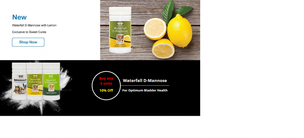
Interesting comments from all, thanks for the feedback. BlueDreamer: testing is a good idea, getting both passed will be difficult. Nillervision: they're front page banners, if you take a look at a site like say : https://www.hollandandbarrett.com/ you'll see they use a black BG, and alternate images pretty regularly. That's the idea here, rotate images on say a fortnightly basis to promote diff products to new and return visitors. davep: this would be the primary banner top of page, just beneath nav menu. Spot on with the print design comment. fisicx: yeah, you're right on possibly needing new designers, not sure I agree on never use a black bg, seems to be trending now days, see for example https://www.hollandandbarrett.com/ that's pretty similar to the layout of our site. Def needs a buy now button, was looking for feed back on impact, which would likely garner more clicks, which looks better etc.
-
Hi Guys, first time poster, read the rules. Hoping we can get some feedback on 2 candidates for a front page banner. We have two designers working at our company. Its is a fairly conservative company, selling products in the naturopathy industry. Customer base is predominantly seniors, but target population is encompasses anyone of any age. We're arguing about which of the following two banners to use in an upcoming update. Top half is banner one, the conservative banner, white bg with lemons on right. Bottom half is banner two, higher impact, black bg. Black bg not so common on the web, but I see it trending a little more now days. Any feedback or criticism welcome, on either one, or both. Thanks.