Anon D
Members
-
Joined
-
Last visited
-
Perfect..Thanks a lot zed. Seems to have fixed it.
-
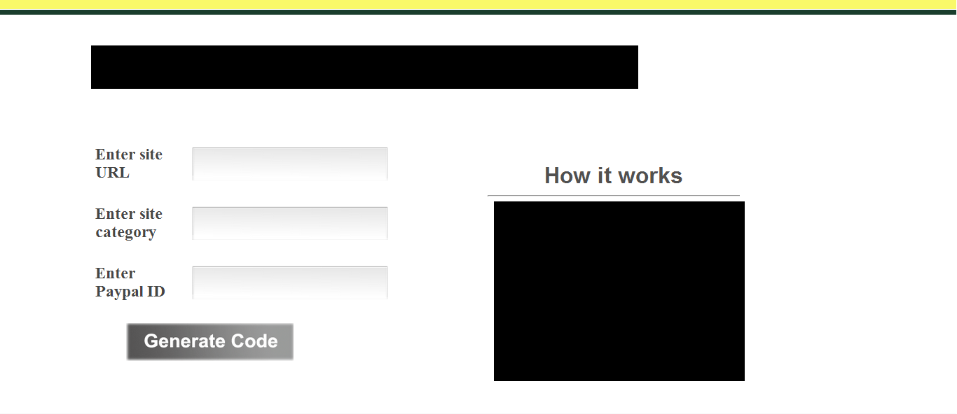
Hi I am working on this new design. Sorry for having to blackout some content. My question is with the alignment. If you look at the image, you will see an HTML form on the left and a 'How it works' section on the right. This is how I have set it Both the form and the 'How it works' section are under one master div tag with a margin-left of 150px (to align with the logo) and width of 1024px Howitworks is a div in itself with width 400px and float:right HTMLform is a div with margin-left:0 and width set to 500px Now, I don't understand why the Howitworks seems to dropping below the form window. I seem to fix it by setting a margin-top in negative for Howitworks, but isn't that bad programming practice. Also, that seems to mess it up on IE. Could someone help me out here.

-
Thanks a lot for the detailed response, Bomb. I just noticed that the text boxes adjacent to the 'text 1' 'text2' fields do not seem to have come in the PNG export. Also, the space between the 'Generate code' and 'Copy code' are supposed to be two large text areas with a script. The 'how it works' section actually contains the lorem ipsum text with the same number of lines as the original. I shall create one more and update it so you get a better idea. In the mean time, could you also tell me your opinion of the site theme - the green strip with a fade-out gray bg? Does it look professional enough? I guess I posted it here at the wrong time. I may not be able to get back on my design till Monday. Will post an update design then. Really appreciate your help.
-
Well, I am not a pro designer in the first place. But if you are doing this for fun at the moment, I could suggest what I did. First spend a good time going through every tool and option on Photoshop - see what it basically does. Google a bit to know more if you cannot get much clue. Once done, basically try to replicate different website designs with Photoshop. Keep cloning site designs on Photoshop and you should be able to pick it up.
-
Hi all Just stumbled upon this forum from Google and nice to see such an active community here.. Hope to stay long here. Now coming to the topic, I am new into web design and I am trying to create a design for my website here. The concept was to create a tiny header strip, a 'how it works' column on the right side and an HTML form on the left side of the content area. So this is what I have landed at Need your honest opinion people. Does this look good enough? Why does it look a little odd, or is just me being insecure? Your advice is going to help a long way.