YoWebDesigner
Members
-
Joined
-
Last visited
-
What? I don't understand what your saying.
-
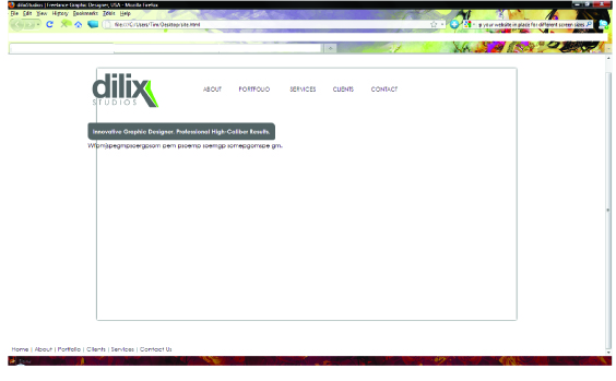
This is what I get with your correction... I'm not wanting it centered. I just want everything to stay where I put it when the screen re-sizes. That's the problem I am having. Thanks!

-
XHTML---- <body> <div id="wrapper" class="shadow"> <div id="header"> <a href="#"><img src="newlogo.gif" border="0" width="160" height="82" class="img"></a> <table valign="center" align="right" cellpadding="0" cellspacing="0" width="500" class="tbl"> <tr> <td><a href="#">ABOUT</a></td> <td><a href="#">PORTFOLIO</a></td> <td><a href="#">SERVICES</a></td> <td><a href="#">CLIENTS</a></td> <td><a href="#">CONTACT</a></td> </tr> </table> </div><!--Header--> <div id="content"> <div id="border" class="tbl2"> <b>Innovative Graphic Designer. Professional High-Caliber Results.</b><br> </div> <p>Wfpmjspegmpsoergpsom pem psoemp soemgp somepgomspe gm.</p> </div><!--Content--> </div> <div id="footer"> <a href="#">Home</a> | <a href="#">About</a> | <a href="#">Portfolio</a> | <a href="#">Clients</a> | <a href="#">Services</a> | <a href="#">Contact Us</a> </div><!--Footer--> </body> </html> CSS------ /*stylesheet.css*/ body { background: #FFF; color: #000000; font-family: Century Gothic, Helvetica, Arial, san-serif; font-size: 12px; } #wrapper { background: #FFFFFF; margin: 60px auto; width: 1000px; height: 600px; } #header { background: #FFF; width: 1000px; height: 100px; } a:link { text-decoration: none; color: #333; font-family: Century Gothic, Helvetica, Arial, san-serif; font-size: 14px; } a:hover { text-decoration: underline; } .img { position:absolute; left:200px; top:72px; z-index:1; } .img2 { position:absolute; left:915px; top: 150px; z-index:1; } .side { position:absolute; left:198px; top: 522px; z-index:1; } .tbl { position:absolute; left:450px; top:100px; z-index:1; text-align: center; background-color: #FFF; } .tbl2 { position:absolute; left:190px; top:190px; z-index:1; text-align: left; color: #FFF; background-color: #666; } #border { -moz-border-radius: 5px 10px 5px 10px; padding: 12px; } p { position:absolute; left:190px; top:220px; z-index:1; } #content { background: #FFF; width: 1000px; height: 400px; font-size: 14px; } .shadow { -moz-box-shadow: 0px 0px 5px #000; -webkit-box-shadow: 0px 0px 5px #000; box-shadow: 0px 0px 5px #000; /* For IE 8 */ -ms-filter: "progid:DXImageTransform.Microsoft.Shadow(Strength=4, Direction=135, Color='#000000')"; /* For IE 5.5 - 7 */ filter: progid:DXImageTransform.Microsoft.Shadow(Strength=4, Direction=135, Color='#000000'); } Footer was left out because it will be outside the Wrapper. Thanks!
-
My stage is 1000x600. I have content in the <div id="header">, <div id="content">, and ,<div id="footer"> areas, which is normal. Ok, when I have the browser window Restored Down, not maximized, all the content is where it should be placed on the stage but when the browser window is Maximized to full size, the content gets moved off the stage. Is there code that I should be placing in my css that prevents this from happening or something else that I need to do to the positioning code? See attached screen shots for a visualization of what I'm talking about Thanks in advance!!