generalawsome
Members
-
Joined
-
Last visited
-
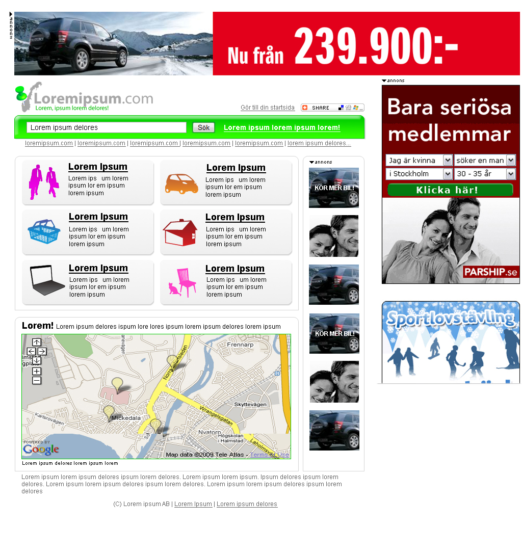
Thanks for your feedback! I have now changed the position of the small ads and made several other changes. I have hard to tell if this is professional or still lock slightley "amateurish"
-
I have edited the colors. Still i don't get this professional feel. Do you have any ideas?
-
Does the green look like flouroscent toxic waste green? I am a bit uncertain about the tone as I am editing on a laptop. The idea is that it should be fresh green but not more. Would you recommend other tone of green or different color?
-
Hello! I have been sitting with this layout and got completely blind. I am looking for a highly professional look and need to know what to change to acheive it. I am looking forward for your replies guise!